More Grumpiness on Competitiveness

Yesterday, I was a grump over national competitiveness and, in particular, the World Economic Forum‘s Global Competitiveness Index. I remain a grump today. Why does this topic bring out the curmudgeon in me?

In short, because national competitiveness is like a shell game where you are shown one definition, and this is then secretly switched to another. Here is a part of a speech by Prime Minister David Cameron on the UK economy in March 2013:

But third, as I said, we are restoring our competitiveness. At the forefront of this is our bold plan to cut corporation tax to 21%. That will be the lowest in the G7. As the recent KPMG survey shows, in just over two years we’ve transformed business perceptions of our corporate tax system from one of the least competitive to one of the most competitive in the world. We’re introducing some of the most generous tax breaks for early investment start-ups of any developed economy on the planet. And, by stripping back the red tape that was smothering businesses, we’ve put Britain back in the World Economic Forum’s Top Ten for competitiveness.

We start with the use of the word ‘competitive’ in the traditional sense: something relative to another. The claim is that UK tax rates are more competitive because they are lower. But this is really a tautology. Put another way, Prime Minister Cameron says this state of affairs is good, because good is defined as being this state of affairs. The only external evidence for the goodness of this state of affairs is the fact that it helps “put Britain back in the World Economic Forum‘s Top Ten for Competitiveness”.

Then later in the speech we see the race metaphor raised:

But my message is simple, people should make no mistake, in this battle for the future of Britain and our competitiveness, I’m prepared to roll-up my sleeves and have a fight, if that’s what it takes. So that is our plan: fiscal responsibility, monetary activism and restoring our competitiveness to succeed in the global race.

And it’s a zero sum race, since if we don’t beat the Chinese and Indians our children won’t get good jobs:

My motives, my beliefs, my passion for sticking to this plan are exactly about doing the right thing to help families and to help businesses up and down our country, because the truth is this: because if we want good jobs for our children, we will not get them if we are burdened with debt and outcompeted by India and China.

And in case you don’t get the message, the speech finishes by battering you with the race metaphor again:

By sticking to the plan, we can together make Britain a great success story in this vital global race. Thank you.

In all, I counted 16 references to ‘competitiveness’ and ‘competing’ in the speech. Productivity: zero. Prosperity: zero. Well-being: Zero.

Quick refresher on the WEF‘s definition of competitiveness, from page 4 of the Global Competitiveness Report 2014 /15:

We define competitiveness as the set of institutions, policies and factors that determine the level of productivity of a country. The level of productivity, in turn, sets the level of prosperity that can be reached by a country.

Note there are no sport or military metaphors to be seen. We neither appear to be in a race or a battle, just striving for a bit more boring productivity.

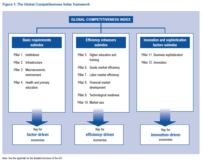
The report then sets out the twelve pillars that make up competitiveness, with these in turn determining productivity. The pillars are as follows:

  1. Institutions
  2. Infrastructure
  3. Macroeconomic environment
  4. Health and primary education
  5. Higher education and training
  6. Goods market efficiency
  7. Labor market efficiency
  8. Financial market development
  9. Technology readiness
  10. Market size
  11. Business sophistication
  12. Innovation

And a pretty chart (click for larger image):

Global Competitiveness Index jpeg

The calculation then gets more complex. Each pillar is subdivided into smaller categories, and each  category is given a weight and a score. Moreover, the weightings differ depending on a country’s level of development. The rationale behind the  particular weightings for each category is not revealed. Weightings appear to drop into the report like manna from heaven.

We now get wonkish as we delve into Appendix A titled “Statistically testing the validity of the Global Competitiveness Index as an estimate of the level of productivity of an economy” on page 46 of the report. In this part of the report, we are told that it is too difficult to measure productivity directly so GDP per head is used as a proxy. The following chart is then produced (click for larger image):

GCI and Level of Income jpeg

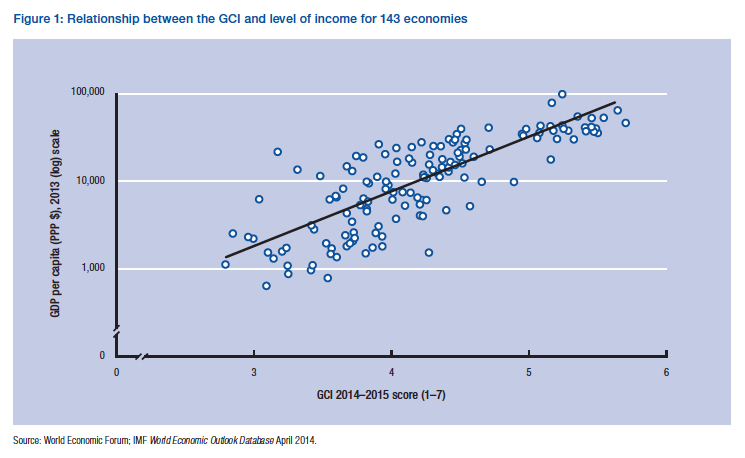
Hang on. What does this chart actually tell us? That rich nations have better institutions, education and so on. Do we really need a 500 page report to tell us that? And from statistics 101 we know that correlation doesn’t equal causation. And if there is causation, which way is it going. As we get richer, doesn’t that allow us to have better institutions and get more educated? Moreover, the accompanying text tells us that the GCI score accounts for only about two-thirds of GDP per capita anyway.

A second chart is then produced to give further credence to the GCI and productivity link. We have a little bit of sleight of hand here because we are jumping from a static to a dynamic measure: from GDP per head over a snapshot in time to GDP growth over a period of time. This is a little bit bizarre. We are saying that productivity should raise the long term growth rate. Yet the long-term growth rate is mostly driven by the change in productivity. So the idea is that if you are productive now, you will be more productive in the future. In short, innovation will continue–probably one of the most inane statements I have ever heard.

GCI and Growth jpeg

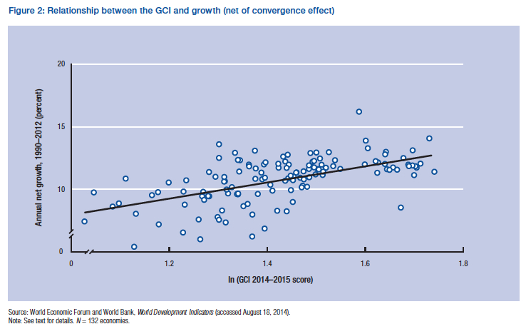
Note that in the above chart they have adjusted the growth number to take account of convergence (other things being equal, poor countries grow quicker than rich ones).

The other thing that jumps out at me from this chart (apart from all the correlation/causation problems) is that we are going backwards: the 2014/15 index score is being used as the determinant of growth from 1990-2012. Shouldn’t we really be taking the first GCI scores published in 2004 and then plotting them against the growth rates over the subsequent decade?

Despite all this, the WEF pats itself on the back and says job well done:

In conclusion, the results of both Figures 1 and 2 indicate that the GCI is a good estimate of the level of productivity. In other words, the GCI’s estimate of the determinants of competitiveness–which, in turn, fundamentally shape the (conditional) medium to long-run growth rate of an economy and its level of prosperity–is validated on a statistical level.

Between David Cameron and the WEF, we now appear in a hopeless muddle. The British prime minister bangs on about competitiveness using the metaphor of a global race. As such, Britain should rejoice that it has gone up the WEF’s Global Competitiveness Index league table. But the WEF says that the GCI is a measure of productivity, and since no-one can really measure productivity, it measures GDP per head (and it is a pretty crap measure of GDP per head at that). But if David Cameron goes along to the UK’s Office of National Statistics web page, he can read off Britain’s GDP per head statistics directly. So what is the bloody point of the GCI!

OK, in the final statistical results paragraph I quote above, an allusion is made to the GCI having some forward-looking predictive power. That is, if you raise your score today, you will become richer tomorrow. But where is the evidence in the WEF report to support this assertion? In truth, there is none.

Now within the index, there are a bunch of GCI pillars that if bolstered I am sure would lead to greater prosperity. Who doesn’t like innovation and higher education? But mixed in with this we have lower corporate tax rates, flexible labour markets (code for fewer labour rights), deregulation and privatisation. These factors are submerged within the GCI methodology like ingredients in a giant Irish stew. Do we know if any of these factors has a bearing on future productivity: no, we haven’t a clue.

In conclusion, appealing to competitiveness is often little more than a game of bait and switch, under which one kind of political agenda suddenly morphs into another. Be warned. Grump over.

What the Hell Does Competitiveness Mean and Why the Hell Should We Care?

Some advice: beware politicians talking about competitiveness.

In the socio-economic arena, you can find an index for this and an index for that. But the World Economic Forum‘s “Global Competitiveness Index” is one of the biggest beasts in this area.

From this index, we learn that Switzerland is the most competitive country in the world, followed by Singapore and the United States. But what does this mean? The WEF tries to help out:

We define competitiveness as the set of institutions, policies, and factors that determine the level of productivity of a country. The level of productivity, in turn, sets the level of prosperity that can be reached by an economy. The productivity level also determines the rates of return obtained by investments in an economy, which in turn are the fundamental drivers of its growth rates. In other words, a more competitive economy is one that is likely to grow faster over time.

We immediately run into a host of problems. For example, China comes in at 28 and India at 71 in the index rankings. Yet these two economies are exemplary examples of economies that have been growing “faster over time”. So the link between competitiveness and growth appears tenuous at best.

Indeed, I would argue that those countries who are least competitive (using the WEF‘s competitiveness metrics) may offer the best growth opportunities, since they have the most painless potential for catch-up. If you are corrupt and your institutions suck, then just by becoming a little less corrupt and by making your institutions suck just a little bit less, then you can grow an awful lot.

Then there is the word “prosperity”, which crops up an awful lot in talk of competitiveness. Unfortunately, prosperity is not the same thing as well-being or happiness. So are competitive nations happy nations? The question isn’t asked.

And what the hell does prosperity mean? In the United States,  a Council on Competitiveness was established nearly 30 years ago. Back in March 2007, the Council issued a report called “Competitiveness Index: Where America Stands“. It was rather smug as reports go, but America’s competitive prowess didn’t stop the country walking into the buzz saw of the Great Recession.

The report also included an introduction by Michael Porter, the doyen of competitiveness studies. If anyone can tighten up the purpose behind competitiveness, then surly Porter could.

The ultimate goal of competitiveness is the prosperity of a nation’s people, or per capita living standards….

….Competitiveness is not about a low-cost labour force, the largest share of exports of even the fastest economic growth. It is about creating the conditions under which companies and citizens can be the most production so that wages and returns on investment can support an attractive standard of living.

For those of a certain age (and an interest in economics and finance), Michael Porter’s book “The Competitive Advantage of Nations” was a must-read. Palgrave describes is as one of the most influential business and management books of all time. For a synopsis of his thesis, read this 1990 Harvard Business Review article here. My younger self was impressed when I first read his book. Now, less so.

For a start, the focus on competitiveness has not helped support “an attractive standard of living”. In the late 1980s, when national competitiveness studies swept into fashion, real median household income was around $52,000–almost exactly where we are now.

Median Wages jpeg

Of course, I frequently point out on this blog that there is a disjoint between standard of living and well-being. But the competitiveness mantra has always ignored well-being. The mantra has told us that we should keep score by looking at growth and prosperity (aka per capita incomes) alone. In short, we are admonished to remain competitive, and in so doing we must reform X, Y an Z. But, by doing this, the average Joe gets nothing in return.

Moreover, measures of competitiveness appear to have absolutely no predictive power whatsoever. In the 1990 HBR article by Porter, Japan played a staring role. Ten years later, and no apology in sight, Porter wrote a book called “Can Japan Compete?

That book, itself, contains a call on Japan to reform its uncompetitive half (a half generally ignored 10 years earlier). And this call is still sounded regularly in the editorial pages of the Wall Street Journal, Financial Times and The Economist. Thank god they have not done it. If they had, I suggest that you would have seen a far greater decline in median incomes and a marked deterioration in well-being. It is the “uncompetitive” piece of the the economy that gives Japan its low unemployment, social coherence and overall resilience to what the world economy and nature (think earthquakes, tsunamis and typhoons) throws at it.

So to conclude, whenever you hear politicians clamour for national competitiveness, expect incoherent, ill-informed and unsupported garbage.

Collapse Comes of Age

Not long ago, the study of human collapse and extinction was the preserve of cranks (or Hollywood). True, a few maverick scholars have taken on the topic, Joseph Tainter and his book “The Collapse of Complex Societies” springs to mind. Yet little academic infrastructure existed to give collapse studies depth. But just as with happiness studies, another topic covered by this blog, the situation has now changed.

In the UK, our two oldest universities, Oxford and Cambridge, have both set up institutes that probe into the greatest risks faced by mankind. In Oxford, we have the Future of Humanity Institute (FHI), and in Cambridge the Centre for the Study of Existential Risk (CSER). To get a taste of the FHI and its founder Nick Bostrom I recommend you read this in-depth article by Ross Andersen of the magazine Aeon here.

Like this blog, Bostrom’s principal concern is risk; that is, the probability that an event will occur combined with the impact should that event occur.

Risk jpeg

However, Bostrom extends this concept to take in scope: whether a particular risk is limited to a locality or whether it is all encompassing. This produces a risk matrix like this (source for the following analysis his paper here; click for larger image):

Typology of Risk jpeg

The X in the grid marks what Bostrom calls “existential risks”, which he defines thus:

A risk where an adverse outcome would either annihilate Earth-orginating intelligent life or permanently and drastically curtail its potential.

Bostrom then goes on to subdivide such existential risk into four categories:

Bangs: Intelligent life goes extinct suddenly due to accident or deliberate destruction.

Under this category we get traditional disaster movie scenarios of asteroid impact, nuclear holocaust, runaway climate change, naturally-occuring modern plague, bioterrorism, terminator-style super-intelligence and out-of-control nanobots.

Crunches: Society resets to a lower-level of technology and societal organisation. 

This includes bang-lite scenarios that don’t quite kill off intelligent life but rather just permanently cripple it.  Crunches also cover resource depletion and ecological degradation whereby natural assets can no longer support a sophisticated society. Crunch could also come from political institutions failing to cope with the modern world–subsequent to which emergent totalitarian or authoritarian regimes take us backwards.

Shrieks: A postmodern society is obtained, but far below society’s potential or aspirations. 

This is a rather nebulous category since the measuring stick of our potential is against something that we may not be able to understand–a reflection of Bostrom’s philosophical roots, perhaps.

Whimpers: Society develops but in so doing destroys what we value. 

Under this scenario, we could pursue an evolutionary path that burns up our resources or we bump up against alien civilisations that out-compete us. Over the time scale that this blog looks at–the lifespan of our young–this existential threat can be ignored.

Building on many of Bostroms preoccupations, a joint report by FHI and the Global Challenges Foundation has just been published under the title “Global Challenges: 12 Risks That Threaten Human Civilisation”. The Executive Summary can be found here and the full report here.  The report is again concerned with existential risks, but approaches this idea somewhat differently than Bostrom’s earlier work.

The focus of the report is on low probability but high impact events. The logic here is that low probability events are generally ignored by policy makers, but when such events occur, they could have catastrophic consequences. Accordingly, policy makers should be duty bound to plan for them. From a probability perspective, what we are talking about here is the often-ignored right tail of the probability distribution.

Existential Probability jpeg

The 12 risks falling into the right tail of the distribution highlighted in the report are:

  1. Extreme climate change
  2. Nuclear war
  3. Global pandemic
  4. Ecological collapse
  5. Global system collapse
  6. Major asteroid impact
  7. Super volcano
  8. Synthetic biology
  9. Nanotechnology
  10. Artificial intelligence
  11. Unknown consequences (Rumsfeld’s unknown unknowns)
  12. Future bad global governance

As an aside, finance is one of the few disciplines that takes these tails seriously since they are the things that will blow you up (or make you a fortune). The industry often doesn’t get the tail-risk right (incentives often exist to ignore the tail) as the financial crisis of 2008 can attest. However, the emphasis is there. A lot of science ignores outcomes that go out more than two or three standard deviations; in finance, half your life is spent trying to analyse, quantify and prepare for such outcomes.

Returning to the Global Challenges report, the emphasis of the analysis is on dissecting tail risks, with the goal of provoking policy makers to consider them seriously. One of the most interesting proposals within the report if for a kind of existential risk early warning system, which I will look at in a separate blog post.

Finally, I will finish this post with a chart dealing with severe climate change (click for larger image or go to page 64 of the report), a risk that I hope will be at the centre of the upcoming COP 21 climate talks in Paris in December. The fact that our top universities are seriously studying such risks will, I hope, prevent them being seen as the preserve of cranks and disaster movies in future.

current climate risk jpeg


Chart of the Day, 17 February 2015: How Scary Is Methane?

A doomer commentary on methane has been doing the rounds on social media. Pictures of  methane bubbles certainly look scary, but the overall atmospheric concentration of methane has been showing only a mild rise. From the Advanced Global Atmospheric Gases Experiment (AGAGE) data series:

AGAVE CH4 jpeg

Moreover, the current climb is far slower than that seen in the 1980s. From a paper by Kirschke et al (click for larger image).

Methane jpeg

Although methane is a very powerful greenhouse gas (about 20 times as powerful as CO2), it presently makes up a little under 2 parts per million (ppm) of the atmosphere compared to around 400 ppm for CO2.

Critically, methane’s atmospheric life is short, about 12 years, after which it converts into CO2 (and thus becomes 20 times less potent). For this reason, it doesn’t accumulate easily. Keeping this in mind, a post by David Archer on the Real Climate blog looked at chronic versus catastrophic methane releases (click for larger image).

Chronic versus catastrophic methane release jpeg

So, in order to recreate a disaster movie scenario, we either need to see a massive and sustained release of methane or a ginormous spike in methane emissions. Where would this come from? The candidates are generally given as methane hydrates or other sources of trapped methane at high northern latitudes. But to see how realistic such places are as a source, we need to see where the methane is coming from at present (source here; click for larger image).

Methane Sources and Sinks jpeg

As you can see, anthrogenic sources such as wet-field rice cultivation, fossil fuel extraction and animal-rearing over-shadow other sources such as hydrates. Indeed, to get hydrates to become the principal driver of atmospheric methane concentrations we would need to see a 10 to 100-fold rise, and this would then need to be sustained for a long period of time.

According to scientists such as David Archer and Gavin Schmidt, such emission scenarios don’t look plausible (for more detail see here). In short, they see little evidence of a methane bomb ready to explode.

Simplistically, the difference between methane and CO2 is that the latter stays up in the atmosphere once put there while the former doesn’t. In sum, CO2 provides plenty of disaster movie material; we don’t have to look further afield to scare ourselves senseless.

A Short Blog Post on a Very Big Question: Well-Being and Policy

Here in the UK, a general election looms. Key themes are common to every western democracy, albeit with a few local characteristics; that is, economic growth, prosperity (narrowly defined around income and wealth), inequality (median wage growth or the lack thereof) and, to a degree, well-being (in the UK’s case proxied by arguments over the NHS). Climate change and the environment will be foot-noted at best.

So could we do better? Emphatically, yes.

To commence with, every politician (and, in fact, everyone), regardless of political persuasion, should read the report “Well-Being and Policy” published by the Legatum Institute last year. The executive summary is here and the full report here. Note the report is written by a suite of top-ranked economists including Angus Deaton and Richard Layard.

The report makes a compelling case that the young discipline of ‘well-being and happiness’ has now matured sufficiently to drive policy. Following from this, my recommendation is that every party organises its manifesto around the three major types of happiness set out in the report (and for the last few years in this blog):

  1. Life satisfaction: how we evaluate our lives
  2. Affect: the daily positive feelings (happiness, joy, contentment) and negative feelings (anger, sadness, fear, depression and so on) we experience
  3. Eudaimonia: whether we feel our lives are meaningful

Where does GDP, income and wealth show up in the above trilogy? They show up quite a lot in life satisfaction, but not so much in affect and eudaimonia. So let’s just drill down into life satisfaction a bit more. We can see its principal components here (click for larger image):

Impact of Policy A upon Life Satisfaction jpeg

For simplicity, let us ignore the eudaimonia and affect forms of happiness and presuppose that policy was purely aimed at the life satisfaction and its determinants as detailed above.

Measured against this new metric, a government could embark on a green agenda that made the UK totally fossil fuel free by, say, 2030 as long as sufficient improvements were made with respect to well-being as it relates to employment, education, family, community, environment, physical heath and mental health such that this offsets any loss in well-being from income. If this were possible, then we would have made a net positive policy choice. In short, we can have our cake and eat it: a society with a higher level of well-being and a society that isn’t destroying the well-being of future generations.

Actually, it gets even easier than that. The entire system as it stands is built around valuing consumption as the main driver of happiness. How many adverts over the last month have you seen admonishing you to cultivate an allotment as opposed to buying an SUV? Yet the evidence in the happiness literature is quite specific: engaging in a community recreational pursuit has a far greater impact on happiness than, say, purchase of a new car (on the impact of auto purchases, see here). Indeed, it is somewhat miraculous that non-monetary forms of happiness have survived the onslaught of a system that values nothing that cannot be bought.

Traditionally, economics has gone with the maxim of revealed preference; that is, look at what people do, not what they say. In short, if they are doing it, by definition it is making them happier. But psychological studies (and more recently economic studies) show that the link between what people do and whether what they do makes them happy is far more tenuous.

Let’s take cigarettes. A study by Gruber and Mullainathan demonstrated that by taxing cigarettes, the government made smokers happier by forcing them to cut down or stop smoking. By extension, in a world where we are continually persuaded to consume, we may work excessively and incur too much debt. By constricting our consumption choices, the government could actually make us use our time to secure far superior sources of happiness than those just founded on the acquisition of consumer goods.

In conclusion, what every politician should be peddling is growth in well-being–everything else is irrelevant.

Chart of the Day, 13 February 2015: Dr. Spencer’s Temperature Record

It’s a while since I posted on  the University of Alabama-Huntsville (UAH) temperature data, or more precisely on the global average lower tropospheric temperature anomaly as measured by satellite. The anomaly refers to the difference between the current temperature reading and the average reading for the period 1981 to 2010 as per satellite measurements.

The official link to the data at UAH can be found here, but most months we get a sneak preview of the release via the climatologist Dr Roy Spencer at his blog here.

Spencer, and his colleague John Christy at UAH, are noted climate skeptics. They are also highly qualified climate scientists, who believe that natural climate variability accounts for most of recent warming and any manmade contribution is minor. If they are correct, then we should see some flattening or even reversal of the upward trend within the UAH temperature time series over a long time period.

The last reading was for January 2015, and showed an anomaly of 0.28 degrees Celsius. This is the forth hottest temperature recorded for any January since the satellite record was started in December 1978 (37 January observations). To get a sense of the trend, see the chart here (click for larger image):

UAH Sat Temp Jan 15 jpeg

The climate skeptic community has made much of the fact that 2014 was not the hottest year on record according to satellite data. This contrasts with the time series recorded by both NASA and NOAA, which show 2014 taking the record. This is how the top 10 stack up according to UAH (taken from Spencer’s site here):

Annual Global Temp Anomalies jpeg

In the same post, Spencer highlights the statistical error surrounding the terrestrial hottest year claim for 2014. This is true. The reported temperatures are best estimates and sit within confidence bands. So newspaper articles should have read: “best estimate of temperature makes 2014 hottest year on record”. This doesn’t, however, make such good newspaper copy.

More important is the fact that one year’s worth of temperature is really just weather, while a decade or two is climate. Spencer has something to say about this as well:

Roy Spencer Text jpeg

The red flag here is “13 calendar years”. Why not ’20’? We are talking about climate after all. Critically, the 13 years takes us back to 2002 and produces the flattest line possible through the data in the chart shown above. If, by way of contrast, you take the UAH data set and compare the average temperature anomaly for the 10 years through 2014 with the average anomaly for the 10 through 2004, you see a rise of 0.13 degrees Celsius. The equivalent 20o4 to 1994 decade comparison is 0.22 degrees Celsius. So we have a slowdown, but it is far less pronounced and we still have a lot of warming.

Further, the 37 year UAH data record is still short, so a plateauing stands out. For the longer terrestrial data series, as I blogged about here, alternate fast and slow warming phases are nothing unusual. A hiatus is just that: a pause not a stop.

Critically, Spencer believes that the recent period of slow warming is evidence of low climate sensitivity to the ongoing rise in atmospheric CO2. Unfortunately, the only way he will be proved wrong about this (since he doesn’t accept consensus theory) if for the planet to undergo significant warming. This is an augment regarding which the consensus will likely be proved right, but which is far from a cause for celebration.

Chart of the Day, 12 February 2015: The Slow Growth Movement

The holy grail of traditional economics lies in strong technology-led productivity growth.

Other types of growth are resource intensive (capital or labour) and suffer from diminishing returns. You can throw more and more capital into the GDP-producing pot (through increasing fixed investment as a percentage of GDP), but it will have less and less of an effect. This is what happened to the Soviet Union and Japan in the past, and this is what will happen to China in the future. (Resource intensive input growth can also sometimes produce an expansion of GDP, but not necessarily a rise in well-being–think spoiled environment.)

Similarly, you can throw more people into the GDP-producing pot, or make them work harder (more hours), or educate them to work smarter. But all three sources of growth also have limits.

So if you want quality, sustainable growth, you want technology-led productivity to expand. Will it? Last week, a short comment published by productivity researchers John Fernald and Bin Wang on the Federal Reserve Board of San Francisco web site looked at this issue. Fernald and Wang note that the ‘go go’ GDP growth years of the late 1990s were mostly built on labour productivity (click for larger image).

Contributoins to Business Sector Output Growth jpeg

But as I noted above, labour productivity can, in turn, be thought of as resting on the availability of more capital, better education or technological advance. Economists generally refer to the last type as total factor productivity (TFP). Think of it as a measure of innovation. And you can see which industries have been driving that innovation here (click for larger image):

Contributions by Industry Type jpeg

In IT-intensive industries in particular, there has been a step-change downward in innovation-led growth. Moreover, the non-IT industries have seen no TFP growth since 2007. But Fernald and Wang want to stress that innovation gains were struggling before the financial crisis hit:

The most recent slowdown in productivity growth predated the Great Recession of 2007–09. Hence, it does not appear related to financial or other disruptions associated with that event. Rather, it appears to mark a pause in—if not the end of—exceptional productivity growth associated with information technology.

This is one reason why I feel that Western countries will struggle to raise GDP growth above 2% any time soon.

Chart of the Day, 11 February 2015: Is Supply What Done It to Oil (Says Goldman)

“Is supply what done it,” says Goldman Sachs (as reported by Bloomberg; click chart for larger image).

The big take-away: “[T]he decline in oil has been driven by an oversupplied global oil market,” wrote Goldman economist Sven Jari Stehn. As a result, “the new equilibrium price of oil will likely be much lower than over the past decade.”

Decomposition of Oil Price Demand jpeg

Looks authoritative? And, on top of the pretty chart, Bloomberg tells us that Goldman is using a “vector autoregression with sign restrictions”.

Yeah, right. Solid statistical (and thus econometric) forecasts need to be founded on known and stable relationships–we have neither (we rarely do in macro). Supposedly, Goldman knows that if demand is X (holding supply stable), price will likely be Y. Or, if supply is W (holding demand stable), price will likely be Z. And then a dynamic multi-factor model can be created to bring everything together.

But for oil, we neither have a good idea of what the underlying relationships look like nor, more importantly, do we understand how they evolve through time. As proof of my scepticism, recall that Goldman was predicting high oil prices just over a year ago (spot the oil forecast; source: Business Insider; click for larger image):

Goldman Sachs Macro Forecasts jpeg

Perhaps I am being too harsh. Goldman’s supply and demand decomposition does give us a cloudy window into past price movements, but it certainly won’t give us a reliable vision of the future. In reality, the prognostications of market strategists are a form of economic story telling. And the best story tellers get paid the most. In certain aspects, humanity has not come that far from 10,000 years ago.

Chart of the Day, 10 February 2015: Debt As an Existential Threat?

McKinsey Global Institute continues to run with a series of reports on the global credit bubble that spurned the Great Recession. The latest titled “Debt and (Not Much) Deleveraging” takes up the story seven years after the crisis (click for larger image).

Seeking Stability in an Indebted World jpeg

The report shines a spotlight on the world’s growth problem. Other things being equal, higher debt should translate into higher effective demand, either through increased investment or greater consumption. Again, other things being equal, more investment should result in a rising capital stock, which in turn should lead to more growth. Further, if growth were accelerating, then the debt-to-GDP ratio should be falling. Yet this text book economics isn’t panning out. Instead, we have rapidly rising debt and anaemic GDP growth. Result: debt-to-GDP grows and grows (click for larger image).

Change in Debt-GDP Ratio jpeg

This is interesting, but doesn’t really tell us anything new. And the McKinsey report avoids the big questions, the biggest of all being  “does debt matter?”

Commentaries at the doomer end of the economic blogosphere suggest that debt matters more than anything else–and, for some, burgeoning debt means the world is on the verge of a financial panic and subsequent collapse. But the relationship between the real economy and the financial economy is a complex thing. I can’t count the number of times that people confuse debt with stuff. Debt is not stuff: debt is a claim on stuff. Expand, contract or shuffle the debt–do what you will–and the same amount of stuff still remains.

Take the purest form of monetary collapse: the Weimar German  hyperinflation between 1921 and 1923. During this period, fiat money became worthless. Yet the real assets of the economy remained intact. Germany had almost the same number of factories in 1923 as it did in 1921. It had the same number of engineers, even if many lost their jobs. And, ultimately, this real economy was sufficiently robust to reignite within a year or two. Money died in 1923 Germany, the real economy didn’t.

What’s more, the real German economy then took a second financial punch in the form of the Great Recession in 1929. Yet despite undergoing all this turmoil (which makes our 2008 crisis look insipid by comparison), the German real economy had enough inherent strength to go on to support the expansionist policies of the Third Reich for a decade.

So when money died in Germany, the real economy didn’t. By contrast, what did die along with money were many of the original ownership claims on the real assets. Who owned what in 1924 (after the situation stabilised) was very different from who owned what in 1920 (before hyperinflation took off). Moreover, during the hyperinflation years, assets remained idle and incomes fell. So there were real effects–they just weren’t ever-lasting.

During the 2008/09 credit crisis we similarly witnessed under-utilised assets, and the claims on those assets were shuffled around to a certain extent. But the real assets that make up the real economy lived on. True, we had what Austrian economists call mal-investment. That is, the financial economy directed the real economy to make some real assets that no one wanted a year or two down the road. But the largest dead assets of America, such as the decaying factory and residential blocks of Detroit, are not the result of a credit bubble that went pop, but rather are due to far deeper and slow-moving underlying real economy forces.

For this reason, I don’t see debt as in the same league of existential threats to well-being as climate change or resource depletion.

To restate my argument: on the positive side, our most-pressing problem is not that of a dysfunctional financial system. But on the negative side, this means that the financial system will provide only limited help in solving our existing challenges.

Before the financial crash, it seemed that modern finance, derivatives and all, had led to a step-change improvement in matching limited resources with limitless needs (what economics is all about). That step-change improvement now appears a mirage. But this also means that real change will ultimately have to come from changing the real economy–and that, in reality, is a far tougher thing to do than fiddling around with our banks and brokers.

Chart of the Day, 8 February 2015: The Primordial Soup of US Renewables

If you like charts (as I do), and you are interested in all things energy and climate change, then the annual Bloomberg New Energy Finance‘s “Sustainable Energy in America Factbook” is an absolute treat. The 2015 edition came out last week.

While the United States does not have a Climate Change Act like the UK, it does have top-end academic research, government-backed blue sky thinking (via the Advanced Research Projects Agency for Energy), lots of entrepreneurial zeal, a deep well of venture capital funding and a multitude of innovative state-led renewable initiatives. Just as the primordial soup of complex molecules on early earth once gave rise to the chemical combinations that we call life, so we hope that the US renewable melting pot will also give birth to something transformational.

Of course, we are not there yet. And Voldemort is well represented in the US care of the anti-science Congress and a fossil fuel lobby that makes the tobacco giant lobbying of the 60s and 70s look like amateur time. But let’s stay upbeat. For a start, King Coal does appear to be in full retreat (click for larger image on all charts).

Electricity Generating Capacity by Fuel Type jpeg

Further, investment continues to pour into the renewable space at a rate 10 times higher than a decade ago:

Renewable Investment jpeg

With the exponential explosion in solar capacity particularly encouraging.

US Solar Roll Out jpeg

I could go on.

Nonetheless, for the US to lead the world into a post-carbon age before we are committed to extremely dangerous climate change still requires a step change upward in renewable investment. But the building blocks for a renewable revolution are there, they just need to be put in the right order.