Category Archives: Peak Oil

Seba’s Solar Revolution Part 1 (100% Solar by 2030?)

Following on from my 20-post series on elective vehicle (EV) penetration rates (which started here), I’ve been mulling a series of posts on the Tony Seba’s forecasts for solar energy growth through to 2030.

Just as with EVs, I am less interested in proving Seba right or wrong; rather, I am using his forecasts as a hook to examine the question of whether such warp-speed technological revolutions are possible. If Tony is right, or even half right, such a disruption will upturn all of our current socio-economic arrangements. In short, the transformation will re-order the wealth of nations, change how our cities and towns are arranged and upturn how we work and play.

Tony Seba is frequently attacked by industry insiders as a publicity-seeking charlatan, with dubious academic credentials and limited knowledge of the fields he opines on. Perhaps. But you can’t accuse of him of refusing to present testable hypotheses, the litmus test that divides evidence-based science and irrefutable faith. In Tony Seba’s 2014 book “Clean Disruption“, we find this passage on page 37:

Globally, solar PV installed capacity has grown from just 1.4 GW in 2000 to 141 GW in 2013. This represents a compounded annual growth rate (CAGR) of 43 percent.

Should solar continue to grow at a 43-percent annual clip, the solar installed capacity will be 56.7 TW by 2030. This is approximately the equivalent of 18.9 TW of conventional caseload power. World demand for energy is expected to be 16.9 TW by 2030, according to the US Energy Information Agency.

Should solar continue on its exponential trajectory, the energy infrastructure will be 100-percent solar by 2030

The use of the word “should’ isn’t his ‘get-out-of-gaol-free’ card since he continues later in the book to suggest that installed capacity growth will grow faster than 43% per annum.

If you want to hear Tony’s claims directly, then listen to this presentation from 50 minutes into the talk:

Solar, the installed base, has doubled every two years since the year 2000. This is on a global basis. That is, basically, a growth compounded at 40% per year. Doubled every two years since the year 2000. Now, solar is about one and a half per cent of generation…..

…..Now if it keeps doubling, and it keeps doubling every two years, how long, how many years, until solar is 100% of the world’s generation of energy ? Let’s do the numbers. So one and half percent, let’s double it every two years. Three percent, one doubling, six, 12 percent, 24, 48, 96. Six doublings. Say I am wrong by a couple of years. Seven doubling, that is 14 years, so essentially by 2030 or so, solar, if it keeps growing like this, and remember S-curves, right, exponential. It’s going to be 100% of the world’s energy generation.

Tony then goes into the respective cost curves of solar versus incumbent energy sources (which I will address in later posts).

OK, let’s put this up against competing forecasts from more mainstream institutions, starting with the International Energy Agency (IEA). This chart from their World Energy Outlook 2018:

untitled 2

In the above chart, NPS stands for New Policies Scenario and SDS the lower carbon Sustainable Development Scenario. Regardless, renewables don’t get much above 25% at best and that is full ten years after Tony’s projected solar-dominance date, plus the renewable category includes all renewables and not just solar.

Let’s look at a few more flagship publications that deal with long-term energy forecasts. In the US, the government’s Energy Information Administration (EIA) puts out an publication titled Annual Energy Outlook that goes out to 2050 as well. It’s US centric, but since so much technology and finance comes out of the US, one would expect the country to not be far off the global solar adoption pace.

For the EIA‘s 2018 edition, solar sits in the “other renewables” category (which excludes hydro). We will disaggregate the other renewables category in later posts, but suffice as to say if solar were doubling every two years, the green curves should be standing up. Instead, the EIA has growth slowing down.

untitled 2

A number of the oil majors also put out long-term energy forecasts. From BP’s Energy Outlook 2018. They have a variety of scenarios, the most aggressive for renewables is called “RE push”. That scenario has all renewables accounting for around 20-25% of energy consumption by 2040.

untitled 2

And from Exxon’s 2018 Outlook for Energy. Wind and solar barely show up:

untitled 2

Finally, a friend of green energy, Bloomberg New Energy Finance makes this forecast in its New Energy Outlook 2018:

untitled 3

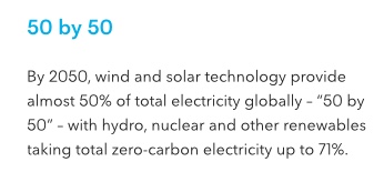
So that is all renewables accounting for only 50% of electricity production, rather than 50% of total energy production or consumption, by 2050.

The main takeaway from this introduction is that Tony Seba’s solar penetration forecasts appear even more aggressive, and even more non-consensus, than his EV sales forecasts. Are they completely barking mad?

To be continued…..

The EIA Sees Our Energy Future – Which Doesn’t Look That Much Different from Today

Exams finished (I’ve been exercising my brain cells by doing some data analysis and computer courses with the UK’s Open University), so I have at last had a chance to blog.

Let’s kick off with a report I usually try to catch each year: the US government’s Energy Information Administration (EIA)‘s “Annual Energy Outlook 2015“, which looks out to 2040.

If you keep up with media reports, the backdrop to the 2015 Outlook would be something like this:

US oil production has pushed up toward 10 million barrels per day (bpd) and is a whisker away from overtaking Saudi Arabia; five LNG export terminals have been approved and are under construction because the US is so awash with natural gas (due to the fracking boom) that it needs to export it; solar PV panel price falls coupled with efficiency gains have brought the levelised cost of solar PV down so substantially that solar energy is now making a major contribution to electricity generation in an ever-growing number of American states; Texas has become a wind-energy king second only to Denmark; and Elon Musk is bringing power to the people (literally) in the form of a new generation of home super batteries.

Wow, sexy stuff! So I guess we are going to see the EIA predicting radical changes to the energy mix in 2040, especially as many of the trends I just highlighted are only getting started. Right? Let’s look at EIA’s flagship chart (page 17 of the report, click for larger image on all charts):

US Primary Energy Consumption jpeg

Continue reading

Charts du Jour, 6 April 2015: US Natural Gas Production

The US government agency The Energy Information Administration reported natural gas production numbers for January 2015 on 31 March (numbers are reported with a two month lag).

US dry gas production was up 8.9% year on year in January, and the 12-month moving average was 6.1% higher year on year, the highest growth since October 2012 (click for large image; source: here).

US Dry Gas Production Jan 2015 jpeg

Meanwhile, natural gas prices have continued to trend down and are now reaching around $2.5 per million British thermal units (Btu). This is not far off their 2012 lows (source: here).

Henry Hub Prices Mar 15 jpeg

Continue reading

Chart du Jour, 1 April 2015: Were the 1950s So Good?

Sometimes it is best just to pilfer other people’s work– any other action feels rather pointless. This from Andy Skuce’s blog Critical Angle (click for larger image):

CO2 Sources copy

Bang! Marty McFly goes back to 1955 to persuade Doc to save the world from fossil fuel emissions (one can but dream).

Then again can we ask ourselves whether the relatively low energy intensity economies of the 1950s had a higher level of well-being than those that exist now (of course development has widened and population has grown). I’ll let my readers have a think about that.

Anyway, check out the Critical Angle blog here.

US Crude Oil Production for January 2015 (and Calling the Top)

Time for a switch in focus, from the philosophical yesterday to the prosaic today. It’s that time of the month for some hard numbers from “frack land”, i.e., the good old USA. What is more, I am going to stick my neck out today and call the top for US crude oil production.

The US government agency the Energy Information Administration (EIA) reports monthly crude oil production with a 2 month lag; January 2015 data were published on 30 March. January saw oil production averaging 9.2 million barrels per day, a rise of 14.8% year on year. Over the previous month, production was down slightly. Nonetheless, we did see a month-on-month decline in November only for production to power to a new record again in December.Yet I’m still calling the top.

True, growth has far exceeded what I expected when I started writing this blog. The production surge is indisputable (here, click for larger image).

US Oil Production jpeg

The reason why I didn’t expect to see output rise so far so fast was due to the high production declines rates exhibited by tight oil plays, leading to what many call the ‘Red Queen’ syndrome: the need to run faster and faster just to stand still. So a mea culpa on my side: the US shale oil industry did run faster and faster. With global crude oil prices locked above $100 barrel for three long years, we got both a lot more rigs and, critically, more efficient rigs as fracking technology advanced. This was enough to overwhelm the naturally high depletion rates. Continue reading

Wantability, Well-Being and Risk

I’ve been mulling a name change for the blog for some time. The name the “The Rational Pessimist” was a riposte to Matt Ridley’s book “The Rational Optimist“. Ridley’s book is a paean to global free markets and human innovation–and in parts is correct. Since the industrial revolution commenced, technology coupled with capitalism has lifted the bulk of the world’s population out of a Hobbesian life that was “nasty, brutish and short”. But where I differ from Ridley is in believing that a 200-year data set of economic growth can fully capture all future risk.

Ridley’s book is Panglossian. He believes that every problem we face–from climate change to resource depletion–is relatively minor, just waiting to be solved by a technological fix. For him, price always trumps scarcity. Whenever something looks like it is running out, the magic of markets will  always lead to new discoveries or acceptable substitutes.

As an economist by training, I accept that the everlasting dance between supply, demand and price is something of beauty. But I also believe that it has its limitations. A backward-looking empirical observation that things haven’t run out is different from a forward-looking theoretical prediction that things won’t ever run out. North Sea oil is running out regardless of price, and a global supply of oil is not qualitatively different from a local one.

Of course, technology may provide a perfect, or dare I say it better, substitute for fossil fuels. But then again it may not. That is uncertainty, and the consequences of that uncertainty is the concept of risk.

Continue reading

Charts du Jour, 18 March 2015: Shale and Seneca’s Cliff

In the words of the Roman philosopher Seneca:

Increases are of sluggish growth, but the way to ruin is rapid

Lucius Annaeus Seneca was musing on the accelerated rate of decline and fall of empires a couple of thousand years ago. The chemist and scholar of the post-growth world Ugo Bardi has borrowed the philosopher’s name for his idea of a Seneca Cliff–the precipice over which our complex society will likely (according to him) tip and fall.

While such ideas gained considerable traction a few years ago (fanned by rocketing fossil fuel prices and the impact of the Great Recession), they are now deeply out of fashion. Doesn’t Bardi know that we live in an age of abundance, or so the shale oil and gas story goes.

Befitting the name of his blog, Bardi remains a committed Cassandra, warning all those who will listen. To my shale oil production chart of yesterday, Bardi responds with this first (all is well in the world of cod):

Cod Landings jpeg

And then this (perhaps it was not as well as it seemed):

US Cod Landings Latest jpeg

Full blog post by Bardi on this theme is here. But does the argument “so goes cod, so will go shale” hold true?

This is certainly the view of the geoscientist J. David Hughes, who maintains a web site called “shalebubble.org“. On it, you will find a number of Hughes’ reports published under the imprint of the Post Carbon Institute, the latest going under the title of “Drilling Deeper‘. The full report is 300 pages long, but Hughes concludes that the US Energy Information Administration has built a production forecast on the back of a series of three false premises. Further, based on these, the US economy has taken as truisms a series of false promises (click for larger image).

False Premises and Promises jpeg

Should Hughes’ analysis be correct, then Seneca’s Cliff may beckon. Within a decade we will know one way or another. Never forget: Cassandra was proved right in the end.

Charts du Jour, 17 March 2015: Pump Baby Pump (but Don’t Drill)

I regularly report on the Energy Information Administration‘s monthly US oil production statistics, which show no slowdown in output as yet (see here for latest numbers). Bloomberg, however, has a series of multimedia offerings giving more colour as to what is going on.

First, a nice chart juxtaposing production and rig count numbers (source: here).

Active Oil Rigs jpeg

And for a great animated graphic showing rig count through time and space, this offering (again from Bloomberg) is superb. Below is my screen shot, but to get the full effect click this link here.

Watch Four Years jpeg

Finally, an animation explaining why the crashing rig count has yet to stop production rising. In Bloomberg‘s view, the divergence between rig count and production has many months to run.

National Geographic recently had an article titled “How Long Can the US Oil Boom Last?” which emphasises the longer view. They argue that the US fracking boom is a multi-year phenomenon not a multi-decade one.

But in the long term, the U.S. oil boom faces an even more serious constraint: Though daily production now rivals Saudi Arabia’s, it’s coming from underground reserves that are a small fraction of the ones in the Middle East.

Both the EIA and the International Energy Agency see US oil production peaking out by the end of the decade regardless of short-term oil price fluctuations. Nonetheless, both organisations have underestimated the upswing in tight oil production to date. Overall, it is very difficult to gauge where US production will be in five years time. This is a bigger story than the current spectacular rig count crash, and one I intend to return to in future posts.

Chart of the Day, 1 March 2015: US Crude Oil Production for December 2014

Yesterday, I noted that US natural gas production has yet to reflect the recent prices declines. Today, I am reporting basically the same story for crude oil.

The US government agency the Energy Information Administration (EIA) reports monthly crude oil production with a 2 month lag; December production was published on 27 February. December saw oil production averaging 9.2 million barrels per day, a rise of 17.4% year on year. The two following charts are taken from the EIA’s weekly oil report here (click for larger images).

US Crude Oil Production  jpeg

The chart of futures prices below shows the 50% decline between the summer of 2014 and the beginning of 2015.

US Crude Oil Futures Prices jpeg

As discussed in my post at the beginning of February, it will take another six to 12 months before futures hedges roll off and rapid shale field depletion rates mean that additional capital investment is required in order to sustain production levels. Such investment will only be forthcoming if the new oil price environment is countered by further technology driven cost savings.

My sense is that new investment projects won’t hit their required hurdle rates and so won’t go through. If so, production will first plateau and then fall. As always, we have to let the data speak on this one.

Chart of the Day, 11 February 2015: Is Supply What Done It to Oil (Says Goldman)

“Is supply what done it,” says Goldman Sachs (as reported by Bloomberg; click chart for larger image).

The big take-away: “[T]he decline in oil has been driven by an oversupplied global oil market,” wrote Goldman economist Sven Jari Stehn. As a result, “the new equilibrium price of oil will likely be much lower than over the past decade.”

Decomposition of Oil Price Demand jpeg

Looks authoritative? And, on top of the pretty chart, Bloomberg tells us that Goldman is using a “vector autoregression with sign restrictions”.

Yeah, right. Solid statistical (and thus econometric) forecasts need to be founded on known and stable relationships–we have neither (we rarely do in macro). Supposedly, Goldman knows that if demand is X (holding supply stable), price will likely be Y. Or, if supply is W (holding demand stable), price will likely be Z. And then a dynamic multi-factor model can be created to bring everything together.

But for oil, we neither have a good idea of what the underlying relationships look like nor, more importantly, do we understand how they evolve through time. As proof of my scepticism, recall that Goldman was predicting high oil prices just over a year ago (spot the oil forecast; source: Business Insider; click for larger image):

Goldman Sachs Macro Forecasts jpeg

Perhaps I am being too harsh. Goldman’s supply and demand decomposition does give us a cloudy window into past price movements, but it certainly won’t give us a reliable vision of the future. In reality, the prognostications of market strategists are a form of economic story telling. And the best story tellers get paid the most. In certain aspects, humanity has not come that far from 10,000 years ago.