In my last post looking at the potential for solar energy, I highlighted the drawbacks identified by Euan Mearns and Roger Andrews in their blog Energy Matters. They emphasise the disjoint between when and where renewable energy can be produced and when and where it is needed. The disconnect between production and consumption makes any consideration of levelized cost of energy (LCOE) problematic.
LCOE is the cost to produce energy at a particular place and time; it is not the cost to deliver energy to the consumer at a particular place and time. Accordingly, while renewables have made great strides to match or even undercut their fossil-fuel rivals in terms of cost competitiveness on an LCOE basis (see the chart below) this isn’t enough to allow renewables to rule the world.
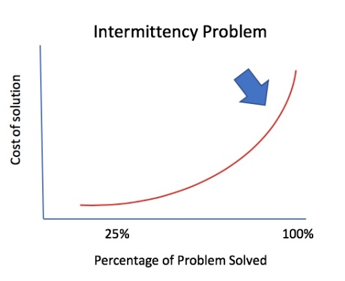
Critically, renewables suffer from a feast or famine: throughout the day and over the year, you could be producing too much renewable energy that goes well beyond demand or not enough energy to meet demand. Once you crank up renewables on a much larger extent than now, you get into a world of energy deficits and energy surpluses as shown in the Energy Matters chart below (from here):
Nonetheless, when putting together the chart above, Andrews skips around or simply ignores any counter arguments that could upset his thesis.
Critically, the question of renewable energy intermittency is well-known, but is being tackled by grid operators in a holistic, multi-dimensional manner. There is no silver bullet ready to solve the problem of intermittency; that is, the problem of moving energy through time and space.
Nonetheless, if you are a renewable energy skeptic, you can extract any one solution to the problem of intermittency, deconstruct it and then destroy it. In isolation, this is relatively easy to do, and is a classic straw-man argument. You pick any one solution, crank it up to try to solve the intermittency problem in its entirety, and then rubbish the solution due to the astronomic cost estimate that you produce.
But the solution to the problem of intermittency comes as a package. A range of solutions to the intermittency problem will be rolled out, and no one solution is expected to tackle the problem of intermittency alone. Restated, if each approach is resolving a bite-sized portion of the problem, it only has to be scaled to a far lower size. The range of such solutions could each have a manageable cost, and after being blended together you get to where you want to go: a renewable energy world. Note, I am not saying this is the likely outcome, I am saying that this is a possible outcome.
Furthermore, Tony Seba’s predictions are, obviously, forward-looking. So any analysis must be looking at costs out into the future. And those are not just the costs associated with the generation of renewable energy itself, but also the costs to provide a solution to the intermittency problem going out 10 years or more. As of today, if we add the cost of the package of intermittency solutions, 100% energy generation via renewables comes out a lot more expensive than fossil-fuel energy generation (of course ignoring the cost of climate change). But that says nothing about tomorrow.
What are the partial solutions to the intermittency problem? I would place them into four major categories.
Overbuild low cost renewables to partially plug the energy deficits
Move renewable energy through space (transmission)
Move renewable energy through time (storage)
Alter the timing of demand to meet supply
These are the topics for my next posts.
P..S. While checking the link to Energy Matters on this post, I was sad to see that Roger Andrews has just passed away. While I don’t agree with everything he wrote, his posts have frequently challenged my beliefs and made me delve a lot deeper into the energy literature. Commiserations to his family; he will be missed by the many who follow the Energy Matters blog.
Over the last decade, the efficiency of solar panels has gone up and cost has come down. Accordingly, if we could move solar-generated electricity seamlessly through time and space, even a relatively poorly endowed country like the UK (in terms of solar irradiation and land availability) could meet its energy needs through allocating around 5% of its land mass to solar panels (as I discussed in my last post).
If the world were run by some kind of benevolent green dictator, he or she could possibly just issue a decree mandating a mass solar power build out which would replace all existing fossil fuel plants. In reality, the only dictatorship we face is that of ‘the market’. For solar to spread, therefore, the market must recognise solar as cheaper than existing fossil fuel alternatives.
Moreover, in order to reach a Tony Seba style 100% solar nirvana, solar must transition through a two-stage process. First, it needs to take out all the fossil-fuel competition with respect to new energy generation facilities to be built from now onward. Second, solar must push out all fossil fuel competition in the form of existing energy generation facilities. The first task is much easier than the second.
Energy generation costs are composed of two principal components: 1) the energy generating facility and 2) the ongoing operating and maintenance expenses. The second part is relatively easy to imagine. How much fuel and maintenance is required to produce X amount of energy, say a kilowatt hour (kWh) or megawatt hour (MWh)? For solar, the obvious answer to this question is “not much”. Once you have your panel set up, it just sits there generating electricity when the sun comes up every day. You may occasionally have to clean it and also prevent your local neighbourhood yob writing graffiti all over it or stealing the wires connecting it to the grid, but that’s about all. In economics speak, we describe this situation as one where the marginal cost of generating an additional kWh or MWh of electricity once a panel is in place is close to zero.
The marginal cost when producing 1 kWh or 1 MWh of electricity from a coal or gas-fired facility is, however, not zero since you need to put coal or gas in at one end to get electricity out the other end. For an automobile, you need to stick gasoline in at one end to get motion out the other end (in this case the via engine and the four wheels). Sorry, I know this bit is blindingly obvious.
The more complex bit of the LCOE calculation relates to the capital cost of the energy-generating plant required. For a utility scale solar farm, you will need to secure a large area of land (buy or lease), purchase the requisite number of solar modules, mount them, connect them up and then covert the electricity generated into a grid-compliant standard through the use of inverters and transformers. A 2017 report by the United States National Renewable Energy Laboratory (NREL) shows the cost breakdown of a variety of solar installations by size and also through time in the US.
Once we know the total cost of the installation, it can then be apportioned over all the electricity generated through the expected lifetime of the facility. Simplistically, the capital cost per unit of energy produced is combined with the operating and maintenance cost of each unit of energy produced to arrive at a single number: the levelled cost of energy (LCOE). The LCOE also takes into account how the project is financed and the time value of money. The NREL provides a more detailed explanation of the LCOE calculation here and also an LCOE calculator that you can play around with here. For those of you who don’t have a financial background and are not familiar with discounted cash flow (DCF) methodology, you can just think of the LCOE as the price at which a project needs to sell its electricity in order to breakeven and stay in business.
Accordingly, if a utility scale solar project has an LCOE of $40 per MWh (which is the same thing as 4 cents per kWh, the financial press switches between the two), then the owners will be very happy bunnies if they can sell their electricity at $50 per MWh. Likewise, an energy consumer may want to enter into a power purchase agreement (PPA) with an energy generator for a set amount of electricity over a set period of time. If a solar utility is offering to enter into the PPA at 4 cents per kWh while a coal-fired facility can only go down to 5 cents per kWh, you will likely go with the solar – other things being equal.
The wording “other things being equal” is critical. Presuming no battery storage is involved, the solar facility can only supply electricity during the day and nothing at night. A factory operating 24/7 needs electricity 24/7. If its weekly requirement is, say, 100 MWh the fact that the solar farm can deliver at $40 per MWh versus $50 for the coal-fired plant will not be a sufficient condition for it to win the contract since it can’t supply the electricity both day AND night. At times, Tony Seba and other commentators can be rather disingenuous in claiming that renewable energy is cheaper than fossil-fuel generated electricity for just this reason. Having an LCOE for renewables lower than that for fossil fuel plants is a necessary but NOT a sufficient condition for renewables to displace fossil fuel. As I stressed in my last post, a kWh or MWh of energy that is not located in time and space is a pretty meaningless concept.
That said, I am not suggesting that we throw LCOE out the window. For renewables to replace fossil fuels, we first need to get the LCOE of renewables below that of fossil fuels and then we need to open up the gap between the two. If solar is generating electricity at $40 per MWh and coal at $100 per MWh, then $60 per MWh is available to transfer the solar generated electricity through time and space. The money could be spent on some form of storage (time) or some form of connection (space). The bigger the gap, the bigger the incentive for markets to try and arbitrage away the cost difference through putting in place mechanisms to transfer energy through such time and space.
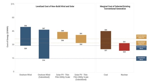
With all those caveats in place, it’s time to look at some LCOE numbers. A well-respected benchmark annual appraisal of competing LCOEs is published every November by the investment bank and asset management firm Lazard. The entire slide deck is well worth flipping through and you can find it here, but I will just extract three charts.
First up, you can see that for new build facilities, the LCOE of both wind and utility scale solar is now below that of gas combined cycle and coal. Accordingly, if we didn’t have any issues with respect to the provision of energy in time and space it would be cheaper to deliver all new energy generation through renewables.
Tony Seba’s claim, however, is that solar will not only be the energy generation vehicle for the future but it will also replace all the old fossil fuel facilities that have been constructed in the past. That is a much tougher hurdle. Remember the LCOE has two principal components: the ongoing operating and maintenance costs and the cost of the facility spread out over all the energy generated over the useful life of that facility.
When looking forward, the cost of building a brand new gas combined cycle or coal facility will be included in the LCOE number, when looking back it won’t. That is because that money has already been spent: it’s a sunk cost. So if solar is to mothball existing fossil fuel power stations, its LCOE must be cheaper that the LCOE of the gas or coal plant made up of the operating and maintenance (O&M) expense alone. The good news from Lazard’s November 2018 report is that wind and solar have got so cheap that they are starting to fulfil that condition as well. The cheapest solar facility at $36 per MWh is cheaper than a large proportion of coal-fired power stations whose operating and O&M costs are between $27 and $45 per MWh.
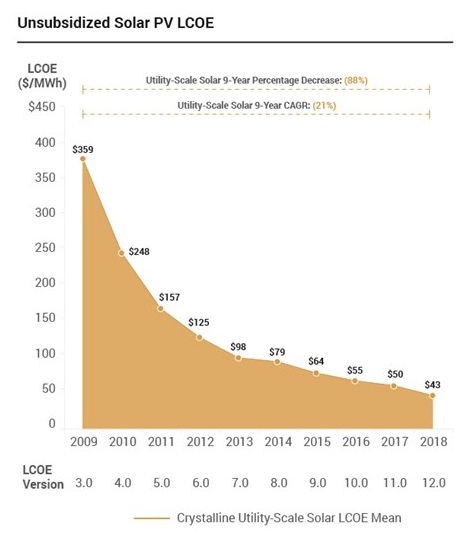
Even more encouraging is the fact that solar has been consistently coming down its cost curve just as Tony Seba predicted.
In addition, in areas of high solar irradiance we have seen 20 year power purchase agreements (PPAs) signed with solar utility scale projects at $20 per MWh or lower. The chart below shows the situation in the US, with new PPA price records being set in states like Arizona and Nevada (source: here). Presumably these PPA prices are higher than the projects underlying LCOE otherwise these projects would be loss-making and the solar utilities wouldn’t sign the agreements.
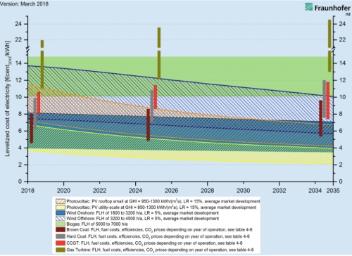
Fortunately, the cost declines have been such that even in countries with poorer solar irradiance profiles, like those in northern Europe, solar has become increasingly competitive. The chart below is taken from a report by the German Fraunhofer Institute for Solar Energy Systems (ISE). At the time of this post, one US dollar bought 0.87 euros. Keeping that exchange rate in mind, ISE forecasts that the cheapest utility scale solar installations will see their LCOE drop from 4 euros per MWh to 2 euros around 2032. At that price solar will be far cheaper than coal and combined-cycle gas turbine plants.
The upshot of this analysis is that countries that are well endowed in terms of solar irradiance already have solar plants that are cheaper than their fossil fuel competition on an LCOE basis, and countries that are less well endowed will see their solar plants winning out over the fossil fuel competitors on an LCOE basis over the next 10 years or so as solar costs continue to decline.
And now for some push back from the renewable energy skeptics Euan Mearns and Roger Andrews from the blog Energy Matters. In November 2018, Spain announced that it intended to move to 100% renewable generated electricity by 2050. Compared with Tony Seba’s claim of 100% solar by 2030 across the entire energy spectrum, it doesn’t seem so aggressive, but let’s put that to one side. In a post in November, Energy Matters took umbrage over the Spanish government’s claim and proceeded to show why such a target would be impossible to achieve.
At the heart of Energy Matters Roger Andrews’ argument is the claim that if we adopted renewables entirely to drive the electricity grid, it would become impossible to transport sufficient energy through time. Solar and wind’s intermittency would lead to large gaps in energy generation, and these gaps would be impossible to fill economically through the use of storage or by any other means. For his analysis, Andrews picked out the average electrical energy consumption and production patterns for two months in Spain: January and July. I will just concentrate on July here, but recommend you read the entire post to follow his argument from beginning to end. Here is the current contribution of renewables production to electricity consumption in July in Spain:
And after scaling up renewables production:
At this point, it’s worth reproducing the commentary accompanying this chart:
Obviously Spain plans to fill the hole with wind and solar. This approach has one thing going for it – the peaks and troughs in renewables generation are a good match to the demand peaks and troughs. But when we scale up July 2018 wind and solar generation (by a factor of 4.5) to match July 2018 demand we see that the amplitudes don’t cooperate.
Andrews then goes on to produce a chart showing the deficits and surpluses:
Which could only be equated by putting into place 1 terawatt-hours (1 TWh) of storage in his view:
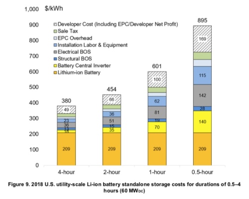
In January, the mismatch is even worse with a requirement for 2 TWh of storage to solve the intermittency problem. Roger Andrews further speculated that potentially 5 TWh to 10 TWh may be required to achieve energy security across the entire year. As an aside, how much would a TWh of storage cost? If we are going to provide such storage via batteries, the RNEL in a recent reported issued in January 2019 estimates the cost of a 4-hour system at $380 per kWh.
Unfortunately, a terawatt-hour is a billion times bigger than a kilowatt hour. So to provide 1 TWh of battery storage would cost $380 billion at current prices. So to get the amount of storage Andrews suggests, we need trillions of dollars. Given Spain’s gross domestic product was only about $1.3 trillion in 2019, buying trillions of dollars worth of batteries looks unrealistic. Of course, there are other storage options like pumped storage, which Andrews briefly considers, but these have major environmental impacts.
So has Roger Andrews thrust a dagger into Tony Seba’s dream of golden world of solar? Well, these Energy Matters posts are certainly thought-provoking, but if I had a criticism it would be that they suffer from an awful lot of confirmation bias. Andrews appears intent on skewering renewables at the outset and then builds his argument to achieve that end. Accordingly, he frequently makes assumptions in his calculations that look somewhat dubious. In my next post, I will subject Roger Andrews’ skepticism to bit of my own skepticism to see if we can resurrect Tony Seba’s dream .
In my last post, I mentioned that the late Cambridge University professor David Mackay was skeptical over the ability of solar to play a lead role in decarbonising the world’s energy infrastructure. MacKay’s highly influential book “Sustainable Energy Without the Hot Air” is rooted in basic science. Yet, despite the text being peppered with scientific identities, it also includes a number of value judgements that touch on the world of economics. And it is from these value judgements that MacKay’s skepticism arises.
MacKay’s book is principally concerned with what it would take to decarbonise the UK economy. Tony Seba, in contrast, forecasts that solar can power the globe not just the UK. In this post, I will stay with the UK, although I will look at other countries in future posts. Nonetheless, for Tony to be right, each and every country must be able to secure its energy needs through solar including the UK (though the solar energy may be imported from abroad). Accordingly, if Mackay’s argument is right (that is that the UK’s solar resource in inadequate) then Tony’s is wrong (notwithstanding the import argument).
Two of the major pushbacks against solar rest on the land mass requirement for sufficient energy generation and the intermittent nature of solar that puts unbearable stresses on the grid. As a former economist by training, I regard such arguments as second-order ones. They are both really subsumed under cost issues. Land is just a scarce resource like any other, and if the return on the land used for solar is higher than that for any other use, then it should be allocated to solar-power usage (that calculation can take into account the cost of climate change and the public good value of land).
Moreover, the unit of energy we are working with in this post, a kilowatt hour, is quite simplistic in economic terms. Energy is demanded at a particular place and at a particular time (hour of the day, and day of the year). A kilowatt hour generated in mid-summer in Spain in July, it not the same thing as a kilowatt hour consumed in mid-winter in London in January. The levelised cost approach (I will have a lot to say on that in future), which is used to compare different energy-producing assets, doesn’t take time and place into account.
In reality, we can think of the energy market as composed of 8,760 hour-long blocks (24 hours times 365 days) with a GPS attached to each one. In each of these GPS-stamped timed blocks, the market will equalise supply and demand at a certain price.
MacKay’s analysis only implicitly addresses the economics. Nonetheless, before we start moving energy through time and space, we must ensure that we have enough energy to move in the first place. MacKay does tackle that question.
In a section of his book titled “Fantasy time: solar farming”, Mackay conducts a thought experiment within which he covers 5% of the UK land with 10%-efficient solar photovoltaic panels.
He starts by calculating that “the average raw power of sunshine per square metre of flat ground (in the UK) is roughly 100 W/m2″. However, with a 10% efficiency photovoltaic panel, of the 100 W/m2 only 10 W/m2 is converted into electricity. From my last post we also know that if we leave a 40W light bulb on all day, it will use up nearly 1 kWh of power (0.04kW times 24). So if we generate 10 W per a one metre squared solar panel, we will get a quarter of that in energy, or 0.25 kWh. MacKay in his calculation has allocated 5% of the UK’s land mass to be used for solar power, which gives 200 m2 to each UK citizen. Times 200 by 0.25 kWh and we get 50 kWh per person per day, which compares with total energy demand of 125 kWh per person per day.
Also, as an aside, note that his calculation goes from power (solar irradiance measured in watts or kilowatts) into an energy number (solar insolation measured in watt hours or kilowatt hours).
At this point, let’s take a step back and look at that allocation of 5% of the UK’s land mass to solar panels. The UK land area is 25.25 million hectares and the population 66 million. Divide one by the other and we get around 0.38 hectares per person, (or just under an acre), which is the same thing as 3,800 m2. MacKay gives each person in the UK 4,000 m2 of land each since the population of the UK was about 5 million smaller when he was working out the maths. However, these numbers are near enough.
Switching from metres squared per person to number of persons per square kilometre, which is the standard measure when comparing countries, I have put together a table of population densities for selected countries, mostly ones with large populations, below. Note that a hectare (10,000 m2 ) is 0.01 of a square kilometre, so 0.4 hectares (40,000 m2 or 0.004 square kilometres) per person translates into 250 people per square kilometre.
From the table we can see that only the Netherlands, Japan, the Philippines, India and Bangladesh have population densities higher than the UK. So if the UK can become energy self-sufficient via solar it bodes very well for the rest of the world (putting differing solar irradiance numbers for each country aside for the time being). Moreover, the really profligate energy users, like the USA and Australia (which get through over twice the energy per person than the UK), have the advantage of having a lot of land.
Back to the UK and MacKay’s fantasy time solar farming:
That 50 kWh per day per person amounts to 40% of the UK’s energy consumption of 125 kWh per person per day. Accordingly, if we hold our 10% panel efficiency steady, then to meet 100% of UK energy requirements we would need to cover 12.5% of the UK land mass with solar panels (about 500 m2 per person).
Critically, MacKay headed his calculation “fantasy time” since he felt the calculation rested upon an unrealistically high cost. Fortunately, this is one area where MacKay was wrong (and Seba right): those fantasy cost reductions have come true (from Bloomberg‘s New Energy Finance (BNEF)‘s New Energy Outlook 2018):
In short, MacKay was far too pessimistic when it came to the cost curve. BNEF calculates a learning rate of 28.5% for solar PV. The learning rate 28.5% means that every time production capacity for solar PV panels is doubled, the cost of those panels comes down by 28.5%. This is an example of a virtuous circle: lower costs spur greater demand for the panels, which spurs greater production, which spurs future cost cuts and thus greater demand — and so the cycle goes on. (Of course, the panels are not the only components that go into a utility sized solar farm and all the other components will have their own learning curves and, hopefully, declining cost curves. We will come back to that in a later post.)
We are 10 years on from when MacKay wrote Without the Hot Air and already solar is overtaking all existing sources of fossil-fueled energy production in terms of cost competitiveness. Of course, there is a big caveat here: production costs are very different from the cost to deliver energy to a customer at a particular time and at a particular place as I have flagged above. Nonetheless, MacKay was worried about how solar stacked up cost-wise on a production basis out to 2050. That worry was misplaced.
How audacious is this plan? The solar power capacity required to deliver this 50 kWh per day per person in the UK is more than 100 times all the photovoltaics in the whole world. So should I include the PV farm in my sustainable production stack? I’m in two minds. At the start of this book I said I wanted to explore what the laws of physics say about the limits of sustainable energy, assuming money is no object. On those grounds, I should certainly go ahead, industrialize the countryside, and push the PV farm onto the stack. At the same time, I want to help people figure out what we should be doing between now and 2050. And today, electricity from solar farms would be four times as expensive as the market rate. So I feel a bit irresponsible as I include this estimate in the sustainable production stack in figure 6.9 – paving 5% of the UK with solar panels seems beyond the bounds of plausibility in so many ways.
A second observation (or criticism) is that MacKay seems to have also been too pessimistic in term of not just his cost assumption but also efficiency. In the above calculation, MacKay used 10% efficiency panels:
I assumed only 10%-efficient panels, by the way, because I imagine that solar panels would be mass-produced on such a scale only if they were very cheap, and it’s the lower-efficiency panels that will get cheap first.
In reality, those crystalline-silicon PV modules shown in the BNEF report above are far more efficient. From the United States Department of Energy:
Crystalline silicon PV cells are the most common solar cells used in commercially available solar panels…..
……Crystalline silicon PV cells have laboratory energy conversion efficiencies over 25% for single-crystal cells and over 20% for multicrystalline cells. However, industrially produced solar modules currently achieve efficiencies ranging from 18%–22% under standard test conditions.
True, these efficiencies are at the panel level not at the solar farm level. A utility scale solar facility will also need room for inverters, control panels, transmissions mechanisms, maintenance huts, security facilities and so on. Yet, we are already at around 20% efficiency levels for commercial products in 2019. Even if we knock off a few percentage points of efficiency to take account of ground cover occupied by stuff needed for a solar installation other than the panels, we are still far above MacKay’s efficiency figure.
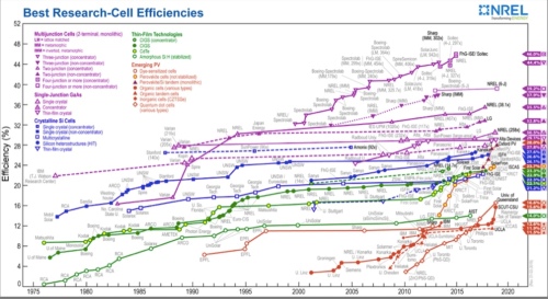
A second area where MacKay was far too pessimistic with respect to the technology relates to the Shockley-Queisser limit. This limit sets the maximum theoretical upper efficiency limit of a single layer solar cell to around 33%. However, a new generation of multijunction cells has hopped over the Shockley-Queisser limit. With a two-layer cell your theoretical ceiling is 44% and with three layers 50%. The US National Renewable Energy Laboratory (NREL) shows the major improvements achieved in the past and those predicted for the future. The energy academic Varun Sivaram also devotes a chapter in his book “Taming the Sun” to these frontier PV technologies.
Currently, the really super-high efficiency panels that are up at 40% are not cost competitive enough to adopt for commercial use. Further, most have drawbacks in terms of manufacturing cells at sufficient size and also with respect to building cells durable enough to be deployed in real-world field conditions. Yet results to date suggest the more efficient panels have kept migrating out of the laboratory and into the marketplace at an ever-falling price.
Given where we are now in terms of panel efficiency and where we will likely be in 10 years time, it is possible that the 200 m2 of land allocated by MacKay to every UK citizen for solar panels could actually meet all the UK energy needs; that is, 125 kWh per person per day if we were deploying 25% efficiency panels (provided that the energy could be transferred though time and space). Further, once solar PV technology can be incorporated into roof tiles and road pavings, not all of the required space need be taken from agriculture land (figure below taken from Without the Hot Air“).
Then, of course, we could add energy generated from wind into our mix. Each additional kWh coming from wind energy means one less kWh needs to come from solar energy. Tony Seba’s focus was on solar, but I see solar and wind as inseparable twins.
Overall, Mackay was far too pessimistic over the ability of solar to come down its cost curve. In my next post, however, I want to look at an even more potent argument against the future primacy of solar. The blogger Euan Mearns and his co-contributor Roger Andrews are not huge fans of renewables and feel the displacement of solar is a pipe dream of green fantasists. We shall see what they have to say.
For those interested in climate change and energy issues, the 2009 book “Sustainable Energy – Without the Hot Air” by Cambridge University Professor David MacKay published in 2009 was a revelation (made freely available online as well, and still there). MacKay provided a rigorous but accessible analysis of what it would take to wean the world off fossil fuels.
MacKay was no emotional ‘eco-warrior’ calling the faithful to arms, yet still a strong supporter of renewables. But every renewable or clean energy pathway explored in the book is deconstructed to check the validity of the underlying physics and maths. The book will have you recalling your high school science lessons, but in a fun and entertaining way. Despite it now being 10 years old, I still think “Without the Hot Air” remains a vital desk reference for anyone interested in climate and energy issues.
Tragically, MacKay died of stomach cancer at the far-too-early age of 48. The loss was even more telling as beyond his successful career in academia and his outreach into popular science, MacKay’s influence had extended into public policy sphere, resulting in him being appointed Chief Scientific Advisor to the UK Department of Energy and Climate Change in 2009.
To get an idea of MacKay’s approach to renewables, it is worth listening to his 2014 Ted Talk here. In his words: “I’m absolutely not anti-renewables. I love renewables. But I’m also pro-arithmetic”
With MacKay as my guide, we are now ready to interrogate Seba’s analysis. First thing is to choose our energy unit of measurement. As usual, the flagship energy statistics publications have their favourites, which differ. The International Energy Agency likes to use Mtoe (million tonnes of oil equivalent) while elsewhere we can find Mboe (million barrels of oil equivalent) and MBtu (million British thermal units). Throughout my blog posts on the electric vehicle revolution I focussed on kWh (kilowatt hours). Since MacKay also likes kilowatt hours, this makes life a bit easier. From Mackay’s TedTalk we also learn that the UK consumes an average of 125 kWh of energy per person a day (electricity, heat, transport, etc) and the USA about twice that at 250 kWh per person per day.
To help his audience get an intuitive grasp of what that amount of energy relates to he uses the image of a collection of light bulbs. Unusually, for MacKay, I didn’t think that was a great example since lightbulbs come in all sorts of energy efficiencies these days. But by doing a bit of basic maths backwards, it seems he is talking about 40 watt ones. So the maths goes like this: 40W equals 0.04kW. So if you leave it on for an hour, that’s 0.04kWh and multiply by 24 as its on all day or 0.96 kWh, so basically 1kWh. So 125kWh is equivalent to leaving 125 40W lightbulbs on all day.
Let’s fact check one of those numbers against primary sources just to make sure the daily numbers are in the right ball park. The International Energy Agency (IEA)‘s publication “Key World Energy Statistics 2018” is one of the most authoritative sources of information in the energy field. On page 34, we find that total primary energy supply (TPES) in the United States in 2016 (latest data) was 6.7 tonnes of oil equivalent per person. That is for the entire year, so we need to change it into kWh and then make it per day. One tonne of oil equivalent is equal to 11,630 kWh (using the conversion tables in the same publication) or 31.9 kWh per day. Multiply, that by 6.7 and we get 213 kWh. That looks a little short, but then we need to adjust for the fact that, despite the fracking revolution, the USA is still a net importer of energy: around 10% is imported (see here). After this correction, we get 237 kWh per day. I think that is sufficiently close to 250 kWh to get a fact check seal of approval.
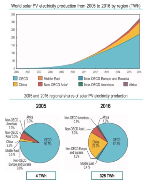
Now let’s fact check one of Tony Seba’s number using the same IEA report. As referenced in my last post, Tony has existing solar at 1.5% of global total energy production. The IEA report has global photovoltaic energy production at 328 terawatt hours in 2016.
The same report also gives total primary energy supply (TPES) at 13,761 million tonnes of oil equivalent. Note that the Other category at 1.7% includes not only solar but also wind, tidal and so on. So does solar dominate ‘Other renewables’?
To answer that question, first let’s check what 13,761 Mtoe in terawatt hours? Again from the IEA‘s conversion charts we get 1 Mtoe equal to 11.63 terawatt hours (TWh). Just as a gentle reminder we go watt, to kilowatt, to megawatt, to gigawatt, to terawatt, with each step change rising by a factor of 1,000.
Accordingly, 13,761 Mtoe equals roughly 160,000 TWh) (for a useful online unit converter see here). Divide that by 328 TWh gives us 0.2%! After this calculation, I decided I needed to fact check my fact checking, so I went away to find different sources. The renewables industry has its own multinational body called the International Renewable Energy Agency (IRENA). They put out at statistical yearbook (here). From this we get a much more detailed statistical breakdown of the solar industry. But IRENA‘s numbers line up with the IEA. In 2016 according to IRENA, total solar energy production was 329 TWh split between 318 TWh as solar photovoltaic and 11 TWh as concentrated solar.
So Tony’s number for solar within global energy production appear to be out by a factor of five or more. So what could account for this? Some possible mistakes could be:
Confusing solar capacity with solar production
Mixing up electricity production with total energy production
Getting the conversion units wrong; for example, converting millions barrels (Mboe) of oil equivalent into terawatts instead of million tonnes of oil equivalent (Mtoe)
Using the overall non-hydro renewables number rather than that just for solar
All of the above would appear highly unlikely given Seba lives and breathes transport and energy economics. So if anyone has any ideas how one can get solar energy production to be 1.5% of the total I would love to hear from you.
At this point you may be wondering whether this is the end of this series of posts. If we are starting at 0.2% solar penetration of total energy production there is no way we will get anywhere near 100% in 2030. True, but if we take Seba’s two-year doubling metric, it only takes 8 years to go from 0.2% to 1.6% so his forecasts are only pushed out to 2038. That is still far more aggressive than any other forecast – and is still world changing. Plus wind power is going to do a significant portion of the heavy lifting in any energy transformation, a renewable source Tony strangely ignores.
And at the heart of Tony’s thesis is a truth: if costs compound down at an exponential rate, then penetration could compound up at an exponential rate. Interestingly, as I dipped back into my well-worn copy of MacKay’s “Sustainable Energy Without the Hot Air” there were certain instances where Tony’s simplistic analysis has been right and MacKay backed the wrong horse.
Before I wrap this post I also want to extract another number from the data we have: average energy production per person across the entire globe. In 2016, the world’s population stood at 7,466 million. From the IEA report above, we also know that energy production in 2016 was 160,000 TWh. Divide one by the other and we get 21,430 kWh. Divide that by 365 and we get 59 kWh per person per day.
With those numbers tucked under our belt, we are ready to look at land mass issues: a subject central to David MacKay’s analysis but one that barely features in Tony Seba’s.
Following on from my 20-post series on elective vehicle (EV) penetration rates (which started here), I’ve been mulling a series of posts on the Tony Seba’s forecasts for solar energy growth through to 2030.
Just as with EVs, I am less interested in proving Seba right or wrong; rather, I am using his forecasts as a hook to examine the question of whether such warp-speed technological revolutions are possible. If Tony is right, or even half right, such a disruption will upturn all of our current socio-economic arrangements. In short, the transformation will re-order the wealth of nations, change how our cities and towns are arranged and upturn how we work and play.
Tony Seba is frequently attacked by industry insiders as a publicity-seeking charlatan, with dubious academic credentials and limited knowledge of the fields he opines on. Perhaps. But you can’t accuse of him of refusing to present testable hypotheses, the litmus test that divides evidence-based science and irrefutable faith. In Tony Seba’s 2014 book “Clean Disruption“, we find this passage on page 37:
Globally, solar PV installed capacity has grown from just 1.4 GW in 2000 to 141 GW in 2013. This represents a compounded annual growth rate (CAGR) of 43 percent.
Should solar continue to grow at a 43-percent annual clip, the solar installed capacity will be 56.7 TW by 2030. This is approximately the equivalent of 18.9 TW of conventional caseload power. World demand for energy is expected to be 16.9 TW by 2030, according to the US Energy Information Agency.
Should solar continue on its exponential trajectory, the energy infrastructure will be 100-percent solar by 2030
The use of the word “should’ isn’t his ‘get-out-of-gaol-free’ card since he continues later in the book to suggest that installed capacity growth will grow faster than 43% per annum.
If you want to hear Tony’s claims directly, then listen to this presentation from 50 minutes into the talk:
Solar, the installed base, has doubled every two years since the year 2000. This is on a global basis. That is, basically, a growth compounded at 40% per year. Doubled every two years since the year 2000. Now, solar is about one and a half per cent of generation…..
…..Now if it keeps doubling, and it keeps doubling every two years, how long, how many years, until solar is 100% of the world’s generation of energy ? Let’s do the numbers. So one and half percent, let’s double it every two years. Three percent, one doubling, six, 12 percent, 24, 48, 96. Six doublings. Say I am wrong by a couple of years. Seven doubling, that is 14 years, so essentially by 2030 or so, solar, if it keeps growing like this, and remember S-curves, right, exponential. It’s going to be 100% of the world’s energy generation.
Tony then goes into the respective cost curves of solar versus incumbent energy sources (which I will address in later posts).
OK, let’s put this up against competing forecasts from more mainstream institutions, starting with the International Energy Agency (IEA). This chart from their World Energy Outlook 2018:
In the above chart, NPS stands for New Policies Scenario and SDS the lower carbon Sustainable Development Scenario. Regardless, renewables don’t get much above 25% at best and that is full ten years after Tony’s projected solar-dominance date, plus the renewable category includes all renewables and not just solar.
Let’s look at a few more flagship publications that deal with long-term energy forecasts. In the US, the government’s Energy Information Administration (EIA) puts out an publication titled Annual Energy Outlook that goes out to 2050 as well. It’s US centric, but since so much technology and finance comes out of the US, one would expect the country to not be far off the global solar adoption pace.
For the EIA‘s 2018 edition, solar sits in the “other renewables” category (which excludes hydro). We will disaggregate the other renewables category in later posts, but suffice as to say if solar were doubling every two years, the green curves should be standing up. Instead, the EIA has growth slowing down.
A number of the oil majors also put out long-term energy forecasts. From BP’s Energy Outlook 2018. They have a variety of scenarios, the most aggressive for renewables is called “RE push”. That scenario has all renewables accounting for around 20-25% of energy consumption by 2040.
Finally, a friend of green energy, Bloomberg New Energy Finance makes this forecast in its New Energy Outlook 2018:
So that is all renewables accounting for only 50% of electricity production, rather than 50% of total energy production or consumption, by 2050.
The main takeaway from this introduction is that Tony Seba’s solar penetration forecasts appear even more aggressive, and even more non-consensus, than his EV sales forecasts. Are they completely barking mad?
Here we go. Tony Seba declares it’s “boom, over” for the internal combustion engine (ICE).
In this series of posts, I’ve tried to provide some metrics to measure whether Tony could be right. Central to my thesis is that when electric vehicles (EVs) match or exceed ICE vehicles on every criteria then “yes” it will be “boom, over”. Let’s revisit the criteria from post number 13 in this series. The sources of utility derived from a car can be thought of as threefold:
Mobility
Acceleration
Top speed
Handling
Internal volume
Configuration
Off-road and specialist capabilities
Aesthetic
Status signalling
With respect to mobility, EVs are already superior to ICE vehicles in terms of acceleration and top speed. With their low centre of gravity (governed by the battery), their handling characteristics are also very good. Moreover, the small size of EV motors means that ultimately we can have motors front and rear, or, indeed, on each wheel. With each such modification, EV handling will pull away from that of ICE vehicles.
The powertrain of an ICE vehicle is a lot bigger volume-wise than that of an EV. It’s only through taking into account the big battery that the entire drivetrain of an EV matches, or possible exceeds, an ICE in volume. Here again, however, technology favours the EV. Batteries are getting smaller. The internal combustion engine has been around for 100 years. It won’t get much smaller. So, in time, the entire drivetrain of the EV will be smaller than that of an ICE, freeing up space in the rest of the car.
The fact that EV motors are so small and don’t require gear boxes, exhaust systems and other ancillary equipment means that they already favour creative configurations. At the minute, the size of the battery is so big that it limits flexibility provided by the smaller electric motors, even though we could chop up the battery and put it in different places. Distributing the battery around the car though is currently not an efficient thing to do since it adds complexity to the electronic control panel and heating systems regulating the battery. But as the size of individual battery cells come down, the battery can be placed within the required form factor of the overall car just as it is in a lap-tap computer. Ultimately, we will move to a designer-led car rather than an engineer-led car, as with smart phones.
With the independent control of each wheel and a freehand regarding configuration, designers can also dream up the perfect MPV, SUV or pick-up truck. Dropping the tyranny of the big engine, gear box, crankshaft, and exhaust system means that future EVs will be able to cope with challenging terrain or complex pulling and carrying requirements far better than ICE vehicles.
Now we get to aesthetic and status signalling. The rush by high-end German auto makers (such as Mercedes,BMW,Porsche and Audi) to roll out EVs in response to Tesla shows that EVs are soon going to dominate high-end auto sales. Indeed, Jaguar‘s top management is now debating whether to transform the brand into an only-EV one near term (here). The strategy of other top-end makers like Porsche is to offer a full-range of EVs alongside the old ICE vehicles. But the key point here is that all the luxury brands now see no contradiction between a car with an electric drivetrain and a car that conveys high status.
True, for those ICE aficionados, the sound of an ICE engine and the steam punk-type glory of lifting a bonnet to see a V8 will never be eclipsed by an EV. But the new Tesla Roadster will place all of these vehicles in the rear-view mirror. So there will remain an aesthetic and status-signalling rump demand for ICE vehicles, but this will be the same rump demand as exists for Swiss mechanical watches. Demand for Swiss mechanical watches exists but its irrelevant in terms of aggregate revenue for the watch industry.
But now we come to the chink in the EV armour: price. As pulled out in previous posts, affordability is a temporal constraint: it stretches from the present to the future. So the purchase decision is not just bounded by the current available budget available to buy a car now, but also by the budget you will have to run the car through time and, ultimately, replace it. Restated, the purchase decision takes into account the sticker price and future costs captured by fuel, maintenance and depreciation.
EVs are already ahead of ICE vehicles with respect to fuel costs, maintenance and depreciation. And if something costs less in the future, theoretically you should have more money to buy it now (financing and credit facilities allow one to push payments for a car from the present to the future). In other words, if we can lessen future costs, we have more money to buy a more expensive car today.
So to repeat: given EVs are superior to ICE vehicles with respect to mobility functions, and can be at least as good with respect to aesthetic and status-signalling, once their price approaches that of ICE vehicles, looked at in terms of the aggregate purchase price and future running costs, the market will tip. That is, sales of EVs will grow exponentially and ICE sales will collapse.
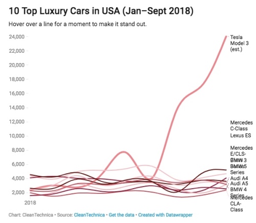
At this juncture, we should emphasise that the car market is not one amorphous mass. It is highly segmented with the vehicles in each space having a particular combination of mobility, aesthetic and status-signallying functions and price points. Thus, we are not really talking about a single tipping point, but a series of rolling tipping points as EVs meet the required sales take-off criteria in each segment one by one. To get a sense of the segment breakdown in the US, 2016 sales by type are given here:
Next question: “Are EVs at the tipping point in any of the above segments?”. Twelve months ago, the answer to that question would have to be ‘no’. But you are lucky to be living at a unique point in history. As of the third quarter of 2018, the answer must be “yes”, and that is down to Elon Musk and his Model 3. The rise of Model 3 sales over the course of 2018 has been nothing short of stupendous despite all the much-reported production issues.
The Model 3 is leaving its rival brands in the dust:
The next segments up for attack by EVs are luxury mid-size and large SUVs and crossovers. Here, the incumbent brands look like they will get to market first since Tesla has its hands full fulfilling its Model 3 order book before it can move on to its crossover Model Y.
At the top end, we have the Jaguar i-Pace, soon to followed by the Audi e-Tron and the Mercedes EQC. The adage “build it and they will come” appears to be holding true again, as the i-Pace has a full order book and Jaguar has hopelessly limited capacity to meet demand. In short, we have evidence that when an EV offering is at a similar price point to incumbent ICE vehicles, you will be able to sell all the EVs that you are able to make.
To repeat: what the sales data are starting to show is that if an EV is offered at a similar price point to an ICE vehicle, the public will buy the EV since an EV is a better transport alternative in terms of performance. Basically, the meme that the pubic don’t want EVs appears total rubbish. Given this state of affairs, what are we to make of these two charts. The first is from a Citibank report on EV penetration rates, and the second from an article by David Roberts of Vox.
In the top chart, the high-end 70% sales penetration rate by 2030 forecast is predicated on a breakthrough in technology (probably a commercial solid state battery). Personally, I don’t think that will happen until a decade later, so can put that forecast aside.
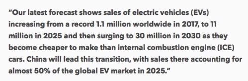
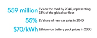
Based on lithium-ion technology, we are really looking at 2030 sales forecasts by every single forecasting entity of less than 50% of total vehicle sales. One of the most bullish forecasts is Bloomberg New Energy Finance (BNEF). This company’s latest Electric Vehicle Outlook 2018, which forecasts forward to 2040, was published in August and can be found here. The headline quote for the report:
And from inside the report a percentages sales penetration number:
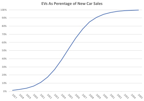
So the bullish BNEF suggests we need another 20 years at least before EVs overtake ICE vehicles in total sales. Keeping that in mind, Tony Seba’s belief that the EV sales penetrations will be over 95% in 2030 is not just an outlier compared with other forecasts but on a completely different planet (my graph based on Tony’s statements):
The disconnect is massive. In effect, BNEF, one of the most bullish mainstream forecasters of EV sales, sees a penetration rate a lot less than half of that of Tony Seba in 12 years’ time.
Nonetheless, as one of the first vindications of Tony’s theory, in the small- to mid-sized luxury car segment Tesla alone was around one third of total sales in September 2018!
Moreover, with a slew of new entrants, the luxury crossover and SUV segments is going to experience an identical attack by EVs on ICE vehicles as the cost and performance metrics are basically the same as the luxury car segment. Accordingly, the only way that BNEF and all the other companies and organisations that forecast total penetration rates well below 50% in 2030 can be right if one or both of two conditions are fulfilled:
EVs can’t get down to cost parity in the mass market car, SUV, crossover and pick-up segments, or
The demand exists across all segments for a Seba style 90%-plus penetration rate, but not enough batteries can be produced and/or EV production lines put in place to fulfil demand.
Now if you listen through Tony’s presentations, he claims that battery-price falls have accelerated from 14% to 20% per annum. He then projects these trends forward and sees EVs being chapter than ICE vehicles across the board in a few short years.
The head of BNEF‘s team Colin McKerracher has some rude things to say about this. From his Twitter account,
And in response to Seba a short Twitter spat ensued:
Mckerracher’s argument is that as the price of the battery comes down, in percentage terms it will become less dominant in the overall price of the car. I agree with this argument, but I don’t think it is enough to knock Seba’s huge EV penetration number out of the ring.
As I have argued throughout these posts, EV’s are superior to ICE vehicles in a number of domains like performance, running costs and so on. Accordingly, they don’t need to be cheaper than ICE vehicles to replace them. All they need to do is reach price parity. And we are witnessing real time what happens when EVs match ICE vehicle in a particular segment with respect to price: in the small- to mid-size US luxury car market we are seeing the market tip toward EVs in a matter of months.
In the same Twitter exchange, another poster put up a helpful chart to show the price fall dynamics of a 16% battery price decline with the price of the rest of the vehicle’s main components kept static. The battery is very much the swing component.
In my last post, I did some rough, back-of-the-envelope calculations so as to determine what the battery price needed to get down to in order for a mass market EV to sell at parity to an equivalent segment ICE vehicle. Look at the post for details, but the bottom line is that the battery needed to be produced for $2,500 for a 2017 US average sticker price model of $37,500.
From Electric Vehicle Outlook 2018, BNEF sees battery pack prices at $70 per kWh in 2030. Further, given the almost daily advances in battery charging speeds taking place at present (we seem to be on a through train from 100kW to 350kW and beyond), a mass market vehicle should be able to get away with a 50 kWh battery (which with a 350kW charging station will recharge in a little over 8 minutes, assuming that battery chemistry and control will have advanced to a stage that can cope with that speed of charge in 10 years’ time).
Seventy times 50 is $3,500 dollars. So let’s say that this makes the EV $1,000 more expensive than ICE vehicle or 2.7% more. As I mentioned above, the aggregate cost of a car is the price of purchase plus running costs. Given EV running costs are lower, a slightly higher EV sticker price of purchase is completely compatible with my concept of total cost parity.
As a reality check, even today we are seeing the first stirrings of proper EV offerings in the smaller vehicle segments. The Hyundai Kona, a small SUV, boasts a 64kWh battery and a range of around 300 miles. Just launched in the UK, it sells for around £25,000. Add back in the government subsidy of £5,000 and the total comes to £30,000 or about $40,000. By comparison, in a similar segment in the US the Honda CR-V and the Toyota RAV 4 sell for around $30,000.
Hyundai uses the LG Chemical NCM 622, which has a relatively high cobalt content compared with Tesla‘s battery. Consequently, I would guess that the Hyundai Kona battery costs around $200 per kWh, or $12,800 for the 64kWh battery overall. If we could get the kWh cost down to $70 in line with the BNEF forecast, the battery would come in at $4,420, for a saving of $8,320. At that price, the Hyundai Kona would sell for about $1,500-$2.000 more than the RAV 4 or CR-V. Basically parity given that the Kona will be cheaper to run.
True, getting the battery cost well below $100 is a challenge. There are two opposing forces we should consider in the declining battery cost trajectory. BNEF rightly point out that Tony’s per annum price decline forecasts are less useful that an experience curve approach (in economics we talk about economies of scale and learning-by-doing effects). What this means is that price declines are not a function of time but rather how many batteries you produce. Thus, if the volume of batteries produced goes up exponentially, the price of the batteries comes down exponentially.
And if you want to get a sense of how fast battery capacity is being ramped up, then you should follow this link and read the article by Simon Moores of Benchmark Mineral Intelligence. Moores notes that existing and announced battery factories will have the capacity to produce 1.1 TWhs of batteries per year. That is over a 10-fold increase over existing production. The scale of this application of capital and innovation should reap huge cost-cutting rewards.
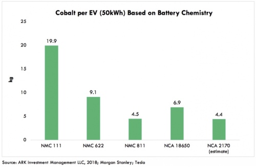
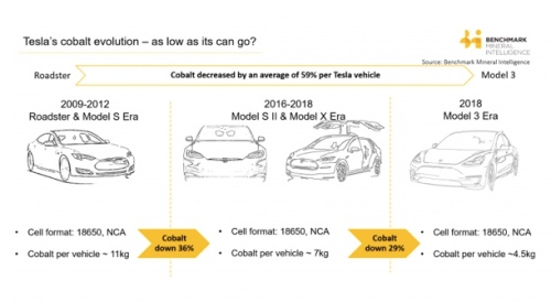
The major impediment preventing batteries costs coming down well-below BNEF‘s forecast of $70 kWh in 2030 is the price of the raw materials that go into a battery. Very roughly, 0.8kg of lithium goes into a 1 kWh battery, and that amount of lithium currently costs about $10. The most expensive metal used in current generation lithium-ion batteries is cobalt, which at one stage got as high as $90 per kg, but is now around $62. From the chart below you can see that different battery technologies use different amounts of cobalt. The NMC 811 battery, viewed as one of the most advanced battery chemistries in terms of energy density, is eight parts nickel to one part cobalt to one part manganese). A 50 kWh battery uses 4.5kg of cobalt or about 0.1kg cobalt per kWh. That is worth about $6. Nickel current trades at about $13 per kg. So for an NMC 811 battery we are looking at about $10 per kWh for the nickel. Thankfully, manganese is relatively cheap, so isn’t a big swing factor in battery pricing.
Nevertheless, if you add the three most costly metal components together, we have a floor cost of $25. And these are the raw materials for just one component in the battery: the cathode! You then need to complement the cathode with a graphite anode, an electrolyte and a separator. Then these components have to be combined into cells, which are linked into battery modules, and finally fabricated into battery packs. And the whole system requires a very sophisticated charge management and heat control system. In sum, getting battery prices below $100 per kWh with current lithium-ion technology will be tough.
With that caveat in mind, I will ask the following question to finish this series of 20 blog posts on the future of EVs:
“Is Tony Seba delusional in seeing EVs totally displace ICE vehicle sales by 2030?”.
My answer to that would have to be “no’. Ninety-five percent plus penetration is certainly a stretch goal since it would require current lithium-ion battery technology to be pushed right up against the boundary of what is possible in terms of price and performance. But I feel it is just about doable.
Does that mean that I think it will likely happen? That is a different question. I’m a probability guy and prefer thinking about the range of possible outcomes as opposed to giving one point estimate. For me, saying EV penetration will definitely be X percent in 2030 when looking at such a dynamic industry is a meaningless thing to do. My own guesstimate is that the EV penetration rate will likely be somewhere between 60-80%, which still puts me completely outside of the mainstream.
Nonetheless, in the spirit of Tony Seba hyperbole, I am happy to go out on a different type of limb. So in my words (rather than Tony Seba’s):
“All those who think EV sales penetration will remain down at around 30% in 2030 (the consensus view) are completely, utterly and certifiably crazy!”
As discussed in my last post, the price of an electric vehicle (EV) battery will play a central role in determining EV sales versus internal combustion engine (ICE) vehicle sales through to Tony Seba’s forecast horizon of 2030.
In that post, I also noted that the average sales price of a vehicle in the USA was $36,113 in 2017. Further, I roughly estimated that the cost of an ICE powertrain plus fuel tank was in the order of $3,400 in that year, or roughly 9.5% of the retail sticker price for an average car. Finally, I made the heroic assumption that an EV powertrain without the battery would cost about $1,000. Accordingly, if the powertrain plus battery of an EV is to come down to the cost of an ICE powertrain plus fuel tank, then the battery most come down to $2,400. Is that possible?
To have an EV completely without range anxiety, and given current miles per kilowatt hour (kWh) of battery efficiency, I speculated in another post that a 100 kWh battery would be required. Based on these assumptions, we can back out the target price of the battery (measured per kWh) in order for EVs to match ICE vehicles in price; in other words, $2,400 divided by 100 kWh, or $24 per kWh.
As mentioned in my last post, Bloomberg New Energy Finance (BNEF) estimated that the weighted average cost of an EV battery in 2017 was $209 per kWh. BNEF analysts estimate that this number will come down to $100 by 2023 and Tesla believes that it can hit the $100 number in 2020. But how much lower that $100 per kWh can a battery pack go? Is $24 a possible 12-year target?
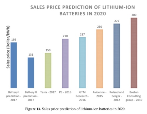
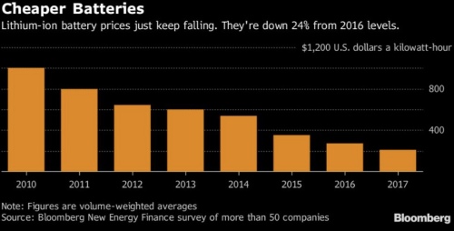
Before we get too despondent over hitting the $24 figure, it should be noted that the industry has, in general, been far too pessimist about the speed of cost reductions with respect to battery-pack pricing. The chart below was taken from a September 2017 article titled “Cost Projection of State of the Art Lithium-Ion Batteries for Electric Vehicles Up to 2030” by Berckmans et al in the academic journal Energies. As of 2018, Tesla is already well below $200 per kWh. So those past predictions have turned out far too pessimist.
Nonetheless, while Tesla/Panasonic, the market leaders in battery technology are still securing both technology-driven cost savings and economies-of-scale related cost savings, there are limits as to how far they can go in battery cost reductions.
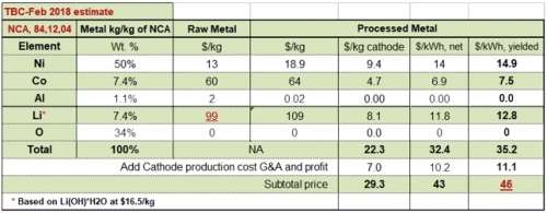
The most important limiting factor is raw material costs. The table below gives a breakdown of the cathode component alone in a battery pack as provided by Total Battery Consulting’s Dr. Menahem Anderman in a Seeking Alpha article. So the cathode materials alone come to $46 per kWh before we add in the anode, electrolyte, separator and then all the battery management software and hardware required to stop the battery overheating and to maintain the battery’s life.
True, the most costly material used in a Tesla battery is cobalt, and the use of cobalt has been on a declining trend.
Moreover, Elon Musk made this statement in the company’s 2018 Q1 conference call (a Reuters article on this theme can be found here).
“we think we can get the cobalt to almost nothing”
Yet even if we near eliminate cobalt, the lithium and nickel alone will prevent the battery pack price getting anywhere close to $25 per kWh.
More realistically, it may be possible to achieve a $50 per kWh battery sometime after 2025. For a 100 kWh vehicle, $50 per kWh gives a total battery pack cost of $5,000, yet we are trying to seek parity with ICE vehicle pricing by producing a battery pack for around $2,500. What is to be done?
There are two possible solutions. First, a leap in battery chemistry could be achieved such that both energy density (kWh per litre) and specific energy (kWh per kg) jump higher without the need for more raw materials. Solid-state batteries appear the lead contender to become the next generation commercial battery technology some time in the mid-2020s. Apart, from eliminating cobalt, solid-state batteries would boost both energy density and specific energy and, once the technology beds down, these batteries have the potential to push battery costs much lower.
Tony Seba, however, is not looking for a technology breakthrough. A major component of Seba’s EV thesis relates to technology cost curves, and his presentations frequently feature the slide below (for example here). The curve is exponential and shows a 16% decline in costs per annum. Moreover, the technology cost curve is really an amalgam of cost-cutting achieved through economies of scale and through ‘learning by doing’. In short, these are incremental cost savings, not revolutionary cost savings.
For existing lithium ion technology, there are theoretical reasons why both energy density and specific energy cannot go above certain levels that we are fast approaching. Further, while we may be able to eliminate certain battery materials we cannot eliminate all the expensive battery materials. The only way we can stay on this 16% per annum downward-sloping exponential curve is for us to jump into a new generation of battery technology. This may, or may not, happen within Tony’s 2030 forecast horizon, but it is certainly not a given.
OK, let’s assume that we don’t get solid state out of the lab and into the factory in the forecast time horizon and we can’t get battery pack costs down to $25 per kWh. The Tony Seba thesis is that EVs will rule the world by 2030. Should we laugh at that goal? Not quite. It is possible that if we loosen our battery size condition at which range anxiety is eliminated, we may still get there. And one way this could be done is through introducing dynamic charging, or charging in motion.
Currently, the 75 kWh battery in a Model 3 can keep the car on the road for 310 miles. Accordingly, a 50 kWh battery will keep it on the road for around 200 miles. But to eliminate range anxiety, I posited in a previous post that we needed a car to go 450 miles on one charge. One way we can square this particular circle is to charge a car while it is moving, and Qualcomm is developing a dynamic vehicle electric charging (DEVC) system called Halo that does just that.
The Halo system can charge your car at a maximum rate of 22 kilowatts. Therefore, if you travelled over this system for one hour continuously you theoretically could charge your car by 22 kWh. Do that a number of times over a long distance journey, say for 3 hours in total, and that would add 66 kWhs. So now our 50 kWh EV can more than double its range to above 400 miles and bye bye range anxiety. Of course, assuming your EV driver is doing 60 miles per hour, three hours of driving translates into roughly 180 miles, or 290 kilometres. That is considerably longer than the Qualcomm 100 metre DEVC test track. And, of course, we haven’t considered the cost of the required infrastructure.
The other alternative is to bring your car to a stop, but have access to a mega super charger such that an extra 100 miles could be added in minutes. If our 50 kWh Tesla Model 3 can do around 200 miles on one charge, then to add 100 miles you would need a charger to add 25 kWh. A new charger by ABB boasts a charge rate of 350 kW. At that rate, 100 miles could be added in about 5 minutes. Such mega fast charging rates provide further challenges for battery technology, since they have the potential to severely damage a battery if not managed properly. Indeed, no existing EVs on the road could currently cope with such charge rates. Nonetheless, the next generation of high-end German EVs appear to be designed to take advantage of a new generation of super chargers, with Porsche first to market with its Mission E vehicle to be launched in late 2019. Given time, this technology is likely to trickle down to mid- and low-end EV models.
In conclusion, getting the price of a battery down to a point where EVs can blow away ICE vehicles on price is not a given. Indeed, it is very difficult to see how incremental improvements in current battery technology alone can vanquish the internal combustion engine. Nonetheless, it is just possible that the combination of a slightly smaller battery coupled with new charging technology could do the job. At that point, EVs should match or exceed ICE vehicles in every area of the car purchase decision, so setting up the possibility that the market will tip and EV domination was arrive at an unprecedented pace.
Finally, the word ‘unpredicted’ could perhaps substitute for the word ‘unprecedented’ since no mainstream organisation or company is forecasting EV sales to vanquish ICE vehicle sales by 2030. The differing EV sales scenarios will be the subject of my last post in this series.
A few posts ago, I looked at the reasons why we buy a car and highlighted mobility, aesthetics and status-signalling as key factors. Those are the ‘wants’ in the purchase decision. But the purchase decision is also determined by ‘constraints’, the most important of which is cost. At the time of purchase, we have a current budget constraint, which is the sum of money available to buy a car, and a future budget constraint which is the sum of money we have available to fuel it, maintain it and, ultimately, replace it as it wears out.
I also stated that for Tony Seba to achieve the penetration rates shown in the chart below (culminating in 95% of auto sales being electric vehicle, EV, by 2030), the EV must match or excel the internal combustion engine (ICE) vehicle in every category of ‘wants’ or ‘constraints’. In this post, I am going to focus on an auto buyer’s current budget constraint: price. So if you have a choice between buying an EV or an ICE and the EV matches or exceeds the ICE in mobility provision, aesthetic, status signalling, fuel costs, maintenance and depreciation, you almost definitely will buy that EV if it also matches the ICE in price.
This post in some ways mirrors the previous one as, in effect, we are comparing the EV powertrain plus battery against the ICE vehicle powertrain plus fuel tank. Previously, the comparison was mostly with respect to weight, but also considered volume. This time we are focussed on cost. Note, however, that for all those parts of the car that don’t relate to the powertrain or energy source, we should have near parity. True, the structural integrity of an EV must be designed to protect the battery and this may uplift costs. But, similarly, the cradling of a large internal combustion engine at the front or back of a car will also pose challenges for a designer and have its own expense. For the sake of simplicity, I am viewing those EV versus ICE costs as a wash. So really this is a competition between a battery plus electric motor and a internal combustion engine plus all its complementary parts including the fuel tank.
Let us start with the most expensive component within the EV: the battery. Again, we have to very careful over what we are comparing here: the battery cell, battery panel or battery pack? I prefer to focus on the ‘all in’ battery pack cost, which includes the heat regulating materials, battery management control panel, ancillary wiring and everything else that is required to connect the battery cells to the electric motor. As stated before, the battery pack size is determined by the number of kilowatt hours (kWh) of energy that can be stored.
In a prior post, I speculated that to almost completely eliminate range anxiety, our next generation EV would need to increase its range from the current Tesla Model 3’s 310 miles to around 450 miles. Note again that I am talking here about an EV range that will in effect eliminate range anxiety for almost all drivers, so allowing new sales of EVs to reach a penetration rate of 95% by 2030. Most drivers will likely be happy with any range north of 300 miles, but this series of posts is setting a much stricter criteria of not ‘most’ drivers but ‘nearly all’ drivers.
We are now ready to start applying some numbers. Let us start with the average battery pack cost per kWh. The most authoritative figure for this cost is provided courtesy of Bloomberg New Energy Finance (BNEF)’s annual survey of battery pack costs. At the end of 2017, this figure had fallen to $209 per kWh.
In my last post, I suggested that in order to get an initial range of 450 miles, a 109 kWh battery would be required. At $209 per kWh, a 109 kWh battery pack would cost $22,781. That is a lot of money for just one component of a car. BNEF analyst James Frith predicts, however, that battery pack costs will fall to $100 or below by 2025. At that price, a 109 kWh battery will cost $10,900. What does that look like as percentage of the total cost of a car?
Although China has overtaken the US as the largest market globally for new car sales, I am just going to run the numbers for US auto sales since granular data is unavailable for China. According to the Kelly Blue Book, the average cost of a new car in the United States was $36,113 as of end 2017.
So a 109 kWh battery is 30% of the price of the average new car sold in the USA. To give us some further perspective, Tesla aims to sell an entry level Model 3 with a 50kWh battery at a price of $35,000. At a cost of $100 per kWh, the battery in that particular Tesla would be around 14% of the cost of the car (and we haven’t added in the electric motor yet). How do these numbers compare with an ICE powertrain? Let us drill down into the cost of a car a bit further.
From the average new automobile transaction price of $36,113, we need to subtract dealer gross margins on new car sales. These average around 6% (source: here). Accordingly, the manufacturer’s average auto sales price pre dealer mark-up comes in at roughly $34,000.
Next, we need to subtract the manufacturers operating profits to get the cost to manufacture a car. PWC has the average operating profits at the manufacturers at around 6%. Subtracting these margins, the average cost to manufacture an average car comes down to around $32,000.
Surprisingly, I really struggled to find a good breakdown of physical materials and components as a percentage of the cost of a car. The best I could find is the chart below.
Forty-seven percent of the post dealer and manufacturer profit figure of $32,000 gives a rough figure of $15,000 for the physical material that makes up a car. A 2012 report by McKinsey that forecasts through to 2020 suggests that this figure of $15,000 is about right. In the graph below, the total vehicle parts cost given by McKinsey is $13,400. That, however, is for 2012.
Assuming the percentage breakdown of different categories of parts is the same now as 2012, we can see that the internal combustion engine powertrain accounts for 22% of total parts, or $3,300 out of $15,000. I’m going to add on to that $100 for the fuel tank to give a total of $3,400 for powertrain plus fuel source.
Following this line of thought, we next need to price an electric motor, the principal powertrain of an EV. That task is even more difficult as the manufacturers appear loathe to disclose any pricing information on the two main EV drivetrain technologies: AC induction motors or permanent magnet motors. We do know, however, that the number of components that go into these motors is vastly fewer than go into an internal combustion engine. Further, an EV powertrain does not need a gear box, exhaust system and so on. As a heroic assumption, I will assume that the EV drive train costs a little less than one third of the ICE drive train, or $1,000.
With all these numbers, we are now in a position to compare an ICE powertrain plus fuel tank with an EV powertrain plus battery. The former costs $3,400 now against a 109kWh EV power train plus battery costing $11,900 in 2025. That suggests that a mid market EV with a long range will still sell at a 25% premium to its ICE counterpart even after battery pack prices have halved. And to repeat again, for EVs to do to ICE vehicles what digital cameras did to film cameras, EVs need to either match or exceed the old technology in every category of consumer preference. A 25% price premium is not matching.
Nonetheless, all is not lost for Tony’s 2030 prediction of total dominance of EVs over ICE vehicles by 2030. First, the application of lighter weight materials in car manufacturing should allow auto makers to eke out more miles per kWh, so allowing a smaller battery. Second, more dynamic charging methods could also permit ‘on the go’ charging tops-ups that would also allow the battery size to shrink. Third, 2025 is not 2030, so the battery price will have further to fall. Fourth, the Bloomberg prediction of $100 per kWh for the battery pack price in 2025 relates to a waited average price across all EV makers. Market leader Tesla is looking at a battery pack price of $100 per kWh by 2020, giving that firm another 10 years of falling battery costs before the 2030 prediction deadline arrives.
In my next and penultimate post of this series I will look at the question of how low battery prices could go and whether dynamic charging developments could allow EVs to get away with smaller batteries yet still banish range anxiety.
In my previous post, I suggested that we are on the cusp of putting electric vehicle (EV) range issues behind us. Two distinct technologies are overcoming the range problem: the growth of fast charging networks and the rise in the energy capacity of EV batteries. In this post, we are going to drill further down into the energy capacity issue.
In the past, the battery constraint has been size and weight. Producing a battery that can deliver 400 or 500 miles of continuous driving is relatively easy: you just make the battery ever bigger. The problem has been delivering the required energy capacity within a sensibly sized and weighted unit. The Tesla Model 3 battery comes in at 478 kg, contains 75 kilowatt hours (kWh) of energy and can propel the car 310 miles between charges according to the US Department of Energy. In the Tesla Model 3, for every 1 kg of battery we get 157 watt hours (Wh). This is called the specific energy of the battery, or the gravimetric energy density, and is measured in watts-hours per kilogram.
I mentioned that the Model 3 has a 478 kg battery. We are really talking about the battery pack here, which incorporates a number of battery modules, which in turn incorporate a number of battery cells. As is the case of many things EV, we are frequently faced with the problem of comparing apples and pairs. That is, if we want to compare specific energy figures between vehicles, we need to compare like with like: battery pack with pack, module with module or cell with cell. The building of a battery, from components, to cells, to modules, to the pack can be seen in the illustration below (source: here):
The combination of the battery elements is a complex interlocking process involving a lot of different disciplines such as chemistry, electrical engineering and mechanical engineering. And it also involves trade-offs. Securing specific energy gains in one area can result in losses in another.
For example, the Tesla Model 3 uses state-of-the-art Panasonic ‘2170’ battery cells that are likely the highest specific energy battery cells deployed in mass production cars. (Note that the 2170 number represents the dimensions of the battery cell not the battery chemistry; 21 mm is the diameter and 70 mm the length.) But the battery chemistry employed in these cells is quite difficult and requires a sophisticated cell management and heat control system to prevent thermal runaway; i.e., the battery catching fire. Obviously, the more sophisticated and complex the cell management system, the more the overall battery pack is bulked up.
Of course, by definition, battery cells have a far greater specific energy (gravimetric energy density) than the battery pack since all the battery pack parts surrounding the cells have zero specific energy. In the Tesla Model 3 tear down that I referred to in a previous post, Jack Rickard extracted the four modules that go into the Tesla Model 3 battery pack. They are slightly uneven in size. Two of the modules contain 1,058 cells and two contain 1,150 cell, so the overall battery pack has 4,416 cells in total. Jack also weighed the modules: in total they came to 362 kg. So with usable energy of 75 kWh, the modules alone have a specific energy of 75 kWh divided by 362 kg, which translates to 207 Wh/kg (Jack blogged about this tear down here). From the top of the post, remember that the specific energy of the battery pack in its entirety was 157 Wh/kg.
We can go even further down to the specific energy of the individual cells. Before we do that, here is a short video of a Tesla Model 3 ‘2170’ cell being dissected:
Surprisingly, I’ve struggled to find an official weight for each individual battery cell. From a Tesla forum conversation, I have seen a figure of 66 grams quoted, but I can’t verify this. Until I get a definitive number, however, I will run with 66 grams as it likely to be only a few grams out. So if we have 4,416 cells each weighing 66 grams, that gives us a total weight for the cells alone of 291 kg. This time, let’s divide the total energy of the battery pack, 75 kWh, by this new figure. The results is that each cell has a specific energy density of 257 Wh/kg. Compared with the theoretical maximum specific energy density of around 400 Wh/kg, you can see that there is the potential for some future efficiency gains but not transformational ones.
In the Model 3, Tesla has a car that can compete with ICE rivals such as Audi, BMW and Mercedes, but for Tesla to utterly dominate all its competitors it would be helpful if we could get its driving range even higher than 310 miles between charges. How easy is it for Tesla to do that within the existing battery chemistry limitations highlighted above?
First, let’s focus on the non-cell components in the battery pack. We already established that the battery cells weigh 291 kg in total. If we take that number away from the overall battery pack weight of 478 kg, then the non-cell components weigh 187 kg. Let’s say that through mechanical and electrical engineering incremental improvements, we reduce the non-cell weight of the battery by 12% per annum for three years; in other words by roughly one third. That will free up about 65 kg out of that 187 kg.
Next we allocate that 65 kg to install more cells. So the cell weight goes from 291 kg to 356 kg. That’s a 22% increase. If we hold the specific energy of the cells constant at 257 Wh/kg, we now have a 91.5 kWh cell pack that should give us a range of 378 miles.
Turning now to the battery chemistry, we recognise that specific energy improvements are harder to achieve in this area than improvements in electrical or mechanical engineering. So for the cells, let’s assume Tesla and Panasonic improve the specific energy by 6% per annum for the next 3 years. That will result in specific energy going from 257 Wh/kg to 306 Wh/kg, an improvement of 19%. With our 19% improvement, the battery now goes from 91.5 kWh to 109 kWh and range improves from 378 miles to 450 miles between charges. At a 450-mile range, I declared in my previous post that all worries over EV range would disappear.
In a perfect world, I would like to not only get up to a 450-mile range but also shrink the battery weight and size. But for that, we probably need to wait for a jump in battery technology that delivers specific energy north of 500 Wh/kg. There are a variety of advanced batteries in the pipeline that aim to do just that as can be seen below. Nonetheless, we have yet to see any that are close to commercial production.
The conclusion of this post, nonetheless, is that even with only incremental improvements in existing technology, EV powertrains (plus their batteries) are getting very close now to matching or exceeding ICE powertrains (plus their fuel tanks) in every single area of performance. Throughout this discussion, however, I have left out one critical parameter: cost. That will be the subject of my next post.
When Jack Rickard pulled the battery out of a wrecked extended range Model 3 in a previous post, it weighed in at 478 kg. We are talking here of a 75 kilowatt-hour (kWh) battery. If you have a high tolerance for ‘slow video’ then you can see Jack, together with Bill from Ace Hardware, Linden, Tennessee, extract the battery from a Model 3 (I rather like Jack’s vlogging style, but then perhaps I should get out more).
Let us put this battery into some kind of context. If we divide the energy storage of the 75 kWh Tesla battery Jack Rickard extracted by its weight of 478 kg we get 0.157 kWh per 1 kg of weight. Let’s change our unit from kilowatts to watts: so we get 157 watt hours (Wh) per kg. Note we are talking about the entire battery here, not the battery cells.
The measure of the amount of energy per unit of weight is referred to as the specific energy or gravimetric energy density. If you are building EVs you want to have as high as possible specific energy for your battery. Each technological advance then allows you to either store the same amount of energy for less weight, or store more energy for the same amount of weight.
When you compare EVs with internal combustion engines (ICEs), the EV basically wins hands down with respect to the delivery of power. So boosting the specific energy of the battery is about having more energy in your battery (rather than power). This, in turn, gives your car more mileage range. Indeed, a critical goal in battery development is to boost specific energy to such an extent that mileage range becomes a non-issue. Nonetheless, even if your battery can deliver all the possible miles that an owner could wish to drive in one sitting, an incentive still exists to boost specific energy even further because that would allow you to continually shrink the battery.
Keep in mind that the Model 3 Tesla battery Jack extracted weighs 28% of the overall vehicle weight. So let’s do a thought experiment and imagine that Tesla doubles the specific energy of the battery to 300 watt hours per kg (wh/kg).
The current Tesla Model 3 has a range of 310 miles according to the US government’s Environment Protection Agency (EPA); pretty good, but I should think the consumer is greedy for more. Let’s decide to increase the mileage range by 50% to around 450 miles between charges. With our new 100% specific energy improved battery we could deliver 450 miles plus shrink the battery by 25% to about 325 kg. We are, in effect, lightening the car by over 100 kg. And, if we are lightening the car by 100 kg, we are making it more efficient.
The extended-range Model 3 weighs in at 1,730 kg; if we drop 100 kg in weight, that translates into a weight saving of around 6%. And given a chunk of the battery’s energy is used up lugging the battery itself around, every time we shrink the battery we release energy that can be used for moving the rest of the vehicle and its occupants. This, in turn, allows us to shrink the battery further. In other words, we have a nice little positive feedback loop emerging here.
Specific energy is not energy density. The term energy density, or volumetric energy density, refers to the energy stored per unit of volume, or watts per litre (wh/l). In an ideal world, I would have loved it if Jack had also taken the dimensions of the extracted Tesla battery as well. Then we could have worked out a real-time energy density number for the Model 3 battery. In the chart below, however, you can see that a linear relationship exists between specific energy (termed here gravimetric energy density) and volumetric energy density. Therefore, as we achieve specific energy enhancements, we generally get energy density improvements as well.
Put another way, as you lighten the battery you will also reduce its size. And every time you do that, the size of the total drivetrain, including energy source, gets more competitive versus the ICE drivetrain plus fuel tank. Note that the EV has already won in the configuration competition with an ICE vehicle. You have far more latitude in arranging your drivetrain components with an EV since you are just connecting them up with wires. No crankshaft or gear box required.
Let’s talk a bit more about range. We’ve established that the extended range Tesla Model 3 can drive around 310 miles on a fully charged battery according to US government statistics. So we get 3.85 miles per kWh. Speed limits in the USA vary by state, but the highest speed limit is found in states like Texas and comes in at 75 mph. So our 310 mile range for the Tesla translates into roughly 4 hours 10 minutes of driving time in the high-speed-limit states, and that is assuming the entire journey is at the maximum speed limit.
Given the average motorist doesn’t wear adult diapers while driving, he or she will periodically need to get out of the car to urinate or defecate. Moreover, I propose that the need for a wee is the limiting factor here, so the act of urination is our boundary constraint (apologies to irritable bowel sufferers). According to WebMD, the average adult urinates between once every two to four hours. So I will take an ‘iron bladder’ as my example Tesla driver. Bottom line, the car will not run out of energy before the girl or boy has gotta go.
Nonetheless, we have to think about how long it takes to charge the car up again. And then we need to plug that number into an equation that also incorporates the time it takes to exit the car, hook it up to a recharging source, walk over to the toilet facility, urinate, walk back to the car, unhook the car from the charger and then drive off.
So does time to wee equate to time to charge? Curiously (at least for me), the “Law of Urination” states that mammals in general take 21 seconds to pee. So the actual act of urination is not the limiting factor here, rather accessing a place to urinate is the issue. For argument’s sake, I will assume that the toilet break is limited to 20 minutes since we need to walk to and from a toilet cubicle.
Next we need to know how long it takes to charge the Tesla. There are a lot of factors that come into play here including the starting charge of the battery, the desired ending charge of the battery and the quality of the charger. Given we are interested in the dynamics of a long road trip here, the driver is going to be using some kind of supercharger network. To get a sense of the charging experience at a Tesla Supercharger, check out the video here:
In the video, you can see a top charging rate of 100 kW, which translates into 375 miles added per hour. The theoretical top charging rate at a Tesla Supercharger is actually 115 kW, but as the battery gets close to being fully charged, the rate of charging drops off.
What can we deduce from all this? Well, if a long distance driver wants to do two back-to-back journeys of around 300 miles each at the top speed limit allowed in the USA and only needs one toilet break of 20 minutes, then the Model 3 can’t deliver that kind of range performance (but an ICE vehicle can). You currently need a good hour of charging in that scenario for your Model 3, even assuming access to the best possible charging rate at a Supercharger.
At this stage, you may point out that the vast majority of car journeys don’t include driving 600 miles straight in two back-to-back sessions with a 20 minute break in between. But that is not really the point. In an earlier post, I established the conditions needed for the auto market to tip between being ICE dominated and EV dominated. The condition was that an EV needed to match or exceed an ICE vehicle in every car attribute. So if an ICE vehicle is superior for long distance marathon driving, EV penetration will be slower.
Nonetheless, it is only the year 2018, and Tony Seba’s 95% EV penetration-rate target by 2030 is still 12 years away. Further, I think the EV is not that far away from matching an ICE for long-distance driving already for two reasons.
First, as the battery capacity gets bigger, the battery will still have a lot of juice when the driver reaches the first toilet stop. With a 50% bigger battery and a 450 mile initial range (achieved through charging overnight), 150 miles will be left in the battery at the first stop. So for leg number two of the journey, only half the charge time is required since we are only topping it up and not starting from zero. (Yes, we could talk about three back-to-back stages amounting to 900 miles, but the driver will eventually have to eat, and, as we get beyond the 99.9% percentile of typical journeys taken, I think we can view these as true outliers.)
Second, as each Supercharger generation is rolled out, the rate of charging will go up. Tesla has already flagged that the V3 Supercharger will arrive this summer and the rate of charge is likely to be between 200 kW and 250 kW, so a roadmap exists toward halving the best current charging time.
Beyond Tesla, two open standards exist that allow shared usage by vehicles produced by different auto makers. These are the CCS standard (backed by the CharIn consortium) and the CHAdeMO standard. CCS, promoted by the German auto makers amongst others, is working toward a charging rate of 350 kW as well as inductive wireless charging stations. The CHAdeMO consortium, which is principally composed of Japanese automakers and electric power companies, is aiming for a rate of 400 kW in the coming years. A good primer on fast-charging protocols can be founder here.
Both CCS and CHAdeMO are having to play catch-up with Tesla’s Supercharger network, which has just reached 10,000 sites worldwide. Undoubtedly, Tesla’s strategy of “build them and they will come” appears to be far superior to the opposition’s strategy of “we will build them when they ask for them”. You can check out Tesla’s global Supercharger network here.
Summing up, while I think access to fast charging facilities will become a non-issue in a few years time, the need for batteries to get better with respect to specific energy and density is still a pressing need if EVs are going to unseat the current dominance of ICE vehicles. Further, to get the required improvement, do we need a John Goodenough-style leap in battery technology or will a Tesla-style incremental improvement in existing technology suffice? That will be the subject of my next post.