
If I had to choose one chart to frame the political debate in the United States it would be this (click for larger image):
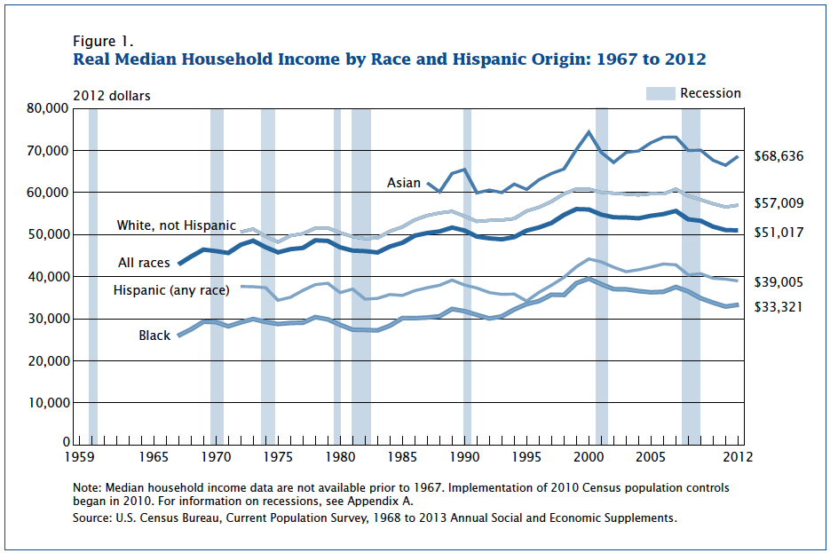
The chart shows the trend of real (which means inflation-adjusted) median household income since 1968. If you line up all US households in order from low income to high income, the median household sits exactly at the half-way point.

For ‘All Races’, median incomes rose in the late 60s and early 70s, moved sideways over the two oils crises, jumped again in the 80s and 90s, stagnated in the 00s, slumped back in the Great Recession and have continued to retreat since then.
There are a myriad newspaper articles that chew over this phenomenon, but for those of a sceptical and inquiring disposition you can access the underlying data behind this chart from the U.S. Census Bureau report here. The above chart can be found on page 5 of the report, and the data underlying the chart is in Table A2 starting on page 40.
From Table A2, you can see that the median household earned $51,017 in 2012 compared with $48,557 in 1973 before the impact of the 1st oil crisis was felt (note these are all inflation-adjusted figures calibrated using 2012 as the base year: so called 2012 dollars). That’s a 5% gain over 39 years.
For the 90th percentile (that is, a high income family earning more than 90% of households), income was $104,683 in 1973, but rose to $146,000 in 2012, for a gain of 39.5%. For those at the 40th percentile, they were worse off in 2012 than 1973.
There is an Aladdin’s Cave of statistics at the back of the report, and you can get a real sense of how US incomes are being divided up between high- and low-income households.
Interestingly, the UK experience is slightly different from the US one. The Office for National Statistics (ONS) in the UK published a report on middle-income households in March of this year. The chart below (click for larger image) shows UK households have had a poor recent decade or so, but are still securing median incomes way above those of the 1970s.

The report also goes on to adjust median incomes for taxation effects, so emphasising real disposable income trends rather than gross income. Further, the impact of changing households structures is also looked at by the ONS. In other words, smaller households have a higher standard of living than larger households of similar income (the same resource shared among fewer people). This is adjusted for through a process called equivalisation. Moreover, the ONS helpfully puts the UK and US experience side by side, as can be seen in the chart below (click for larger image):

US equivalised median household disposable income data are only available up until 2008, so the chart does not capture the impact of the Great Recession. Nonetheless, the lag between US median income growth and GDP per person growth is vividly illustrated—in contrast to the experience in the UK.
Unfortunately, the OECD suggest that the lag between median income gains and per capital GDP increases (suggesting that richer households are getting most of the benefit from economic growth) is showing up in the data everywhere. The US may be more extreme than the UK, but it is by no means an outlier (click for larger image, source here):

In conclusion, if we continue down the path of economic growth not translating into higher living standards for the majority of the population in developed countries, support for the post-war economic consensus is bound to collapse, turning politics upside-down. We live in interesting times.


And just imagine what will happen to the “consensus” when the path of economic growth inevitably turns down the road of continuous economic recession.
Yes, you do have a double punch here, since as you point out GDP per capital growth has also been on a downward trajectory. If more and more gains are accruing to the top earners at a time when total gains are meagre, the idea of ‘trickle down’ is dead in the water.