Category Archives: Climate Change

Links for the Week Ending 7 February 2014

  • Now is the time of year when a young (and not so young) person’s fancy lightly turns to thoughts of skiing (not least because of the Sochi Winter Olympics). Few, however, like to talk about the threat that climate change poses for winter sports. This spectre at the feast is met with passive denial—if we pretend it isn’t there, perhaps it will go away. So it is rare to hear a voice from within the industry itself, such as that of Powder Magazine‘s Porter Fox in an Op-Ed piece titled ‘The End of Snow?”  in The New York Times, calling for action.
  • Fox references a paper by the National Resources Defence Council (NRDC) called “Climate Impacts on the Winter Tourism Economy in the United States” if you like to dig into data.
  • Two weeks ago, I referenced a Mark Lewis article in The Financial Times disputing the peak demand theory for oil (here, free registration at the FT). As a contrast, I thought it worthwhile referring back to a 2013 Steve Kopits interview on resilience.org which gives the opposing argument (here). Personally, I believe that the intersection between price, demand destruction and supply response  is too complex to forecast accurately, particularly as these factors all play out over different time horizons. That said, my gut feeling is that oil is already putting a break on GDP growth at the margin, with more turbulence to come.
  • The U.K. has been plagued by floods over the last couple of months, with the head of the Environment Agency Lord Smith becoming the fall guy for middle England’s frustrations. In a frank letter to The Daily Telegraph, Smith had the temerity to argue that difficult choices have to be made, but this position has produced outrage in the shires. I always find irony in the fact that the political right argues for self-reliance yet runs crying to the state whenever it finds itself on the wrong end of climate change.
  • Southern Europe has become Ground Zero for the collapse narrative. And here is a post by one of my favourite bloggers Ugo Bardi of Cassandra’s Legacy looking at the situation in Italy. And a conversation between Bardi and Dmitry Orlov on the same topic can be found here.

Data Watch: UAH Global Mean Temperature January 2014 Release

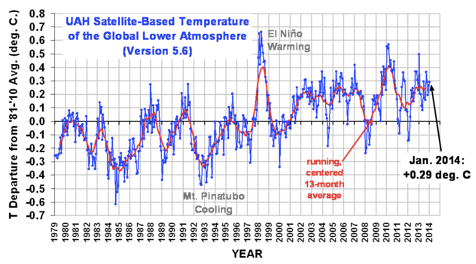
On February 5th, Dr Roy Spencer released the University of Alabama-Huntsville (UAH) global average lower tropospheric temperature anomaly as measured by satellite for January 2014.

The anomaly refers to the difference between the current temperature reading and the average reading for the period 1981 to 2010 as per satellite readings.

January 2014: Anomaly +0.29 degrees Celsius

This is the joint 5th warmest January temperature recorded since the satellite record was started in December 1978 (35 January observations). The warmest January to date over this period was in 2010, with an anomaly of +0.56 degrees Celsius.  The U.S. cold snap was not of sufficient severity to show up in the global temperature record.

As background, five major global temperature time series are collated: three land-based and two satellite-based. The terrestrial readings are from NASA GISS (Goddard Institute for Space Studies), HadCRU (Hadley Centre/Climate Research Unit in the U.K.), and NCDC (National Climate Data Center). The lower-troposphere temperature satellite readings are from RSS (Remote Sensing Systems, data not released to the general public) and UAH (Univ. of Alabama at Huntsville).

The most high profile satellite-based series is put together by UAH and covers the period from December 1978 to the present. Like all these time series, the data is presented as an anomaly (difference) from the average, with the average in this case being the 30-year period from 1981 to 2010. UAH data is the earliest to be released each month.

The official link to the data at UAH can be found here, but most months we get a sneak preview of the release via the climatologist Dr Roy Spencer at his blog.

Spencer, and his colleague John Christy at UAH, are noted climate skeptics. They are also highly qualified climate scientists, who believe that natural climate variability accounts for most of recent warming. If they are correct, then we should see some flattening or even reversal of the upward trend within the UAH temperature time series over a long time period. To date, we haven’t (click for larger image).

UAH Satellite Temps jpeg

That said, we also haven’t seen an exponential increase in temperature either, which would be required for us to reach the more pessimistic temperature projections for end of century. However, the data series is currently too short to rule out such rises in the future.

One of the initial reasons for publicising this satellite-based data series was due to concerns over the accuracy of terrestrial-based measurements (worries over the urban heat island effect and other factors). The satellite data series have now been going long enough to compare the output directly with the surface-based measurements. All the time series are now accepted as telling the same story (for a fuller mathematical treatment of this, see Tamino’s post at the Open Mind blog here).

Note that the anomalies produced by different organisations are not directly comparable since they have different base periods. Accordingly, to compare them directly, you need to normalise each one by adjusting them to a common base period.

Links for the Week Ending 26 January

  • The current oil narrative in the U.S. is one of bountiful supply but structurally reduced demand. Yet Mark Lewis, in The Financial Times, disputes the latter story (here, free registration at the FT). He argues that the last five years have seen a cyclical, not structural, shift in demand. But now that the economy is picking up speed, demand for oil is kicking up a notch. Given the astronomical capital expenditures needed to bring new supply to market, however, the only mechanism able to maintain equilibrium will be the rationing effect of higher prices.
  • Again in The Financial Times are some fascinating statistics showing that 26% of young adults aged between 20 and 34 now live with their parents in the U.K., up from around 21% in 1996. A prime mover behind this trend is the 13% decline in real median incomes for this age group in the decade from 2001/02 to 2011/12. All part of the new normal.
  • In my former job running a hedge fund, I learned one great skill that is rarely developed in the general populace; that is, to believe both the buy and sell case for any individual position. So does this mean that I was unable to trade, like a deer caught in the headlights? Not really, because sometimes (but not often) you rate the rationale behind one side of a trade as a little superior than the other—and that’s when you place your bet.  This approach can be extended to most things in life. So in the case of my recent series on technology and unemployment (starting here), I  looked at a series of papers that suggested we have a serious problem with technology. Given that bias, my inclination is to find intelligent people who say we don’t have a problem. One such person is the progressive economist Lawrence Mishel, who in a blog post last week argues that technology is not the job killer; rather,  low wages, inequality and unemployment are caused by other, non-technological factors. My understanding of this topic is highly fluid, with argument and counter-argument going on to my weighing scales. I tilt towards worrying, but am still very receptive to opposing views.
  • Of course, in the case of climate change, the scales are dramatically weighted to one side—i.e., bad climate change outcomes. Marginally encouraging is the fact that corporations are slowly comprehending climate change risk. As evidence, climate change has elbowed its way back onto the agenda at Davos. The Guardian is one of the few publications to pick up on this trend and has been tracking the various seminars, panel discussions and presentations there (herehere and here). And The New York Times has an informative article by Coral Davenport on how big business is getting more concerned over global temperature rise.
  • The Guardian also has a very interesting article on the impact of ENSO cycles (El Nino and La Nina cycles) on global mean temperature. What is new to me is the claim, which originates from a note in the academic journal Nature Climate Change (full article is behind a paywall), that the ENSO cycle itself will change as the planet warms, leading to more extreme El Ninos and thus more volatility in temperature variation. Yet again we learn of another source of climate risk.

It’s That Time of Year Again (To Despair)

Although my blog is titled “The Rational Pessimist”, I am definitely ‘a cup half full’ kind of guy personality-wise. In a crappy situation, I will generally try to focus on the positive. But reading BP’s latest “Energy Outlook”, a publication that comes out every January, it is difficult to avoid despondency. Here is the latest edition, which was published a couple of days ago.

The charts within this publication are depressing enough, but more so is BP’s concluding slide (click for larger image):

BP Energy Outlook Conclusion jpeg

For those not familiar with the publication, the BP Energy Outlook forecasts energy supply and demand out a couple of decades or so. For the January 2014 publication, we are now looking out to 2035, compared with the forecast to 2030 in the January 2013 edition.

Apart from all the numbers for oil, gas, coal, renewables and so on, the latest Outlook also gives a prediction for CO2 emissions out to 2035. This is what they are referring to when they use the word ‘sustainable’ and this is what they define as having ‘room for improvement’. This is how I would reword the last bullet point:

Sustainable?
– No, A Frigging Disaster

How on earth can you regard this chart as merely demonstrating ‘room for improvement’?

Emissions by Region jpeg

The red dotted line is the International Energy Agency’s simulated emission path required to keep the atmospheric concentration of CO2 below 450 parts per million, the consensus (although somewhat arbitrary) limit deemed necessary to prevent dangerous climate change.

Is there any silver lining for this dark cloud? Continue reading

Extreme Weather Accounting 2013

It is ironic that organisations like the Heartland Institute combine a religious belief in free markets with a dogmatic denial of climate change science. Yet there exist free market companies who must bet on the science of climate change as an integral part of their business models: the reinsurers. Such companies as Munich Re, Swiss Re and Aon must put their money where their mouths are, and their position on climate change in unequivocal. An article in The New York Times sums up the insurance industry’s position: 

Most insurers, including the reinsurance companies that bear much of the ultimate risk in the industry, have little time for the arguments heard in some right-wing circles that climate change isn’t happening, and are quite comfortable with the scientific consensus that burning fossil fuels is the main culprit of global warming.

For this reason, the reinsures provide some of the best data and analysis on climate change trends, including yearly impact assessments. Last week, we got Aon Benfield’s “Annual Global Climate and Catastrophe Report 2013“, which is stuffed full of informative charts. Within the report, you can see a lot of ‘noise’ in terms of year -to-year weather, but also a lot of ‘trend’ in terms of climate. Here are a few charts that jumped out at me.

The first shows the long-term temperature trend since 1880. Nothing new here, but it sets the scene (click for larger image).

Temperature Anomalies jpeg

Against this background, economic losses due to extreme weather events have been very lumpy. Obviously, you need to ignore earthquake losses in the chart below, but, of the climate-related perils, flooding appears to be showing some tentative trend (click for larger image).

Global Economic Losses by Peril jpeg

Continue reading

Polar Vortex 101 from NASA

“It’s cold, therefore global warming is a myth.” Well I guess (misquoting the bible) the ignorant will always be with us. Here is a two-minute NASA-produced video explaining why the polar vortex decided to pay a visit to northern Florida.

And Peter Sinclair of the Yale Forum on Climate Change and the Media has a 7-minute video placing the polar vortex within a long-line of extreme weather events rendered more likely by climate change.

The video contains short interview clips with a series of climate scientists recorded at the American Geophysicial Union fall meeting.

I have nothing extra to add.

Data Watch: UAH Global Mean Temperature December 2013 Release

On January 3rd, Dr Roy Spencer released the University of Alabama-Huntsville (UAH) global average lower tropospheric temperature anomaly as measured by satellite for December 2013.

The anomaly refers to the difference between the current temperature reading and the average reading for the period 1981 to 2010 as per satellite readings.

December 2013: Anomaly +0.27 degrees Celsius

This is the joint 2nd warmest December temperature recorded since the satellite record was started in December 1978 (35 December observations). The warmest December to date over this period was December 2003, with an anomaly of +0.37 degrees Celsius.

As background, five major global temperature time series are collated: three land-based and two satellite-based. The most high profile satellite-based series is put together by UAH and covers the period from December 1978 to the present. Like all these time series, the data is presented as an anomaly (difference) from the average, with the average in this case being the 30-year period from 1981 to 2010. UAH data is the earliest to be released each month.

The official link to the data at UAH can be found here, but most months we get a sneak preview of the release via the climatologist Dr Roy Spencer at his blog.

Spencer, and his colleague John Christy at UAH, are noted climate skeptics. They are also highly qualified climate scientists, who believe that natural climate variability accounts for most of recent warming. If they are correct, then we should see some flattening or even reversal of the upward trend within the UAH temperature time series over a long time period. To date, we haven’t (click for larger image).

UAH Dec 2014 jpeg

That said, we also haven’t seen an exponential increase in temperature either, which would be required for us to reach the more pessimistic temperature projections for end of century. However, the data series is currently too short to rule out such rises in the future.

One of the initial reasons for publicising this satellite-based data series was due to concerns over the accuracy of terrestrial-based measurements (worries over the urban heat island effect and other factors). The satellite data series have now been going long enough to compare the output directly with the surface-based measurements. All the time series are now accepted as telling the same story (for a fuller mathematical treatment of this, see Tamino’s post at the Open Mind blog here).

Note that the anomalies produced by different organisations are not directly comparable since they have different base periods. Accordingly, to compare them directly, you need to normalise each one by adjusting them to a common base period.

Links for the Week Ending 28 December

Apologies for my absence, but I have been super busy over the holiday period.

  • Liam Halligan in The Daily Telegraph explains why oil prices will likely remain high in 2014. It’s a well-worn story in this blog, but Halligan provides a nice recap on the disappearance of “easy oil”. In his words: “The ‘upstream’ oil industry capital expenditure has risen, in constant dollars, from $250bn in 2000 to $700bn last year – almost a threefold increase. Over the same period, global oil supply rose just 14%.” In sum, shale oil is no free lunch.
  • Staying with The Telegraph, Ambrose Evans-Pritchard gives praise where praise is due with respect to the Fed and QE. I still think that the uber-aggressive version of QE we have witnessed in the US will only be vindicated once it is unwound. The imbalances it is causing are many, but they have manifested themselves in asset inflation not generalised inflation. Nonetheless, with both structural reform and active fiscal policy missing in action during the Great Recession, it was left to the Fed to stop the sky from falling down—which is what the Fed did, so all kudos to them. The next question is: can the US growth without QE? We shall see.
  • Being ‘poorer than your parents’ is  a hot topic on both sides of the Atlantic. Bloomberg has a lovely article comparing a dad and a daughter, but the statistics on US savings and pensions levels are what shocked me most. How will those boomers live through retirement with that amount of money?
  • Over the pond (and less anecdotal), the Institute for Fiscal Studies (IFS) has just published a report looking at the economic circumstances of different cohorts born from the 1940s to 1970s. Conclusion: for the middle-aged, you have little chance of matching your parents prosperity in your later years unless you can nail down a significant inheritance. If you don’t want to read the whole report, you can see a good synopsis in The Guardian here, but almost all the UK national press, whether from the left or right, reported on the IFS study.
  • Previously in the Links, I flagged Larry Summers speech at an IMF symposium. Here he is again talking about long-term economic stagnation in The Financial Times.
  • I frequently mention the thought-provoking work of Tyler Cowen, and have just finished reading his latest book “Average Is Over“. David Brooks has a nice piece in The New York Times expanding on Cowen’s employment theme and thinking about what type of people can thrive as technology upturns the job market.
  • And last but not least, over to climate change. The Carbon Brief has a wonderful post on the five-most important climate change papers of 2013, including the key charts. Required reading for anyone who has bought into the idea that the current temperature hiatus has lowered the risk posed by climate change. But then again, such a reader would be unlikely to stray far from Watts Up with That.

Data Watch: UAH Global Mean Temperature November 2013 Release

On December 3rd, Dr Roy Spencer released the University of Alabama-Huntsville (UAH) global average lower tropospheric temperature anomaly as measured by satellite for November 2013.

The anomaly refers to the difference between the current temperature reading and the average reading for the period 1981 to 2010 as per satellite readings.

November 2013: Anomaly +0.19 degrees Celsius

This is the joint 8th warmest November temperature recorded since the satellite record was started in December 1978 (34 November observations). The warmest November to date over this period was November 2009, with an anomaly of +0.39 degrees Celsius.

As background, five major global temperature time series are collated: three land-based and two satellite-based. The most high profile satellite-based series is put together by UAH and covers the period from December 1978 to the present. Like all these time series, the data is presented as an anomaly (difference) from the average, with the average in this case being the 30-year period from 1981 to 2010. UAH data is the earliest to be released each month.

The official link to the data at UAH can be found here, but most months we get a sneak preview of the release via the climatologist Dr Roy Spencer at his blog.

Spencer, and his colleague John Christy at UAH, are noted climate skeptics. They are also highly qualified climate scientists, who believe that natural climate variability accounts for most of recent warming. If they are correct, then we should see some flattening or even reversal of the upward trend within the UAH temperature time series over a long time period. To date, we haven’t (click for larger image).

UAH Satellite-Based Temperature November 2013 jpeg

That said, we also haven’t seen an exponential increase in temperature either, which would be required for us to reach the more pessimistic temperature projections for end of century. However, the data series is currently too short to rule out such rises in the future.

One of the initial reasons for publicising this satellite-based data series was due to concerns over the accuracy of terrestrial-based measurements (worries over the urban heat island effect and other factors). The satellite data series have now been going long enough to compare the output directly with the surface-based measurements. All the time series are now accepted as telling the same story (for a fuller mathematical treatment of this, see Tamino’s post at the Open Mind blog here).

Note that the anomalies produced by different organisations are not directly comparable since they have different base periods. Accordingly, to compare them directly, you need to normalise each one by adjusting them to a common base period.

Data Watch: UAH Global Mean Temperature October 2013 Release

On November 12, Dr Roy Spencer released the University of Alabama-Huntsville (UAH) global average lower tropospheric temperature anomaly as measured by satellite for October 2013.

The anomaly refers to the difference between the current temperature reading and the average reading for the period 1981 to 2010 as per satellite readings.

October 2013: Anomaly +0.29 degrees Celsius

This is the joint 4th warmest October temperature recorded since the satellite record was started in December 1978 (34 May observations). The warmest October to date over this period was last year, with an anomaly of +0.37 degrees Celsius.

As background, five major global temperature time series are collated: three land-based and two satellite-based. The most high profile satellite-based series is put together by UAH and covers the period from December 1978 to the present. Like all these time series, the data is presented as an anomaly (difference) from the average, with the average in this case being the 30-year period from 1981 to 2010. UAH data is the earliest to be released each month.

The official link to the data at UAH can be found here, but most months we get a sneak preview of the release via the climatologist Dr Roy Spencer at his blog.

Spencer, and his colleague John Christy at UAH, are noted climate skeptics. They are also highly qualified climate scientists, who believe that natural climate variability accounts for most of recent warming. If they are correct, then we should see some flattening or even reversal of the upward trend within the UAH temperature time series over a long time period. To date, we haven’t (click for larger image).

UAH Global Satellite Data jpeg

That said, we also haven’t seen an exponential increase in temperature, which would be required for us to reach the more pessimistic temperature projections for end of century. However, the data series is currently too short to rule out such rises in the future.

One of the initial reasons for publicising this satellite-based data series was due to concerns over the accuracy of terrestrial-based measurements (worries over the urban heat island effect and other factors). The satellite data series have now been going long enough to compare the output directly with the surface-based measurements. All the time series are now accepted as telling the same story (for a fuller mathematical treatment of this, see Tamino’s post at the Open Mind blog here).

Note that the anomalies produced by different organisations are not directly comparable since they have different base periods. Accordingly, to compare them directly, you need to normalise each one by adjusting them to a common base period.