Category Archives: Climate Change

Chart of the Day, 4 March 2015: Arctic Stories

Arctic sea ice extent is one of the most iconic indicators of climate change, but we usually give it most attention during the summer melt months. Nonetheless, I try to do a quick catch-up around the beginning of March, which marks peak extent. And this is what we see (Source: National Snow and Ice Data Center here; click for larger image):

Arctic Sea Ice Extent jpeg

Generally, winter ice is not a good predictor of summer ice extent, so I wouldn’t read too much into the fact that we are currently hitting new historical March lows in terms of what will happen this coming summer. That said, what we see in the above chart is still part of the general picture of new climate records being made across the board–especially in northern latitudes where warming is amplified.

The NSIDC is also hosting a series of stunning animated NASA satellite images that illustrate the changing nature of Arctic snow cover, vegetation and frozen ground as well as sea ice extent.  The frozen ground page has this inset chart showing the general thaw (click for larger image):

Nonfrozen Ground Anomalies jpeg

This, in turn, is increasing fears relating to methane release, although as I blogged about here, I still see this as a lesser risk than general CO2 emissions. The Global Carbon Project also has a good backgrounder on methane (here), including a methane budget showing sinks and sources (click for larger image):

Methane Graphic jpeg

At present, we have more to fear from ruminants, rice, landfills and fossil fuels, than from hydrates and thawing peat bogs.

Returning to sea ice, the ‘go to’ site is Neven’s “Arctic Sea Ice Blog” I’ll be checking in regularly to see if what we are seeing now with Arctic sea ice is just a blip or harbinger of another big melt season. Neven has also just highlighted a disturbing Ocean Geographic Magazine photo essay by Jenny Ross that is worth checking out. It’s a surreal and unnerving experience to witness the planet change dramatically before our eyes.

Climate Change Pledge: Credit, Where Credit Is Due

In my last post (here), I was somewhat rude about Prime Minister David Cameron. Or rather I was rather rude about the vacuous drivel he spouted about competitiveness. But credit where credit is due. Of the three party leaders who signed a pledge in mid-February to combat climate change regardless of the outcome of the May election, it was Cameron who had the most political capital on the line.

First, here is the pledge (credit also to The Green Alliance, who brokered it) and for the whole one page document see here (click for larger image).

Climate Change Pledge jpeg

The Climate Coalition‘s “Show the Love Campaign” also helped created sufficient momentum to secure the joint pledge. (The Climate Coalition brings together 100 organisations whose interests relate to climate change; for membership, see here.) Indeed, the full pledge document was actually badged with the “For the love of” logo:

for the love of jpeg

Overall, the press coverage has been positive. Even the generally climate skeptic friendly Daily Mail gave the announcement a positive spin (here). And The Financial Times highlights the courage that Cameron has shown:

The deal is likely to infuriate numerous Tory rightwingers, such as Owen Paterson, the former environment secretary, who believes that climate change has been “consistently and widely exaggerated” in scientific forecasts.

Mr Paterson has argued that the UK should scrap the Climate Change Act, which binds the country to cutting greenhouse gas emissions.

Others who have urged Mr Cameron to tone down the green rhetoric include Lord Lawson, the former chancellor, who has criticised the UN Intergovernmental Panel on Climate Change, seeing it as “alarmist”.

The Carbon Brief also suspends cynicism and takes on board the positive aspects of the pledge.

The UK probably hasn’t witnessed a similar show of cross-party political unity on climate change since parliament voted to pass the UK Climate Change Act in 2008, with the support of all the main party leaders and only five votes against.

The joint pledge is, therefore, domestically significant for what it rules out, rather than what it rules in, because it reduces the chance that the next government could weaken the UK’s stance on climate change.

And they also highlight what to me is the most important part of the pledge: that climate change does not have to be a wedge issue. You can be passionate about countering climate change regardless of which part of the political spectrum you occupy.

In broader political terms, the cross-party UK climate pledge is already being used as an example to others. In Australia, a Nobel laureate says his country’s political leaders should follow the UK lead. In the US, the Washington Post compares UK leaders’ unity to Republican and Democrat disagreement over climate.

So three cheers for the pledgers, and special kudos to Cameron. But I’m greedy, and I hope that whoever wins the next election will kick it up a notch and be even more aggressive over countering climate change. Here’s hoping.

Collapse Comes of Age

Not long ago, the study of human collapse and extinction was the preserve of cranks (or Hollywood). True, a few maverick scholars have taken on the topic, Joseph Tainter and his book “The Collapse of Complex Societies” springs to mind. Yet little academic infrastructure existed to give collapse studies depth. But just as with happiness studies, another topic covered by this blog, the situation has now changed.

In the UK, our two oldest universities, Oxford and Cambridge, have both set up institutes that probe into the greatest risks faced by mankind. In Oxford, we have the Future of Humanity Institute (FHI), and in Cambridge the Centre for the Study of Existential Risk (CSER). To get a taste of the FHI and its founder Nick Bostrom I recommend you read this in-depth article by Ross Andersen of the magazine Aeon here.

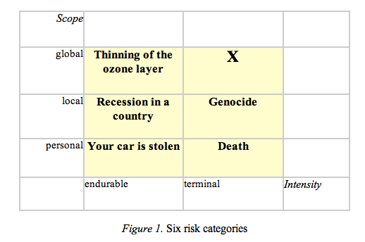
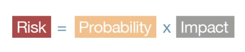
Like this blog, Bostrom’s principal concern is risk; that is, the probability that an event will occur combined with the impact should that event occur.

Risk jpeg

However, Bostrom extends this concept to take in scope: whether a particular risk is limited to a locality or whether it is all encompassing. This produces a risk matrix like this (source for the following analysis his paper here; click for larger image):

Typology of Risk jpeg

The X in the grid marks what Bostrom calls “existential risks”, which he defines thus:

A risk where an adverse outcome would either annihilate Earth-orginating intelligent life or permanently and drastically curtail its potential.

Bostrom then goes on to subdivide such existential risk into four categories:

Bangs: Intelligent life goes extinct suddenly due to accident or deliberate destruction.

Under this category we get traditional disaster movie scenarios of asteroid impact, nuclear holocaust, runaway climate change, naturally-occuring modern plague, bioterrorism, terminator-style super-intelligence and out-of-control nanobots.

Crunches: Society resets to a lower-level of technology and societal organisation. 

This includes bang-lite scenarios that don’t quite kill off intelligent life but rather just permanently cripple it.  Crunches also cover resource depletion and ecological degradation whereby natural assets can no longer support a sophisticated society. Crunch could also come from political institutions failing to cope with the modern world–subsequent to which emergent totalitarian or authoritarian regimes take us backwards.

Shrieks: A postmodern society is obtained, but far below society’s potential or aspirations. 

This is a rather nebulous category since the measuring stick of our potential is against something that we may not be able to understand–a reflection of Bostrom’s philosophical roots, perhaps.

Whimpers: Society develops but in so doing destroys what we value. 

Under this scenario, we could pursue an evolutionary path that burns up our resources or we bump up against alien civilisations that out-compete us. Over the time scale that this blog looks at–the lifespan of our young–this existential threat can be ignored.

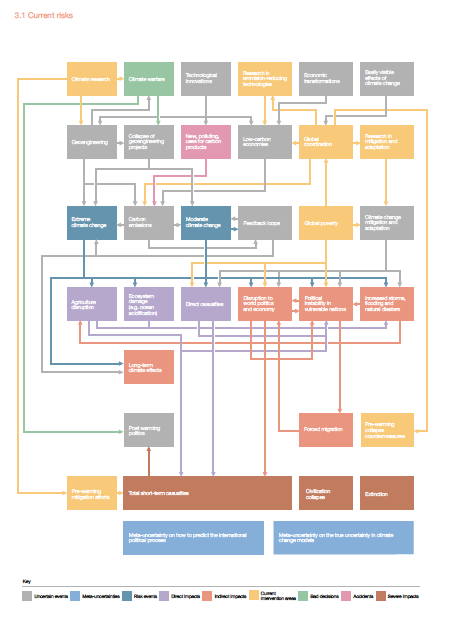
Building on many of Bostroms preoccupations, a joint report by FHI and the Global Challenges Foundation has just been published under the title “Global Challenges: 12 Risks That Threaten Human Civilisation”. The Executive Summary can be found here and the full report here.  The report is again concerned with existential risks, but approaches this idea somewhat differently than Bostrom’s earlier work.

The focus of the report is on low probability but high impact events. The logic here is that low probability events are generally ignored by policy makers, but when such events occur, they could have catastrophic consequences. Accordingly, policy makers should be duty bound to plan for them. From a probability perspective, what we are talking about here is the often-ignored right tail of the probability distribution.

Existential Probability jpeg

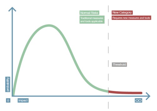
The 12 risks falling into the right tail of the distribution highlighted in the report are:

  1. Extreme climate change
  2. Nuclear war
  3. Global pandemic
  4. Ecological collapse
  5. Global system collapse
  6. Major asteroid impact
  7. Super volcano
  8. Synthetic biology
  9. Nanotechnology
  10. Artificial intelligence
  11. Unknown consequences (Rumsfeld’s unknown unknowns)
  12. Future bad global governance

As an aside, finance is one of the few disciplines that takes these tails seriously since they are the things that will blow you up (or make you a fortune). The industry often doesn’t get the tail-risk right (incentives often exist to ignore the tail) as the financial crisis of 2008 can attest. However, the emphasis is there. A lot of science ignores outcomes that go out more than two or three standard deviations; in finance, half your life is spent trying to analyse, quantify and prepare for such outcomes.

Returning to the Global Challenges report, the emphasis of the analysis is on dissecting tail risks, with the goal of provoking policy makers to consider them seriously. One of the most interesting proposals within the report if for a kind of existential risk early warning system, which I will look at in a separate blog post.

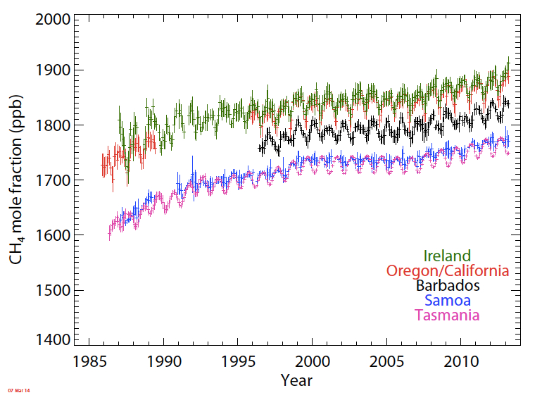
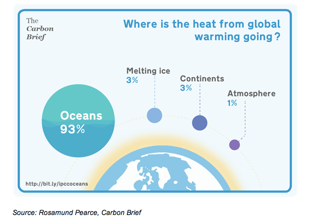
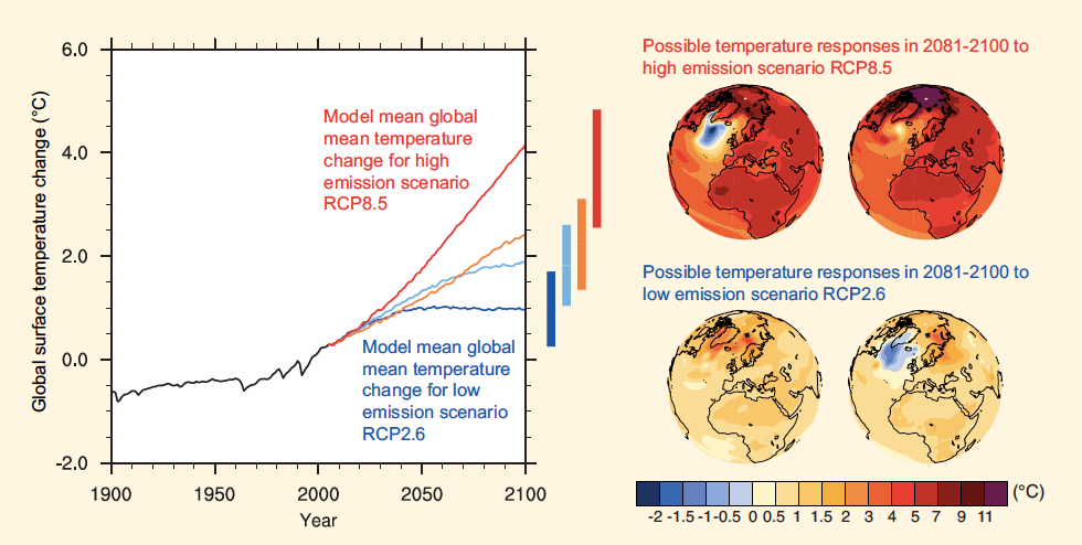
Finally, I will finish this post with a chart dealing with severe climate change (click for larger image or go to page 64 of the report), a risk that I hope will be at the centre of the upcoming COP 21 climate talks in Paris in December. The fact that our top universities are seriously studying such risks will, I hope, prevent them being seen as the preserve of cranks and disaster movies in future.

current climate risk jpeg


Chart of the Day, 17 February 2015: How Scary Is Methane?

A doomer commentary on methane has been doing the rounds on social media. Pictures of  methane bubbles certainly look scary, but the overall atmospheric concentration of methane has been showing only a mild rise. From the Advanced Global Atmospheric Gases Experiment (AGAGE) data series:

AGAVE CH4 jpeg

Moreover, the current climb is far slower than that seen in the 1980s. From a paper by Kirschke et al (click for larger image).

Methane jpeg

Although methane is a very powerful greenhouse gas (about 20 times as powerful as CO2), it presently makes up a little under 2 parts per million (ppm) of the atmosphere compared to around 400 ppm for CO2.

Critically, methane’s atmospheric life is short, about 12 years, after which it converts into CO2 (and thus becomes 20 times less potent). For this reason, it doesn’t accumulate easily. Keeping this in mind, a post by David Archer on the Real Climate blog looked at chronic versus catastrophic methane releases (click for larger image).

Chronic versus catastrophic methane release jpeg

So, in order to recreate a disaster movie scenario, we either need to see a massive and sustained release of methane or a ginormous spike in methane emissions. Where would this come from? The candidates are generally given as methane hydrates or other sources of trapped methane at high northern latitudes. But to see how realistic such places are as a source, we need to see where the methane is coming from at present (source here; click for larger image).

Methane Sources and Sinks jpeg

As you can see, anthrogenic sources such as wet-field rice cultivation, fossil fuel extraction and animal-rearing over-shadow other sources such as hydrates. Indeed, to get hydrates to become the principal driver of atmospheric methane concentrations we would need to see a 10 to 100-fold rise, and this would then need to be sustained for a long period of time.

According to scientists such as David Archer and Gavin Schmidt, such emission scenarios don’t look plausible (for more detail see here). In short, they see little evidence of a methane bomb ready to explode.

Simplistically, the difference between methane and CO2 is that the latter stays up in the atmosphere once put there while the former doesn’t. In sum, CO2 provides plenty of disaster movie material; we don’t have to look further afield to scare ourselves senseless.

Chart of the Day, 13 February 2015: Dr. Spencer’s Temperature Record

It’s a while since I posted on  the University of Alabama-Huntsville (UAH) temperature data, or more precisely on the global average lower tropospheric temperature anomaly as measured by satellite. The anomaly refers to the difference between the current temperature reading and the average reading for the period 1981 to 2010 as per satellite measurements.

The official link to the data at UAH can be found here, but most months we get a sneak preview of the release via the climatologist Dr Roy Spencer at his blog here.

Spencer, and his colleague John Christy at UAH, are noted climate skeptics. They are also highly qualified climate scientists, who believe that natural climate variability accounts for most of recent warming and any manmade contribution is minor. If they are correct, then we should see some flattening or even reversal of the upward trend within the UAH temperature time series over a long time period.

The last reading was for January 2015, and showed an anomaly of 0.28 degrees Celsius. This is the forth hottest temperature recorded for any January since the satellite record was started in December 1978 (37 January observations). To get a sense of the trend, see the chart here (click for larger image):

UAH Sat Temp Jan 15 jpeg

The climate skeptic community has made much of the fact that 2014 was not the hottest year on record according to satellite data. This contrasts with the time series recorded by both NASA and NOAA, which show 2014 taking the record. This is how the top 10 stack up according to UAH (taken from Spencer’s site here):

Annual Global Temp Anomalies jpeg

In the same post, Spencer highlights the statistical error surrounding the terrestrial hottest year claim for 2014. This is true. The reported temperatures are best estimates and sit within confidence bands. So newspaper articles should have read: “best estimate of temperature makes 2014 hottest year on record”. This doesn’t, however, make such good newspaper copy.

More important is the fact that one year’s worth of temperature is really just weather, while a decade or two is climate. Spencer has something to say about this as well:

Roy Spencer Text jpeg

The red flag here is “13 calendar years”. Why not ’20’? We are talking about climate after all. Critically, the 13 years takes us back to 2002 and produces the flattest line possible through the data in the chart shown above. If, by way of contrast, you take the UAH data set and compare the average temperature anomaly for the 10 years through 2014 with the average anomaly for the 10 through 2004, you see a rise of 0.13 degrees Celsius. The equivalent 20o4 to 1994 decade comparison is 0.22 degrees Celsius. So we have a slowdown, but it is far less pronounced and we still have a lot of warming.

Further, the 37 year UAH data record is still short, so a plateauing stands out. For the longer terrestrial data series, as I blogged about here, alternate fast and slow warming phases are nothing unusual. A hiatus is just that: a pause not a stop.

Critically, Spencer believes that the recent period of slow warming is evidence of low climate sensitivity to the ongoing rise in atmospheric CO2. Unfortunately, the only way he will be proved wrong about this (since he doesn’t accept consensus theory) if for the planet to undergo significant warming. This is an augment regarding which the consensus will likely be proved right, but which is far from a cause for celebration.

Chart of the Day, 8 February 2015: The Primordial Soup of US Renewables

If you like charts (as I do), and you are interested in all things energy and climate change, then the annual Bloomberg New Energy Finance‘s “Sustainable Energy in America Factbook” is an absolute treat. The 2015 edition came out last week.

While the United States does not have a Climate Change Act like the UK, it does have top-end academic research, government-backed blue sky thinking (via the Advanced Research Projects Agency for Energy), lots of entrepreneurial zeal, a deep well of venture capital funding and a multitude of innovative state-led renewable initiatives. Just as the primordial soup of complex molecules on early earth once gave rise to the chemical combinations that we call life, so we hope that the US renewable melting pot will also give birth to something transformational.

Of course, we are not there yet. And Voldemort is well represented in the US care of the anti-science Congress and a fossil fuel lobby that makes the tobacco giant lobbying of the 60s and 70s look like amateur time. But let’s stay upbeat. For a start, King Coal does appear to be in full retreat (click for larger image on all charts).

Electricity Generating Capacity by Fuel Type jpeg

Further, investment continues to pour into the renewable space at a rate 10 times higher than a decade ago:

Renewable Investment jpeg

With the exponential explosion in solar capacity particularly encouraging.

US Solar Roll Out jpeg

I could go on.

Nonetheless, for the US to lead the world into a post-carbon age before we are committed to extremely dangerous climate change still requires a step change upward in renewable investment. But the building blocks for a renewable revolution are there, they just need to be put in the right order.

Chart of the Day, 7 Feb 2015: UK Emissions Progress Good, but Not Good Enough

Last week, the UK’s Department of Energy and Climate Change published its final figures for 2013 greenhouse gas emissions. At first glance, the picture looks encouraging (click for larger images on all charts).

Emissions of Greenhouse Gases UK jpeg

And we appear comfortably ahead of our Kyoto target and the carbon budget intermediary goals established under the Climate Change Act 2008:

UK Carbon Budget Targets jpeg

Unfortunately, much of the success of the first carbon budget came on the back of the 2008/9 recession. As outlined previously in this blog, carbon emissions are a composite product of population expansion, growth in GDP per head, the energy intensity of GDP and the carbon intensity of energy (this relationship is called the Kaya Identity and is looked at it in more detail here). So when economic growth is slow, greenhouse gas emission growth is slow as well.

To its credit, the 2008 Climate Change Act also established a watchdog called the Committee on Climate Change (CCC), whose remit was to report whether targets were being met. From the July 2014 progress report to parliament on the preliminary 2013 numbers we read this:

CCC 2014 Progress Report jpegEmissions reduction policies suffer from the fact that the low-hanging fruit is aways picked first. If we are lucky, technology will make some of the higher growing fruity easier to pick, but we are in no way assured that this will happen. Against this background, the CCC is not confident that the UK can keep the reduction pace through the 3rd and 4th carbon budgets. As things stand, we do not have the policies in place to create a path to get to where we need to go.

Planned Policy jpeg

Forth Carbon Budget Policies jpeg

And the scale of the challenge can sometimes appear daunting. The 73% reduction in emissions to 2050 required from now onwards will see UK society almost completely decarbonised.

GG Emissions to 2050 jpeg

Yet this is what we have to do. To repeat the Churchill quote: “It’s not enough that we do our best; sometimes we have to do what is required”.

Chart of the Day, 6 Feb 2015: Is Natural Capital a Helpful Concept?

Although David Cameron has come under criticism for his previous boast about running “the greenest government ever” in the UK, the coalition should be given credit for bringing some fresh thinking to the field of environmental economics. In particular, the concept of natural capital – the different elements of nature that provide value for people – has been lifted into the limelight (click for larger image).

Natural Capital jpeg

The idea of natural capital first popped up in E.F. Schumacher’s 1970s eco classic “Small Is Beautiful”. Only recently, however, has it migrated from academia to economic policy-making, most noticeably taking centre stage in the 2011 government white paper “The Natural Choice: Securing the Value of Nature”.

This white paper, in turn, gave birth to the Natural Capital Committee, chaired by the Oxford economist Dieter Helm, which has produced a series of three reports under the common title “The State of Natural Capital” (here).

So is this all “green crap” (the phrase attributed to PM Cameron when talking about energy bills)? At first glance, it looks eminently sensibly from a business perspective; that is, subjecting nature’s assets to the discipline of accrual accounting. Firms are comfortable with the concept that capital depreciates and that this is a cost. For a company to remain an ongoing concern, it can’t trash its balance sheet to the benefit of the income statement–at least not for long. Similarly, if we erode our soil or pollute our air, the benefits from these resources will gradually diminish.

Yet there are many problems. While we can sometimes back out the value of complex assets like shore-line ecosystems in terms of their functioning as flood defence, extending this approach to intangibles such as a picnic in a park is problematic.

Further, if we wish to prevent natural capital eroding, then we have to assign costs. Much natural capital suffers from the tragedy of the commons (certain economic actors secure profits but dump the costs associated with these profits on society as a whole), and getting the Office of National Statistics to compile natural capital accounts will be meaningless if enforcement isn’t given teeth. The record on climate change isn’t encouraging here. The economics profession is almost unanimous in recommending a carbon tax to make CO2 polluters pay, but few governments have thad the guts to implement one in the face of vocal opposition from vested interests.

Finally, natural capital accounting will live or die by how much you discount the future compared to the present. If we assign a high discount rate, then there is a rationale for gutting our children’s future in order to consume now. A low rate implies we care about coming generations. After the May elections, the incoming government will get to show how much it cares.


Chart of the Day, 4 Feb 2015: Finding the Missing Heat and What It Means for Risk

The climate change debate generally focuses on the atmosphere–or rather two metres of the atmosphere through which we wander. Accordingly, the flagship statistic for climate change is the global mean temperature anomaly (latest update on this by me here). This is understandable: we are not fish.

Nonetheless, global warming refers to the globe, of which the atmosphere is a little piece. So we always have to remind ourselves of what warming goes where. From The Carbon Brief:

Where Is the Heat Going jpeg

Consequently, if the rate of transfer of heat into the ocean fluctuates (which it does), this will have a significant impact on atmospheric temperature. The largest short-term source of heat transfer volatility between atmosphere and ocean is the ENSO cycle, with El Ninos being associated with hot atmospheric years and La Ninas with cool ones.

Once we strip this factor out (plus the smaller impacts from the solar cycle and volcanic activity), then the upward march in atmospheric surface temperatures becomes a lot smoother. That is the difference between the orange and red lines in the chart below from a Real Climate blog post by Stefan Rahmstorf.

Temperature Anomaly without ENSO jpeg

Nonetheless, while we have had a broad-brush understanding of the atmosphere-ocean interface for quite some time, the granular detail on what energy is going where is only just emerging. The establishment of the ARGO network of temperature-measuring buoys is the game changer here (Carbon Brief; click for larger image).

ARGO jpeg

The data only goes back to 2006, but nevertheless this has been sufficient to give us a better picture of where the energy sinks exist. From a new paper in Nature Climate Change by Roemmich et al we see this (click for larger image):

Trends in Ocean Heat Content jpeg

Andrew Revkin also covers this story in his New York Times Dot Earth blog and relays an e-mail correspondence with climate scientist Yair Resenthal:

In an email chat, Yair Rosenthal of Rutgers University and Braddock Linsley of Columbia University, whose related work was explored here in 2013, said the Argo analysis appeared to support their view that giant subtropical gyres are the place where heat carried on currents from the tropics descends into the deeper ocean.

Linlsey said: “I think the Argo data point to the central gyre regions as key to the ocean-atmosphere heat exchange story.”

Rosenthal noted that this heat-banking process could buy humanity time, providing what he has called “a thermal buffer for global climate change,” particularly because the deeper ocean layers are still relatively cool (compared to much of the Holocene period since the end of the last ice age).

The critical point here from a risk perspective is that the heat-banking process “could” buy humanity time. The problem with this is that it also possibly “could not”.

We are at a stage where we are learning of the existence of the giant subtropical gyres but we know little about how they function or evolve through time. If these gyres have been responsible for an increase in heat transfer to the deep ocean over the last decade or so, it is quite possible that they could be responsible for a decrease in heat transfer at some future time. At this stage, we just don’t know.

We may have graduated from the stage when we were dealing with an ‘unknown unknown’ to a ‘known unknown’ but this hasn’t made much of an impact on how we can assess risk. In short, we are still learning about the probability distribution associated with warming outcomes. Yet within that distribution, a far-from-negligible chance of 4 degrees Celsius plus of temperature rise by end-century exists. Further, we know that a 4 degree rise would be catastrophic.

The good news is that the probability distribution of warming outcomes we are dealing with–unlike those for volcanoes or tsunamis–is one where we control one of the key variables: the trend in emissions. The bad news is that we aren’t controlling that variable.

Chart of the Day, 30 Jan 2015: Pick a Pathway (to Climate Nirvana or Climate Hell)

After yesterday’s post on China’s emissions, I will try to keep in a ‘cup half full’ frame of mind today.

The Intergovernmental Panel on Climate Change (IPCC) is an organisation for which I have great respect. But while their research may be applauded for its rigour,  communication with the wider world frequently lacks clarity (to put it mildly). Take, for example, the emissions scenarios, which in the Fifth Assessment Report (AR5) are called Representative Concentration Pathways (RCPs). Here are the RCPs and the change in temperature that accompanies them (Source: IPCC AR5, WG1).

Global Mean Temperature Change jpeg

I have spent many an hour grinding through IPCC reports trying to find clear explanations of what sits behind these pathways, but it is a painful process. Eventually, Skeptical Science saved the day by publishing “The Beginner’s Guide to Representative Concentration Pathways“.

There are four Representative Concentration Pathways: RCP 8.5, RPC 6, RCP 4.5 and RCP 2.6. The numbers refer to what is termed the ‘radiative forcing’, the change in net energy flow as measured in watts per square metre. Moreover, RCP 8.5 is expected to keep on increasing past 2100, RCP 6 and 4.5 will peak in 2100 and RCP 2.6 will have peaked prior to 21oo. Simplistically, a larger forcing means the globe will reach a higher mean temperature, as you can see in the chart above.

Surprisingly, AR5 is not particularly concerned with the socioeconomic assumptions that lie behind the RCPs. In this respect, the climate scientists behind the RCP concept are thinking the way economists often do: they are saying “imagine if we had condition X, what would be the output Y”. In this way, you can explore the model, and, hopefully, you obtain some insight which you can then take back to the real world.

I’m still a little uncomfortable with this. I think the IPCC should have chosen RCPs with highly transparent assumptions and realistic story lines. Instead, two of the four RCPs look utterly unrealistic to me. For example, to get to RCP 2.6 would require a transition away from fossil fuels that now looks impossible. And the good news? Well, RCP 8.5 looks barking mad to me too. Here are the emissions trajectories (from the Skeptical Science RCP report; click for larger image):

RCP Emission Trajectories jpeg

And if you concentrate on the blue line in the CO2 chart, you can see that around 24 giga tonnes of carbon are expected to be emitted in 2060. In yesterday’s blog post I was on working in units of tonnes of CO2. In the above chart, while the subject is CO2, the y-axis is in carbon. For those who have forgotten high school chemistry, you have to remember this:

CO2 jpeg

So when we move from calculations working in tonnes of carbon to tonnes of CO2 we have to multiple by 3.67 (44 ÷12) and vice versa. Joe Romm had a great piece in Climate Progress a while ago highlighting the number of people who get caught out through mixing up CO2 and carbon units. Accordingly, the 24 giga tonnes of carbon in 2060 is equivalent to about 88 giga tonnes of CO2. To put this in perspective, what are the big emitters putting out today:

Regional Emissions to 2019 jpeg

European emissions are already in decline and US emissions are flatlining. China’s emission growth will decelerate because its fixed-investment driven GDP growth model will come to the end of its natural life. China is also just about to enter its own demographic transition, and we have all see what such a transition did to Japanese economic growth (and by extension its emissions).

Obviously, India and other developing nations will increase their emissions, but they are unlikely to be able to replicate China’s export-led growth model. Further, with every passing year, the grid parity of renewables falls. Prime Minister Modi announced a push toward renewables when meeting President Obama. This was not just as a diplomatic gesture ahead of the Paris climate talks, but also as a pragmatic measure to buttress India’s energy independence and reduce the country’s exposure to volatile fossil fuel price movements.

So the cup half full is that RCP 8.5 looks unlikely–but the cup half empty is that RCP 6.5 is pretty awful climate-wise all the same.