Category Archives: Climate Change

A Host of Katrinas and the Damage Function

If you are interested in the interface between weather and climate, then I would highly recommend Dr. Jeff Master’s Wunderblog. Yesterday, Jeff highlighted a paper by Aslak Grinstead of the Danish Niels Bohr Institute looking at storm surge frequencies.

Grinstead has decided to take as his unit of measurement a Katrina-sized storm surge. While we all know that this is pretty big, the high water marks in the photos below from Master’s post (click for larger image) bring home just how amazing the storm surge was:

High Water Marks Katrina jpeg

Turning to the institute’s press release, Katrina-scale storms surges are recorded as having taken place around once every 20 years since 1923. However, Grinstead’s main finding is that this frequency no longer holds:

We find that 0.4 degrees Celcius warming of the climate corresponds to a doubling of the frequency of extreme storm surges like the one following Hurricane Katrina. With the global warming we have had during the 20th century, we have already crossed the threshold where more than half of all ‘Katrinas’ are due to global warming.

And he goes on:

If the temperature rises an additional degree, the frequency will increase by 3-4 times and if the global climate becomes two degrees warmer, there will be about 10 times as many extreme storm surges. This means that there will be a ‘Katrina’ magnitude storm surge every other year.

You can see the relationship in the chart below (click for larger image). Note the log scale for Katrinas per decade on the left, which means such events do not rise linearly with temperature—rather they go through the roof.

Storm Surge Frequency jpeg

Continue reading

U.K. March Weather: Forget the Noise, Look at the Trend

It is close to two years now since I returned to the U.K., and the March weather I have experienced could not have been more different. The March of 2012 was one of T-shirts and cold beer drunk in pub gardens. This March, the wood-burning stove is going flat out, and the papers are full of reports of potential natural gas shortages due to unexpected heating demand.

Such a swing has given rise to a host of articles claiming just about everything and anything to do with climate. In the face of this, my first reaction is to look at the data. The first port of call is the U.K. met office site, and you can find the monthly and annual temperature data record here.  The Met Office graphics are sorely lacking in sophistication, but nonetheless you can observe March mean temperatures all the way back to 1910 (click for larger image):

UK Mean Temperature March jpeg

As you can see, last March (2012) was the third warmest on record (over the last 100 odd years). Given March 2013 has yet to finish, the date point for this month has not yet been entered in the Met Office data base. Fortunately, The Guardian has added a proxy number for March 2013 (based on average temperature up to the 17th) to produce the much prettier bar chart below (article here, click for larger image).

March Temperatures jpeg

It is pretty damn cold in my town of Henley as we see out the end of the March, but whether we challenge the 1962 record average temperature low of around 2 degrees Celsius remains to be seen. What we can observe, however, it that there is a discernible trend: overall, things are warming up.

As for more extreme weather? Well, two divergent months in consecutive years don’t make a new trend toward higher volatility. And if you look at the top Met Office chart, you can see there has been plenty of volatility over the last one hundred years. Of course, the climate science tells us to expect more extreme weather, but there appears meagre evidence to collaborate the theory as yet from a temperature perspective in the U.K. looking at the month of March alone. But then again, as temperature has only just started to push above the range in maintained within the 12,000 year holocene era, things are only just getting started climate-wise.

Flood Risk in the U.K.: What Does Mr. Market Think? (Part 4 You Ain’t Seen Nothing Yet)

The National Flood Risk Assessment  (NaFRA) of 2008, conducted by the Environment Agency (EA), calculates that 330,000 properties are at ‘significant’ risk (defined as one in 75 years) of fluvial flood in England. The survey is a bit long in the tooth nowadays, and I expect that if they repeated the assessment exercise today, more houses would fall into the ‘significant’ risk category.

In a similar vein, The Association of British Insurers’ (ABI) submission to the U.K. parliament talks of around 200,000 homes (some 1 to 2 percent of the total housing stock) that would now find it difficult to obtain flood insurance if open market conditions solely determined availability (and if they can’t get insurance, they won’t be able to support a mortgage).

For climate change “skeptics” who believe in free markets, the fact that the British insurance industry takes climate change as a given, and has done so for many years, is a difficult fact to face. In a forward to a report called “The Changing Climate for Insurers” back in 2004, The ABI’s then Head of General Insurance John Parker was unequivocal:

Climate change is no longer a marginal issue. We live with its effects every day. And we should prepare ourselves for its full impacts in the years ahead. It is time to bring planning for climate change into the mainstream of business life.

What the ABI is doing through requesting the government to create a new insurance arrangement after the expiry of the Statement of Principles agreement in June 2013 is to “prepare ourselves for (climate change’s) full impacts in the years ahead”. We can hardly say we were not warned.

We can also hardly say that climate change is alarmist nonsense or a socialist plot. The insurance industry is about as close to “red in tooth and claw” capitalism as one could get. And the message from Mr. Market in his insurance industry incarnation is very clear: climate change is coming to a place near you very soon—get used to it.

Yet the ABI has blurred the line between uninsurability and unafordability. Tim Hartford in his Financial Times’ “Undercover Economist” column sets out three hard-to-insure risks. First, genuine unknown unknowns, where the insurer has no idea of the shape of the frequency distribution and severity distribution. Second, the adverse selection situation, where there is an asymmetry of information acting against the insurer: those who know they are bad risks use their effective insider knowledge to seek out and profit from insurance. Finally, insurance that is just expensive. He puts flood insurance into the final category:

Now the third kind of hard-to-insure risk is stuff that’s expensive and happens quite often. I’m trying to buy a house, I’m nearly 40 and so I’m trying to buy insurance for my family in case I die or become too ill to work. This is perfectly possible: it’s just expensive, because it’s not unusual for middle-aged men to get seriously ill. This sounds like a much better description of allegedly uninsurable homes: if there is a one in five chance of a flood, and a flood is going to cost £50,000, don’t expect to pay less than £10,000 a year for flood insurance.

…..but unaffordability is not uninsurability. It’s insurable but expensive.

If these homes actually were uninsurable the government would need to step in and cut some kind of deal with the insurance industry – exactly the kind of deal that has lasted for the past few years and seems about to unravel. But if the problem is unaffordability, trying to solve it by cutting a deal with the insurance industry is just a way of obscuring what is really going on. The real solution is simple and stark: the government needs to decide whether it wants to pay people thousands of pounds a year to live in high-risk areas or not.

And in austerity Britain, no Chancellor of the Exchequer really wants to shoulder these extra payments. Continue reading

Visualise This: Arctic Sea Ice Death Spiral

Fresh from attending (with my daughter Emiko) a course held in London and organised as part of The Guardian newspaper’s Masterclass series, I am particularly sensitive to good examples of data visualisation at the minute.

Here is a great one: a chart put together by Andy Lee Robinson that has gone viral on the web (click for larger image).

Arctic Sea Ice Death Spiral jpeg

This is Andy Lee Robinson on the background to the chart:

I became interested in climate science and fascinated by the shocking decline of Arctic sea ice – the most sensitive canary in the coalmine indicator of the effect that CO2 is having on our home.

I followed the science, researched the data and used my experience and intuition to create the iconic Arctic Death Spiral.

It went viral, and I estimate it’s had about a million views so far.

It sums up very succinctly, artistically and vividly what is happening, and anyone that isn’t as shocked by it as me, really doesn’t (or doesn’t want to), understand the implications.

I came upon this chart via a Skeptical Science post, which also features other work by Andy. Such as this animation.

And this graphic showing the change in Arctic sea ice minimum volume placed on a grid of New York City (click for larger image).

Arctic Sea Ice Minimum Volume jpeg

Not much more to say—apart perhaps for repeating Andy’s words:

anyone that isn’t as shocked by it as me, really doesn’t (or doesn’t want to), understand the implications

Flood Risk in the U.K.: What Does Mr. Market Think? (Part 3 The Information Game)

In my last post, we saw that the insurance industry has broken with the status quo because it realises that flood risk has entered into a new era. The stable frequency and loss distributions that underpinned their actuary-led calculations of the past are no more. The loss-related data that the industry laboriously collected in the past only gives insurers a limited ability to look into the future.

Nonetheless, if we only think of the pure insurance risk (as opposed to an insurer’s business model risk), insurance companies are really looking out only one year: when a home owner’s policy comes up for renewal each year, the insurer has the opportunity to change the terms and conditions of the policy including the premium and excess. And they could change the terms and conditions very aggressively—the equivalent of suspending coverage, just in disguise.

Given these factors, if an insurer can look out for that one year and capture a decent understanding of the risk, it should be protected from any massive loss event that blows it out of business. And if there is a big loss event and the insurance company is still standing, it can subsequently change the terms and conditions of the outstanding policies at the next yearly renewal including a hefty hike in the premiums.

Up until the floods of 2007, with their £3 billion-plus associated insurance pay-outs, the information in the hands of an insurer and a well-informed home owner would have not been that much different. Both would have had access (and still do have access) to the Environment Agency (EA)’s flood maps.

The flood maps are updated quarterly and give a risk assessment at the one in 100 and one in 1000 flood probability levels  for river flooding (an EA pamphlet on the flood map can be found here). On top of this, the EA provides the insurance industry with the National Flood Risk Assessment (NaFRA) data. As mentioned in a previous post, this is more specific in terms of its flood risk categories (an EA pamphlet on NaFRA can be found here) and underpins the Statement of Principles agreement between the Association of British Insurers and the government. I will repeat the risk category definitions once again:

  • Low risk: the chance of flooding each year is 0.5 per cent (1 in 200) or less
  • Moderate risk: the chance of flooding in any year is 1.3 per cent (1 in 75) or less but greater than 0.5 per cent (1 in 200)
  • Significant risk: the chance of flooding in any year is greater than 1.3 per cent (1 in 75)

A home owner may have more interest in the one-in-75 risk (available from NaFRA) rather than the one-in-100 risk (available from the EA on-line Flood Map) since this is the demarcation point used to differentiate between ‘significant’ risk and ‘moderate’ risk, and as a result drives insurance premiums levels. Moreover, this risk demarcation point gives an some indication of what ‘significant’ risk property owners may be in for after the expiry of the Statement of Principles agreement expires in June 2013. Continue reading

Flood Risk in the U.K.: What Does Mr. Market Think? (Part 2 An Actuary’s Nightmare)

In my previous post, I noted that strange things were happening in the flood insurance market. In short, the insurance industry no longer wants to extend the status quo (here):

The current agreement under which insurers continue to offer flood insurance to their existing customers will expire on 30 June 2013. The insurance industry has proposed a new a scheme to ensure customers can still buy affordable flood insurance, after this date. We are currently in talks with the Government about taking this forward.

In truth, they want to move some flood risk from one actor in the market to another. But before I look at that issue, I want to ask the question “why do they want to change the status quo?”

To do this, we need to take a quick detour through the theory of insurance. There is a nice little eight-minute youtube video that explains the theory of insurance here:

The core message in the video is the same as the core message of this blog: risk is the probability of an event times the cost of the event. Continue reading

Flood Risk in the U.K.: What Does Mr. Market Think? (Part 1 Five Million Homes at Risk and Rising)

Last week I attended an evening of talks given under the title “Extreme Weather and Floods” and hosted by the local sustainability group PAWS in the Thames side village of Pangbourne. The speakers were Professor Nigel Arnell,  Director of the Walker Climate Institute, Reading University, and Stuart Clarke, Principal Engineer and the senior officer for flood risk management at West Berkshire Council.

At the close of the Q&A at the end of the evening, the moderator encouraged the audience to mingle with the speakers and take the opportunity to ask any follow-up questions.  I ambled up to Professor Arnell to ask for a pdf copy of his Powerpoint slides, but before I could get to him he was grabbed by a late middle-aged man who wanted to vent his frustrations on his treatment by his insurance company (I shall call him Mr. Angry, and don’t blame him). The insurer was now demanding a £1,400 (about $2,100) annual insurance premium for flood risk cover and a £15,000 (about $23,000) excess for flood damage (the home owner has to pay the first £15,000 of damages before the insurer steps in). Result? He declined and his house now goes uninsured.

Flood insurance is a classic case of where climate change meets Mr. Market. At present, U.K. insurers have an agreement with the government known as the Statement of Principles on the Provision of Flood Insurance (a copy can be found at the Association of British Insurers here) that can be summarised as Mr Market Lite.

The border line between capitalism ‘red in tooth and claw’ and the socialization of risk is a one-in-75 year flood event (a 1.3% chance of flooding in an individual year). If you are in a flood zone which is estimated to have a flood risk greater than one in 75 years and the government has no plan to beef up flood defences over the next 5 years, then ‘tough’—you have to make an accommodation with Mr. Market. If—like Mr. Angry of Pangbourne above—Mr. Market’s quote is in the stratosphere, then you may be forced to turn it down and go uninsured. Note that if your property was built after 1 January 2009, it automatically falls outside of this agreement between the insurers and the government.

You can see the definitions of ‘low’, ‘moderate’ and ‘significant’ risk in the Environment Agency’s “Flooding in England: A National Assessment of Risk” here (click for larger image).

Flood Risk Categories jpeg

Continue reading

Preparing for the Arctic Melt Season

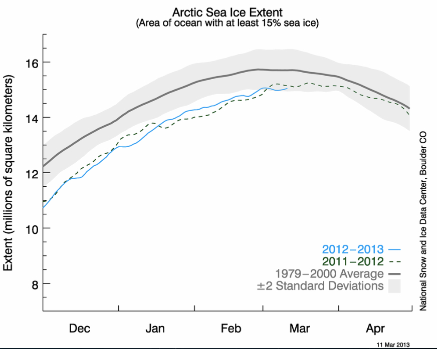
In 2012, the maximum Arctic sea ice extent was reached on 18 March at 15.24 million square kilometres according to National Snow and Ice Data Center (NSIDC). Nonetheless, this was far from a record low—indeed, only number eight historically. The year 2011 held (and still holds) pole position for the freeze season maximum low, at 14.64 million square kilometres.

However, for the 2012 melt season, we all know what happened next (or at least the sentient part of mankind knows what happened next). The NSIDC announced the crash in sea ice extent to 3.41 million square kilometres at its September 16 low (smashing the previous 2007 record of 4.17 million square kilometres) with all the gory detail here.

The upshot of all this? Basically, current sea ice extent won’t tell us if we will hit a new record low this coming September. So we need to be patient if we want to answer the big question of whether we will continue to see a jagged descent this year (with even a possible year-on-year marginal gain) or a further phase change (setting us up for an ice free summer Arctic within a decade). In other words, will the patient cling on for a while longer or opt for a quick death.

With two kids aged 11 and 16, this must be one of the most depressing data tracking exercises I have ever done. In short, my children will surely now inherit an ice free summer Arctic (and possibly spring and autumn too by their middle age), with all the consequences that this implies. But how quickly?

So what will I be looking at? First stop is always the NSIDC’s daily image update, which gives you this chart:

Arctic Sea Ice Extent jpeg

And while I am at the NSIDC site, I will be checking their new Greenland Ice Sheet Today page, which shows the latest domino to fall: Greenland ice sheet melt.

The only problem with the NSIDC image is that it does not contain a daily ice extent number. For that, I like the Japan-hosted IARC-JAXA Information System (IJIS) sea ice extent data series that can be found here. If you look at this series, then it is possible that we have already peaked for the year (but watch out for the last reported day to be always revised substantially).

Next, I go over to Neven’s incomparable blog for all things sea ice. Currently, Neven is reporting good news, bad news. The good news (well let’s say goodish news) is that sea ice volume (as opposed to extent) is above last year’s level. The bad news is that many parts of the Arctic sea ice are showing large unseasonal cracks that could herald further record sea ice lows in the months to come.

Neven’s site is also a chart fest and live-cam orgy. It is like having a ring-side seat of the sea ice collapse. Comments area also generally very interesting.

After that, I will periodically check on the Open Mind blog, in which Tamino will be statistically slaying the latest nonsense from Anthony Watts and his ilk (good example here). If you want to dust off your stats, read Tamino’s series of posts on ice sheet loss in preparation for the new melt season. They start here.

Finally, I will try to bring the dire state of the Arctic sea ice into conversations with those I meet. Most will, in turn, change the subject. Planeticide is such an unseemly topic—best not to talk about it and pretend it isn’t there.

Siberian Permafrost Thaw and Risk Revisited (and Corrected)

Two weeks ago, I posted on a new paper by Dr Anton Vaks and colleagues looking at permafrost thaw in the context of overall climate risk. In that post, I talked about a 1.5 degrees Celsius rise in global mean temperature from today setting off significant permafrost thaw and carbon release.

After exchanging e-mails with Anton Vaks, the lead author of the report, I found that the correct number is a 1.5 degrees Celsius rise from pre-industrial levels. Given that we have already warmed by about 0.7 to 0.8 degrees Celsius from pre-industrial levels as of now, that puts the tipping point only around 0.8 degrees Celsius further away.

This is an important, and a very negative, correction—and it has massive risk implications. At the end of the post, I will explain why much of the media and blogosphere interpreted the paper incorrectly (including myself), but first I will look at the more important question of what a lower hurdle for permafrost thaw means.

Let’s start by reporting the relevant passages of the paper itself (note that the paper is behind a paywall):

We reconstruct the history of Siberian permafrost (and the aridity of the Gobi Desert) during the last ~500 kyr using U-Th dating of speleothems in six caves along a north- south transect in northern Asia from Eastern Siberia at 60.2°N to the Gobi Desert at 42.5°N.

Speleothems are mineral deposits formed when water seeps into a cave from surrounding bedrock and earth. If the surrounding bedrock and earth is frozen, you get no water seepage and no speleothem formation. So when an interglacial period reaches a sufficiently warm level, permafrost melts and speleothems form. U-Th dating refers to uranium-thorium dating that is accurate up to around 500,000 years.

The interglacials for the last 800,000 years can be seen in the following chart (not take from the paper, source here, click for larger image):

Interglacials jpeg

Continue reading

Data Watch: Atmospheric CO2 February 2013

Atmospheric CO2 concentration is the world’s leading risk indicator. Every month, the National Oceanic and Atmospheric Administration (NOAA), a U.S. government federal agency, releases data on the concentration of atmospheric CO2 as measured by the Mauna Loa Observatory in Hawaii. The official NOAA CO2 data source can be found here.

This is the longest continuous monthly measurement of CO2 and dates back to March 1958, when 315.71 parts per million (ppm) of CO2 was recorded.

The Intergovernmental Panel on Climate Change (IPCC) uses the year 1750 as the pre-industrialisation reference point, at which date the atmospheric concentration of CO2 was approximately 280 ppm according to ice core measurements.

Key numbers relating to NOAA’s March 5th release of February 2013 mean monthly CO2 concentration are as follows:

  • February 2013 = 396.80 ppm, +3.26 ppm year-on-year
  • Twelve Month Average = 394.2 ppm, +2.36 ppm year-on-year
  • Twelve month average over pre–industrial level = +40.8%

Decadal CO2 Change jpg

Continue reading