Category Archives: Resource Constraints

Life in a Time of Hiatus and the Off-Grid Movement

Humans aren’t very good at risk. Or rather they are good as long as the future looks a lot like the recent past. In economics, this way of looking toward the future is called “adaptive expectations“, where we change the way we look at the world only when an event comes along that jars with our original working hypothesis of how we thought things work.

For a time, the more sophisticated idea of “rational expectations” ruled the roost in economic circles (and in 1995 the economist Robert Lucas picked up a Nobel prize for his work on this idea). Lucas’ idea was that individuals discounted all known information (not just empirical evidence from the past) so accordingly their expectations over future economic variables should show no discernible bias. Partially on the back of this belief, Lucas made the following statement to the American Economic Association in 2003:

The central problem of depression-prevention has been solved, for all practical purposes, and has in fact been solved for many decades.

The statement contained two components of Lucas’ libertarian philosophy: 1) past recessions came about as a result of governments messing up and 2) private-sector actors act rationally and efficiently if left alone. And then along came the popping of countless irrational bubbles in 2009 and the subsequent Great Recession—out of which we are still struggling to emerge.

What has this got to do with the themes of this blog? Well, if we assume that the expectations of individuals are formed in an adaptive manner, then on the big questions of climate change and resource depletion, secular shifts and step changes will cause populations to consistently make bad decisions. People will cling to the past until their lives are turned upside down.

In other words, if Mark Twain was wrong, and history doesn’t repeat itself or rhyme, then we humans appear to be in trouble;  we are preprogrammed to look for rhymes and find them even when they don’t exist. We all have our life narratives—the work we do, where we live, the lives we wish ourselves and our kids to lead—and we don’t like it when this narrative is questioned.

Confirmation bias is rife in this way of thinking. If a piece of information comes along that supports the narrative, it is emphasised; if it contradicts the narrative, it is discounted. Nonetheless, if a new piece of information hits with sufficient force, it won’t be completely ignored. Or alternatively, a little bit of discomfort if continuously felt will cause us to shift our position.

Climate change, being the wicked problem that it is, fulfils neither of these conditions. The hot years of 1998 and 2009 were just not hot enough to permanently shift the narrative. And the hot years are sufficiently infrequent to allow us to forget. Mother Nature hasn’t helped by putting the globe into a La Nina-dominated phase of the ENSO cycle, thus masking the upward trend in temperature over the last few years.

The statistician Tamino, in  his excellent Open Mind blog, analyses this phenomenon in a recent post (with much of this work building on an article in Nature by Kosaka and Xie in Nature). In his words:

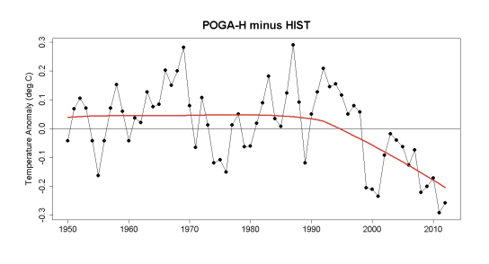
The influence is clear: a pronounced recent ENSO-induced cooling which has cancelled the continued global warming due to man-made CO2, leading to the “hiatus” in the increase of global temperature.

And he includes a chart that shows how much the ENSO cycle is currently subtracting from the overall warming trend:

ENSO Effect on Temperature jpeg

Nonetheless, despite the fact we are living in a hiatus period of slow temperature rise, the maximum temperature records are still coming thick and fast. For a state of play, see here. My old home of Japan, for example, posted a new record of 41 degrees Celsius this summer, and new highs also came in Slovenia, Austria and Greenland. When the next strong El Nino rolls round, I expect this records page to explode. In the meantime, however, people are just bored with the unspectacular gradual saw-tooth warming path as encapsulated in Dr Roy Spencer satellite temperature anomaly chart:

UAH Global Mean Temps July 2013 jpeg

This sawtooth is typical of a stochastic process with a trend. Climate change may punch you in the face one year, but it is highly unlikely to punch you in the face two years in a row. Accordingly, all those symptoms of climate change also have a tendency to fade in and out of consciousness year by year. So in 2012, we had an extraordinary collapse in Arctic sea ice extent. And this year?

Arctic Sea Ice Extent 2013 jpeg

Of course, the downward trajectory is still intact. The average for September 2013 looks like coming in  at around 5 million square kilometres, which would put it slap bang on trend.

Aveage Monthly Arctic Sea Ice Extent September jpeg

Actually, I think the media was already bored with sea ice extent. Coverage during the shocking collapse last year was patchy at best. Sea ice extent decline can be seen as the canary in the coal mine for climate change, but few actually care that the canary is dying. In 2012, the Financial Times and Wall Street Journal devoted far more space to polar shipping route and oil and gas drilling opportunities arising from receding Arctic sea ice than the greater existential threat the phenomenon of retreating ice represented in itself.

But what about the ‘in your face’ extreme weather events that bring climate change home. When Hurricane Sandy hit at the end of October 2012, for a time climate skeptics were put on the back foot (even though scientists are loathe to attribute any one weather event to climate change). Mayor Michael Bloomberg actually cited Hurricane Sandy and climate change as a catalyst for him supporting Obama in the presidential election (here).

But weather is a fickle friend for those occupying the ramparts and calling for action over climate change, with, for example, this year’s hurricane season proving a spectacular bust; indeed, Bloomberg reports that there have been no Atlantic hurricanes reported as of 4 September. There is a while yet until the end of the hurricane season, but in reality the probability of a few Katrina or Sandy-type hurricanes hitting in quick succession—something that would make an impact on the broader populations adaptive manner of forming expectations—is low.

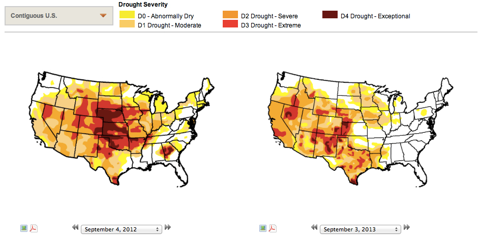
The same applies to deluge and drought. Both the U.K. and U.S. continue to experience ‘weird weather’. But the record droughts have broken and record floods have receded, and life has moved on. For example, last year the U.S. was gripped with severe drought and this year is still bad—but not quite so bad (click for larger image, chart source here):

Drought Severity US jpeg

Ironically, the resource depletion debate has also followed a similar trajectory. The media has grown bored and skeptics have declared victory. As is typical with such controversies, much of the sturm und drang centres around establishing a straw man in the opposing camp to attack. God forbid we go back to the original sources and read what the influential peak oil theorists of the modern era actually said. For example, here is a high profile article written by  Colin Campbell and Jean H. Laherrere  back in March 1998 for Scientific American. This is what they said:

The world is not running out of oil – at least not yet. What our society does face, and soon, is the end of the abundant and cheap oil on which all industrial nations depend.

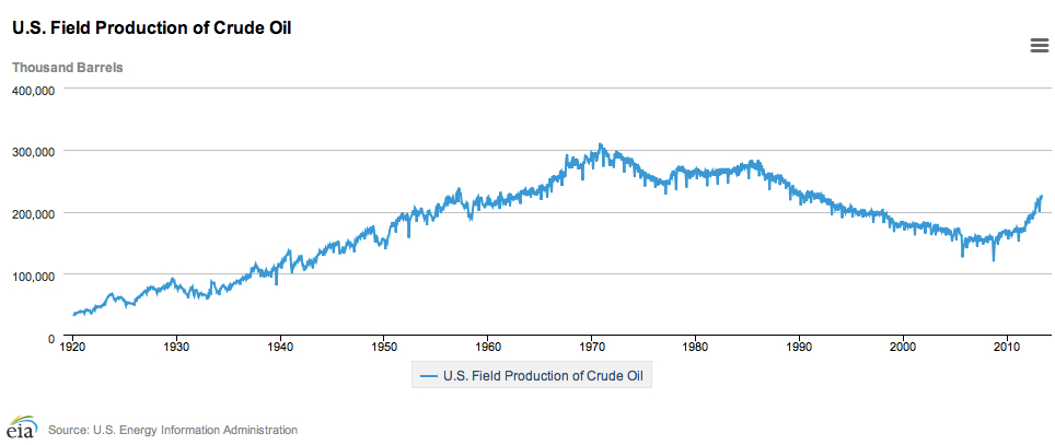
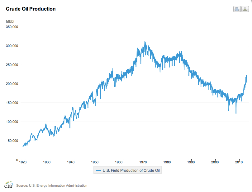
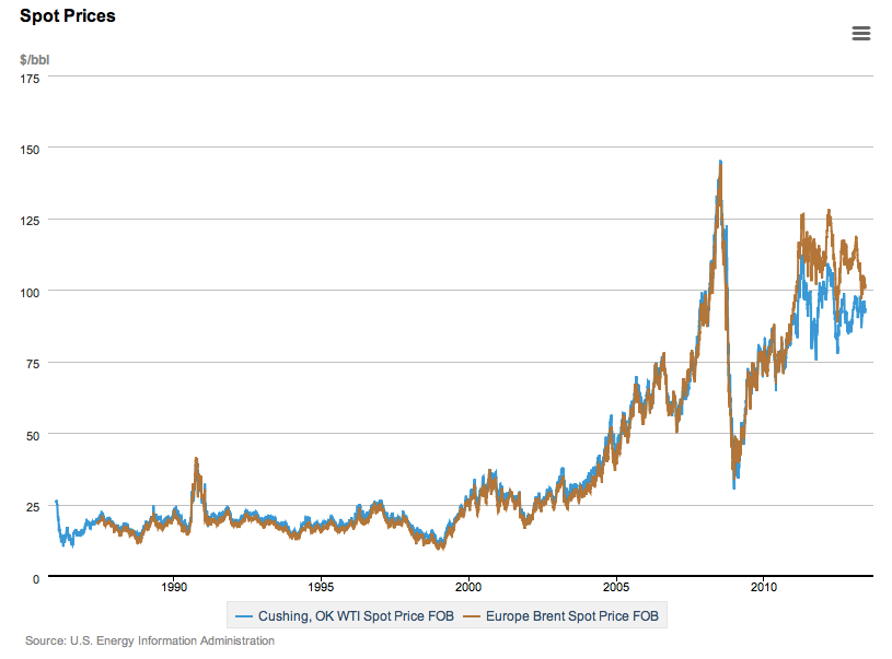
And what was the price of oil when they wrote this article? The annual average cost of crude in the U.S. in 1998 was $11 barrel (see the EIA numbers here). In short, Campbell and Laherrere came out with a big, bold call on rising oil prices in March 1998, and they were absolutely right.

Spot Oil Prices jpeg

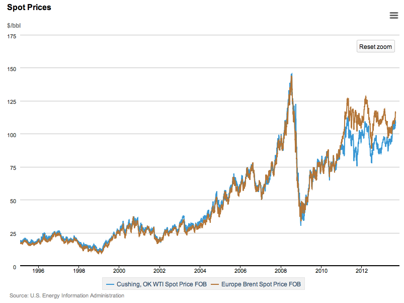
Moreover, from the graph above it is difficult to detect any softening of the oil price in recent years. Not to worry, the media tells us that  peak oil is dead, slayed by the white knight of fracking technology. And Daniel Yergin, the high-profile cornucopian who appears to have free rein to write op-ed articles in the Wall Street Journal at will, dances on its dead body. But who has been closer to the truth over the last two decades, Campbell and Laherrere or Yergin? Well here are Yergin’s predictions (taken from a great post at Stuart Staniford’s Early Warning blog):

Daniel Yergin jpeg

Ironically, the only time he was bullish on the oil price was just prior to when the global economy plummeted into the Great Recession (in respect of which high oil prices played no small part). Nonetheless, while the upward trend in oil prices remain intact, we are not currently breaking to new records. At the same time, economic actors are doing just enough in terms of substitution and efficiency that the pain is tolerable. That is, until oil prices break substantially higher some time in the future, so tipping us into a new recession.

For those individuals and organisations that call for a proactive and forward-looking response to global warming and resource depletion, the tendency for humans to stick to their existing life narratives unless violently bashed over the head has proved a challenge, particularly in a period of hiatus. Here is a part of Transition Network‘s mission statement:

Transition Network supports community-led responses 
to climate change and shrinking supplies of cheap energy, building resilience and happiness.

But if most of your audience doesn’t believe that climate change or energy availability is changing sufficiently to impact their lives, then they won’t be receptive to making their lives more sustainable and resilient (and in the process help ensure their children and grandchildren don’t come to live on a planet that has radically changed).

I feel the frustration. A few years ago, I could engage with the agnostic over climate change (the fundamentalist climate skeptics have always been a lost cause). But now most don’t want to know. The Great Recession coupled with the hiatus have led people to return to their comfortable old life narratives.

So what is to be done? I think the way is twofold. First, work with the believers in enhancing sustainability and resilience wherever possible.

Second, and perhaps more controversially, use the off-grid movement as a Trojan Horse to advance sustainability and resilience. Ironically, technology and the information revolution have brought aspects of off-grid living to ever larger segments of the population. And the appeal of the off-grid way of life runs across the political spectrum to encompass a multitude of ways of thinking including:

  • Environmentalism
  • Post-consumerism
  • Down-sizing
  • Survivalism
  • Libertarianism

Over the summer break, I read two books by Nick Rosen, “How to Live Off-Grid” and “Off the Grid” (the former concentrating on the U.K. experience, the latter the U.S.). Rosen is a lukewarm environmentalist. His motive for moving off-grid is more philosophical:

Some of the cosiest-sounding places in the world are off-grid. And I detected that as well as this physical sense of off-grid, there also seemed to be another meaning  – an off-grid attitude that you could take into the local park or your own back yard, a sense of feeling at ease in the world. of reclaiming your independence and individuality. A practical, freewheeling kind of self-sufficiency.

To me, off-grid is synonymous with empowerment. Surprisingly, although technology had created a system of global hyper-capitalism that extols specialisation, supply chain management, outsourcing and the rest, it could allow us to disengage and then deal with the market in our own terms. If you don’t have to worry about the bottom segments of Maslow’s hierarchy of needs (the physiological needs of food, water, temperature control and so on), then you have a better chance to flourish in the higher segments. I will return to this theme in the future.

Data Watch: US and Global Crude Oil Monthly Production

On July 30th, the U.S. government agency The Energy Information Administration (EIA) announced provisional U.S. crude oil production figures for May 2013. Key points:

  • May crude oil production was 226.8 million barrels, equivalent to 7.3 million barrels per day (bpd)
  • Change over May 2012 on a barrel-per-day basis: +15.4% y/y
  • May total crude oil plus natural gas liquids 303.6 million barrels, equivalent to 9.8 bpd

As can be seen from the chart below (click for larger image, link to original data here), the fracking of tight oil formations in the U.S. has made a major impact on U.S. crude production. The critical question is whether the current large year-on-year percentage growth rates in oil production can be sustained.

US Field Production of Crude Oil to May 2013 jpeg

The year-on-year increase in production peaked in October 2012 at 18.2%, but currently year-on-year oil production gains remain robust, with mid-teen growth rates being recorded. The situation for oil is in marked contrast to that of U.S. natural gas, where production growth has stopped.

The differentiator here is price. Both tight gas and tight oil are expensive to produce compared with the conventional alternatives. Accordingly, production investment requires a high product price to remain feasible. U.S. natural gas prices are down roughly by half from their average level in the 2005 to 2008 period (removing the temporary 2008 spike). By contrast, the price of West Texas Intermediate, the U.S. benchmark oil price, remains near all-time highs (again excluding the very short-term 2008 spike).

Given crude oil is a globally traded commodity, U.S. production numbers need to be placed in the context of world supply and demand. In its latest Oil Market Report dated 11 July 2013, the International Energy Agency (IEA) recorded global ‘all liquids’ production of 91.2 million bpd for June 2013, down 0.3 million pbd from the previous month.

IEA Oil Supply June 2013 jpeg

Full quarterly IEA world supply-and-demand figures, including Q2 2013 estimates, can be found here. The preliminary estimate for Q2 2013, shows a 0.5% rise over Q2 2012. The lacklustre increase in supply accounts for why world oil prices remain strong despite a slowdown in global GDP growth.

Links for the Week Ending 21st July

  • Lots of commentary on whether the bankruptcy of Detroit is emblematic of a post-industrial, post-growth world, or just an exception. This blog post by Juan Cole (via Stuart Staniford’s Early Warning) delves far deeper than most.
  • And from a very different perspective, Raghuram Rajan, who wrote the wonderful book Fault Lines, continues to ask some probing questions as to why we continue to need financial repression by the the central banks to underpin what little growth we have—and where this could all lead.
  • Forbes has been gleefully dancing on the grave of The Oil Drum (here). Of course, they fail to reference the fact that oil prices have remained remarkably high despite a significant slowdown in global growth and that all Daniel Yergin’s predictions (Yergin being the cheerleader for the cornucopians) have been wrong. Like climate change, resource depletion in the form of peak oil is something people have grown bored with. Unfortunately, just because you get bored with something, it doesn’t mean it goes away (as a final post in The Oil Drum points out).
  • Having brought up climate change, it is worth directing you to the World Meteorological Office (WMO)’s state of play for the decade 2001-2010. No sign of climate change going away here. And we have had a record turnaround in this year’s snow and ice melt after a slow start. At this time of year, I check Arctic sea ice extent daily (here) to see how our dying canary is doing.
  • Meanwhile, the wilfully ignorant continue to buy real estate in Miami, which is likely to be the first major advanced city to be lost to climate change. An excellent article in Rolling Stone details the city’s fate here. And no, just because this is likely to happen decades in the future doesn’t mean current prices won’t be impacted. We just need a couple of climate-induced hurricane hits to change the valuation metric from free hold to lease hold as the market suddenly realises that all real estate in the city will ultimately be worth zero at some future date.

Data Watch: FAO Food Price Index for June 2013

At the beginning of each month, the Food and Agriculture Organisation of the United Nations (FAO) releases a series of price indices for a variety of food commodities (here). The headline FAO Food Price Index is a composite of five food groupings: meat, dairy, cereals, oils and fats and sugar. The base 100 is the indexed averaged price for the 2002-2004 period. The June 2013 index number was released on July 4th. Key points are as follows:

  • The FAO Food Price Index averaged 211.3 for June 2013, down 1.9 points from the revised value of 213.2 for May
  • The index was up 10.8 points from the 200.5 recorded in June 2012, or 5.4 percent
  • In inflation adjusted terms, the Food Price Index stood at 140.3 for June 2013 against the 2002-2004 base of 100

The nominal and real price indices have followed a trajectory not dissimilar to the global oil price (click chart for larger image). Here is food:

FAO Food Price Index June 2013 jpeg

And here is oil (click for larger image):

Spot Oil Prices June 2013 jpeg

The drought in New Zealand has now broken, allowing the dairy component of the index to fall significantly from the April peak. Sugar prices also fell over the month. The sub-indices can be found here.

Data Watch: US and Global Crude Oil Monthly Production

On June 27th, the U.S. government agency The Energy Information Administration (EIA) announced provisional crude oil production figures for April 2013. Key points:

  • April crude oil production 220.6 million barrels, equivalent to 7.4 million barrels per day (bpd)
  • Change over April 2012 on a barrel-per-day basis: +16.9% y/y
  • April total crude oil plus natural gas liquids 294.6 million barrels, equivalent to 9.8 bpd

As can be seen from the chart below (click for larger image, link to original data here), the fracking of tight oil formations in the U.S. has made a major impact on U.S. crude production. The critical question is whether the current large year-on-year percentage growth rates in oil production can be sustained (click for larger image). The year-on-year increase in production peaked in October 2012 at 18.2%, but April 2013 also recorded a very strong 16.9% year-on-year jump. Currently, year-on-year oil production gains remain robust, in contrast with U.S. natural gas trends.

U.S. Crude Oil Production jpeg

Given crude oil is a globally traded commodity, U.S. production numbers need to be placed in the context of world supply and demand. In its latest Oil Market Report dated 12 June 2013, the International Energy Agency (IEA) recorded global ‘all liquids’ production of 91.3 million bpd for May 2013, down marginally from the previous month, but up 0.2 million bpd over May 2012. The June 2013 Oil Market Report can be found here.

OPEC & Non-OPEC Supply May 2013 jpeg

Full quarterly IEA world supply-and-demand figures, including Q3 2013 estimates, can be found here.

Data Watch: US Natural Gas Monthly Production April 2013

The U.S. government agency The Energy Information Administration (EIA) issues data on U.S. natural gas production, including shale gas, on a monthly basis with a lag of roughly two months. The latest data release was made on June 28 and covers the period up until April 2013.

Data is reported in billion cubic feet (bcf). Key points:

  • April 2013 natural gas dry production: 1,985 bcf,  plus 1.1% year-on-year
  • Average monthly production for the 12 months to April 2013: 2,003 bcf, +2.2% over the same period the previous year

Since the end of 2011, the rate of production increase has levelled off (click chart below for larger image), and the 12-month moving average continues to decline.

US Dry Gas Production April 13 jpeg

Much recent media attention has centred on a so-called shale-gas revolution in the United States and, in particular, the ability of shale gas to boost overall volume of natural gas production. Many claims are made with respect to the prospective expansion in shale gas production in the coming years including the following:

  • Shale gas will provide a low-cost source of natural gas, and thus cheap energy, for decades to come. This, in turn, will boost the competitiveness of the U.S. economy.
  • The U.S. will move toward an era of energy self-sufficiency, which will help buttress the country’s geopolitical security.
  • The scale of shale gas production will be sufficient to allow the U.S. to commence natural gas exports, thus transforming energy markets outside of the U.S. such as those in Europe.
  • Increased natural gas production in the U.S. will mitigate carbon emissions through displacing coal and so reduce the risk of dangerous climate change.

For these claims to be substantiated, significant year-on-year rises in U.S. natural  gas production will be required over an extended period. Through tracking monthly production of natural gas, a non-specialist can confirm or refute whether large rises in natural gas production are being achieved and, therefore, whether the claims associated with a shale-gas revolution are credible. In short, the monthly numbers allow you to evaluate the hype. Monthly data are currently not showing any material increase in production.

Data Watch: FAO Food Price Index for May 2013

At the beginning of each month, the Food and Agriculture Organisation of the United Nations (FAO) releases a series of price indices for a variety of food commodities (here). The headline FAO Food Price Index is a composite of five food groupings: meat, dairy, cereals, oils and fats and sugar. The base 100 is the indexed averaged price for the 2002-2004 period. The May 2013 index number was released on June 6th. Key points are as follows:

  • The FAO Food Price Index averaged 215.2 for May 2013, down marginally from 215.8 the previous month
  • The index was up 10.4 points from the 204.8 recorded in May 2012, or 5.1 in percentage terms
  • In inflation adjusted terms, the Food Price Index stood at 142.9 for May 2013 against the 2002-2004 base of 100

The nominal and real price indices have followed a trajectory not dissimilar to the global oil price (click chart for larger image). Here is food:

FAO Food Price Index May 2013 jpeg

And here is oil:

Oil Spot Prices May 2013 jpeg

The drought in New Zealand has now broken, allowing the dairy component of the index to fall slightly from the April peak. The trend in diary prices, however, was offset by a small increase in the cereal price index. The sub-indices are available from the FAO here.

Data Watch: US Natural Gas Monthly Production March 2013

The U.S. government agency The Energy Information Administration (EIA) issues data on U.S. natural gas production, including shale gas, on a monthly basis with a lag of roughly two months. The latest data release was made on May 31 and covers the period up until March 2013.

Data is reported in billion cubic feet (bcf). Key points:

  • March 2013 natural gas dry production: 2,037 bcf,  plus 1.0% year-on-year
  • Average monthly production for the 12 months to March 2013: 2,003 bcf, +2.5% over the same period the previous year

Since the end of 2011, the rate of production increase has levelled off (click chart below for larger image); March saw the year-on-year growth rate move back into positive territory (keeping in mind that negative number in February was distorted by the leap year in 2012), but the 12-month moving average growth rates continues to decline.

US Natural Gas Production March 2013 jpeg

Much recent media attention has centred on a so-called shale-gas revolution in the United States and, in particular, the ability of shale gas to boost overall volume of natural gas production. Many claims are made with respect to the prospective expansion in shale gas production in the coming years including the following:

  • Shale gas will provide a low-cost source of natural gas, and thus cheap energy, for decades to come. This, in turn, will boost the competitiveness of the U.S. economy.
  • The U.S. will move toward an era of energy self-sufficiency, which will help buttress the country’s geopolitical security.
  • The scale of shale gas production will be sufficient to allow the U.S. to commence natural gas exports, thus transforming energy markets outside of the U.S. such as those in Europe.
  • Increased natural gas production in the U.S. will mitigate carbon emissions through displacing coal and so reduce the risk of dangerous climate change.

For these claims to be substantiated, significant year-on-year rises in U.S. natural  gas production will be required over an extended period. Through tracking monthly production of natural gas, a non-specialist can confirm or refute whether large rises in natural gas production are being achieved and, therefore, whether the claims associated with a shale-gas revolution are credible. In short, the monthly numbers allow you to evaluate the hype. Monthly data are currently not showing any material increase in production.

More Gas Out There (But at What Price?)

The important biennial assessment of United States natural gas resources was released last month by the Potential Gas Committee, a grouping of 145 volunteer specialists in the natural gas field. The press release for the report can be found here and the accompanying slides here.

The report always attracts a lot of erroneous claims that the United States has 100-years of natural gas; indeed, President Obama repeated the same mistake in his State of the Union address that I previously blogged on here. The report is principally concerned with “technically recoverable natural gas resources”; that is, those gas resources that can be recovered if price was not an issue. To quote directly from the press release:

Dr. Curtis cautioned, however, that the current assessment assumes neither a time schedule nor a specific market price for the discovery and production of future gas supply. “Assessments of the Potential Gas Committee represent our best understanding of the geological endowment of the technically recoverable natural gas resource of the United States,” he explained.

Keeping this caveat in mind, fracking technology has nonetheless led to a boom in gas prospecting, which is clearly visible in the recent uptrend in natural gas resources stated in consecutive biennial reports (click for larger image):

Total Potential Gas Reserves 2013 jpeg

The 2,226 trillion cubic feet of traditional gas resources (traditional by their definition includes shale gas) compares with 305 tcf of proved reserves as published by the Energy Information Administration (EIA).

Natural Gas Assessment 2013 jpeg

The EIA’s proved reserves of  crude oil, natural gas liquids and natural gas can be found here (latest figures are for 2010); moreover, the 305 tcf is for dry natural gas and can be found in this EIA table here. Proved reserves (as opposed to resources) are those known gas reservoirs from which gas can be extracted at existing prices, technology and infrastructure. To put these numbers in context, the U.S. consumed 25.5 tcf in 2012, so proved reserves are sufficient for 12 years of consumption.

Of the three resource categories—probably, possible and speculative—probable resources are equivalent to 28  years of 2012 equivalent consumption. A more thorough treatment of the assessment methodology and category definitions can be found in this this appendix to the MIT 2001 interdisciplinary report entitled “The Future of Natural Gas” which is well worth reading and can be found here.

Resource Assessment by Category jpeg

The migration of speculative, possible and probable resource toward, or into, proved reserve is dependent on two main variables: price and technology. A rising price may move some possible resources into proved reserves, but it may also reduce the competitiveness of natural gas vis a vis coal and renewables and ultimately stymie economic growth. Accordingly, any commentary within the media claiming that fracking technology has removed the energy constraint on the U.S. economy should be taken with a pinch of salt.

Data Watch: FAO Food Price Index for April 2013

At the beginning of each month, the Food and Agriculture Organisation of the United Nations (FAO) releases a series of price indices for a variety of food commodities (here). The headline FAO Food Price Index is a composite of five food groupings: meat, dairy, cereals, oils and fats and sugar. The base 100 is the indexed averaged price for the 2002-2004 period. The April 2013 index number was released on May 9th. Key points are as follows:

  • The FAO Food Price Index averaged 215.5 for April 2013, up from 213.2 the previous month
  • The index was up 2.4 points from the 213.1 recorded in April 2012, or 1.1 in percentage terms
  • In inflation adjusted terms, the Food Price Index stood at 143.1 for April 2013 against the 2002-2004 base of 100

The nominal and real price indices have followed a trajectory not dissimilar to the global oil price (click chart for larger image). Here is food:

FAO Food Price Index April jpeg

And here is oil:

Spot Oil Prices jpg

As in March, the main driver behind the upward movement in the overall index is the Dairy component. The Dairy Price Index rose 14.9% in April over the previous month and is up 39.4% from April 2012. The principal cause for this surge has been the drought in New Zealand; NASA has two images comparing April 2013 with April 2009, a normal year, here. The drought has now broken, but the after-effects are still being felt. The sub-indices are available from the FAO here.