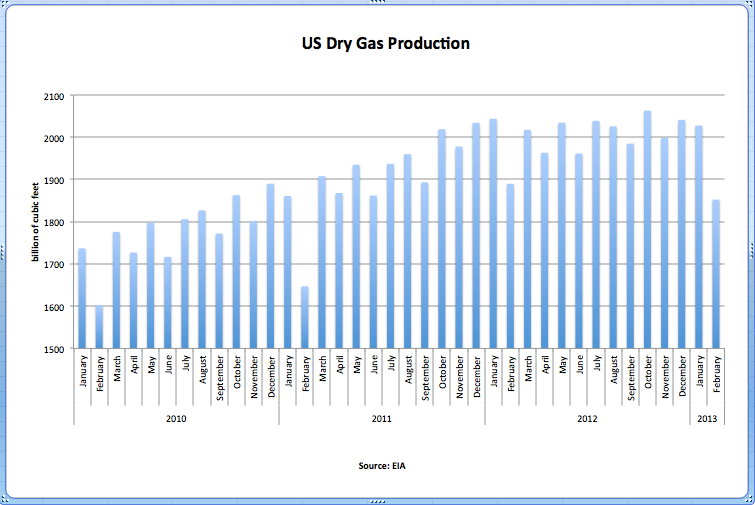
The U.S. government agency The Energy Information Administration (EIA) issues data on U.S. natural gas production, including shale gas, on a monthly basis with a lag of roughly two months. The latest data release was made on April 30 and covers the period up until February 2013.
Data is reported in billion cubic feet (bcf). Key points:
- February 2013 natural gas dry production: 1,852 bcf, –2.0% year-on-year
- Average monthly production for the 12 months to February 2013: 2,001 bcf, +2.9% over the same period the previous year
Since the end of 2011, the rate of production increase has levelled off (click chart below for larger image); for the most recent two months of data, we have seen year-on-year declines.![]()
![]() Much recent media attention has centred on a so-called shale-gas revolution in the United States and, in particular, the ability of shale gas to boost overall volume of natural gas production. Many claims are made with respect to the prospective expansion in shale gas production in the coming years including the following:
Much recent media attention has centred on a so-called shale-gas revolution in the United States and, in particular, the ability of shale gas to boost overall volume of natural gas production. Many claims are made with respect to the prospective expansion in shale gas production in the coming years including the following:
- Shale gas will provide a low-cost source of natural gas, and thus cheap energy, for decades to come. This, in turn, will boost the competitiveness of the U.S. economy.
- The U.S. will move toward an era of energy self-sufficiency, which will help buttress the country’s geopolitical security.
- The scale of shale gas production will be sufficient to allow the U.S. to commence natural gas exports, thus transforming energy markets outside of the U.S. such as those in Europe.
- Increased natural gas production in the U.S. will mitigate carbon emissions through displacing coal and so reduce the risk of dangerous climate change.
For these claims to be substantiated, significant year-on-year rises in U.S. natural gas production will be required over an extended period. Through tracking monthly production of natural gas, a non-specialist can confirm or refute whether large rises in natural gas production are being achieved and, therefore, whether the claims associated with a shale-gas revolution are credible. In short, the monthly numbers allow you to evaluate the hype. Monthly data are currently not showing any increase in production.