Chart of the Day, 7 Feb 2015: UK Emissions Progress Good, but Not Good Enough

Last week, the UK’s Department of Energy and Climate Change published its final figures for 2013 greenhouse gas emissions. At first glance, the picture looks encouraging (click for larger images on all charts).

Emissions of Greenhouse Gases UK jpeg

And we appear comfortably ahead of our Kyoto target and the carbon budget intermediary goals established under the Climate Change Act 2008:

UK Carbon Budget Targets jpeg

Unfortunately, much of the success of the first carbon budget came on the back of the 2008/9 recession. As outlined previously in this blog, carbon emissions are a composite product of population expansion, growth in GDP per head, the energy intensity of GDP and the carbon intensity of energy (this relationship is called the Kaya Identity and is looked at it in more detail here). So when economic growth is slow, greenhouse gas emission growth is slow as well.

To its credit, the 2008 Climate Change Act also established a watchdog called the Committee on Climate Change (CCC), whose remit was to report whether targets were being met. From the July 2014 progress report to parliament on the preliminary 2013 numbers we read this:

CCC 2014 Progress Report jpegEmissions reduction policies suffer from the fact that the low-hanging fruit is aways picked first. If we are lucky, technology will make some of the higher growing fruity easier to pick, but we are in no way assured that this will happen. Against this background, the CCC is not confident that the UK can keep the reduction pace through the 3rd and 4th carbon budgets. As things stand, we do not have the policies in place to create a path to get to where we need to go.

Planned Policy jpeg

Forth Carbon Budget Policies jpeg

And the scale of the challenge can sometimes appear daunting. The 73% reduction in emissions to 2050 required from now onwards will see UK society almost completely decarbonised.

GG Emissions to 2050 jpeg

Yet this is what we have to do. To repeat the Churchill quote: “It’s not enough that we do our best; sometimes we have to do what is required”.

Chart of the Day, 6 Feb 2015: Is Natural Capital a Helpful Concept?

Although David Cameron has come under criticism for his previous boast about running “the greenest government ever” in the UK, the coalition should be given credit for bringing some fresh thinking to the field of environmental economics. In particular, the concept of natural capital – the different elements of nature that provide value for people – has been lifted into the limelight (click for larger image).

Natural Capital jpeg

The idea of natural capital first popped up in E.F. Schumacher’s 1970s eco classic “Small Is Beautiful”. Only recently, however, has it migrated from academia to economic policy-making, most noticeably taking centre stage in the 2011 government white paper “The Natural Choice: Securing the Value of Nature”.

This white paper, in turn, gave birth to the Natural Capital Committee, chaired by the Oxford economist Dieter Helm, which has produced a series of three reports under the common title “The State of Natural Capital” (here).

So is this all “green crap” (the phrase attributed to PM Cameron when talking about energy bills)? At first glance, it looks eminently sensibly from a business perspective; that is, subjecting nature’s assets to the discipline of accrual accounting. Firms are comfortable with the concept that capital depreciates and that this is a cost. For a company to remain an ongoing concern, it can’t trash its balance sheet to the benefit of the income statement–at least not for long. Similarly, if we erode our soil or pollute our air, the benefits from these resources will gradually diminish.

Yet there are many problems. While we can sometimes back out the value of complex assets like shore-line ecosystems in terms of their functioning as flood defence, extending this approach to intangibles such as a picnic in a park is problematic.

Further, if we wish to prevent natural capital eroding, then we have to assign costs. Much natural capital suffers from the tragedy of the commons (certain economic actors secure profits but dump the costs associated with these profits on society as a whole), and getting the Office of National Statistics to compile natural capital accounts will be meaningless if enforcement isn’t given teeth. The record on climate change isn’t encouraging here. The economics profession is almost unanimous in recommending a carbon tax to make CO2 polluters pay, but few governments have thad the guts to implement one in the face of vocal opposition from vested interests.

Finally, natural capital accounting will live or die by how much you discount the future compared to the present. If we assign a high discount rate, then there is a rationale for gutting our children’s future in order to consume now. A low rate implies we care about coming generations. After the May elections, the incoming government will get to show how much it cares.


Chart of the Day, 4 Feb 2015: Finding the Missing Heat and What It Means for Risk

The climate change debate generally focuses on the atmosphere–or rather two metres of the atmosphere through which we wander. Accordingly, the flagship statistic for climate change is the global mean temperature anomaly (latest update on this by me here). This is understandable: we are not fish.

Nonetheless, global warming refers to the globe, of which the atmosphere is a little piece. So we always have to remind ourselves of what warming goes where. From The Carbon Brief:

Where Is the Heat Going jpeg

Consequently, if the rate of transfer of heat into the ocean fluctuates (which it does), this will have a significant impact on atmospheric temperature. The largest short-term source of heat transfer volatility between atmosphere and ocean is the ENSO cycle, with El Ninos being associated with hot atmospheric years and La Ninas with cool ones.

Once we strip this factor out (plus the smaller impacts from the solar cycle and volcanic activity), then the upward march in atmospheric surface temperatures becomes a lot smoother. That is the difference between the orange and red lines in the chart below from a Real Climate blog post by Stefan Rahmstorf.

Temperature Anomaly without ENSO jpeg

Nonetheless, while we have had a broad-brush understanding of the atmosphere-ocean interface for quite some time, the granular detail on what energy is going where is only just emerging. The establishment of the ARGO network of temperature-measuring buoys is the game changer here (Carbon Brief; click for larger image).

ARGO jpeg

The data only goes back to 2006, but nevertheless this has been sufficient to give us a better picture of where the energy sinks exist. From a new paper in Nature Climate Change by Roemmich et al we see this (click for larger image):

Trends in Ocean Heat Content jpeg

Andrew Revkin also covers this story in his New York Times Dot Earth blog and relays an e-mail correspondence with climate scientist Yair Resenthal:

In an email chat, Yair Rosenthal of Rutgers University and Braddock Linsley of Columbia University, whose related work was explored here in 2013, said the Argo analysis appeared to support their view that giant subtropical gyres are the place where heat carried on currents from the tropics descends into the deeper ocean.

Linlsey said: “I think the Argo data point to the central gyre regions as key to the ocean-atmosphere heat exchange story.”

Rosenthal noted that this heat-banking process could buy humanity time, providing what he has called “a thermal buffer for global climate change,” particularly because the deeper ocean layers are still relatively cool (compared to much of the Holocene period since the end of the last ice age).

The critical point here from a risk perspective is that the heat-banking process “could” buy humanity time. The problem with this is that it also possibly “could not”.

We are at a stage where we are learning of the existence of the giant subtropical gyres but we know little about how they function or evolve through time. If these gyres have been responsible for an increase in heat transfer to the deep ocean over the last decade or so, it is quite possible that they could be responsible for a decrease in heat transfer at some future time. At this stage, we just don’t know.

We may have graduated from the stage when we were dealing with an ‘unknown unknown’ to a ‘known unknown’ but this hasn’t made much of an impact on how we can assess risk. In short, we are still learning about the probability distribution associated with warming outcomes. Yet within that distribution, a far-from-negligible chance of 4 degrees Celsius plus of temperature rise by end-century exists. Further, we know that a 4 degree rise would be catastrophic.

The good news is that the probability distribution of warming outcomes we are dealing with–unlike those for volcanoes or tsunamis–is one where we control one of the key variables: the trend in emissions. The bad news is that we aren’t controlling that variable.

Chart of the Day, 3 Feb 2015: US Shale Oil and the Coming Production Cliff

The impact of shale oil, otherwise known as tight oil or light-tight oil (LTO), in the United States is indisputable. Aggregate production (conventional and non-conventional) is now almost level with its 1970 peak (click for larger image) with shale leading the oil rennaisance.

US Field Production of Crude Oil jpeg

The latest figures (which go up to November 2014) from the Energy Information Administration (EIA) released at the end of January are yet to show a slowdown in growth despite the oil price collapse illustrated below:

Crude Oil Spot Prices copy

Indeed, US production was 9 million barrels per day in November, a rise of 14.5% over the same period the previous year

How long will it take for production to adjust if crude stays around $50 per barrel? As I’ve mentioned before, shale is an industry with high upfront costs but relatively low operating and maintenance costs. The upfront costs are already ‘sunk’, so the ‘pump’ or ‘don’t pump’ break-even point is as low as $10-20 per barrel. Moreover, many producers hedge to varying degrees. To get a taste of this, here is part of a table on listed shale oil producers published at Seeking Alpha.

Oil hedges jpeg

Once these hedges roll off, profit margins will collapse. Meanwhile, the output of shale wells declines by around 60% in the first year; therefore, sustained production requires continuous new investment. And new investment requires a decent return on investment. Reuters has a good article by John Kemp on how this dynamic works.

Bloomberg New Energy Finance estimates that to sustain current levels of shale oil production would require a return on investment of 10%, but to increase production would need a 20% return (see their White Paper here). Using these rates, they then go on to look at what oil price is required for each region to get such returns (click for larger image).

Breakeven Points for US Shale Plays jpeg

Based on these calculations, the US oil industry will fall off a cliff should the oil price remain below $50 for more than a year.

Bottom line: shale oil has not killed peak oil, but cheap oil will kill shale. The only way this won’t happen is if the oil price moves back up again–which I forecast it will.

As Colin Campbell and Jean Laherrere said in a prophetic 1998 article in Scientific American, “The world is not running out of oil–at least not yet. What our society does face, and soon, is the end of abundant and cheap oil on which all industrial nations depend.” As I said yesterday for natural gas, to prove Campbell and Laherrere wrong we need to see low oil prices and rising production–not one without the other. It’s a simple test. Let’s see what happens.

Chart of the Day, 2 Feb 2015: Still Talking about a Shale Gas Revolution?

The US government’s Energy Information Administration (EIA) has just come out with US natural gas production figures for November. But before we look at them, let’s glance at the long-term chart first (Source EIA here):

US Natural Gas Monthly Supply jpeg

Looks good if you are a fracking enthusiast, although the chart makes the shale gas surge seem like one continuous, seamless event. Scale up to the monthly chart and the situation looks a bit more nuanced:

US Dry Gas Production Nov 14 jpeg

For two years, 2012 and 2013, production almost flatlined, before jumping up again at the beginning of 2014. The latest numbers show dry gas production for November up 6.2% year on year, and the twelve month average rose 4.6%. What explains the two-year hiatus in the shale gas revolution? That’s easy: price (Source: Nasdaq).

Natural Gas Futures jpeg

The Holy Grail for shale gas enthusiasts is rising production and cheaper prices. In reality, however, what we have seen is rising production when prices are high, but stagnating production when prices fall. We haven’t really seen the same dynamic for tight oil in the US because we haven’t seen a prolonged period of falling prices–until now.

Meanwhile, the EIA’s latest Short-Term Energy Outlook (STEO) , released on 13th January, contains new forecasts that extend out through 2016 . The outlook is for a short plateau, then a renewed upward move:

STEO Jan 15 copyTo be honest, foresting oil and gas markets is a nightmare, the reason being that you are actually having to forecast two interlocking variables: price and production. Keeping that caveat in mind, here is the EIA’s price forecast:

Henry Hub Natural Gas Prices

The chart is a little difficult to read, but the EIA is looking at $3.44 per million Btu in 2015 and $3.86 in 2016. This compares with an average of $4.39 in 2014.

Putting price and production together paints a pretty optimistic picture from the EIA. Previously, the slump in prices in 2011 led to a plateauing of production in 2012. Further, a jump in prices in 2013 resulted in reinvigorated production growth in 2014. Of course, technology is changing, and this relationship may not hold. Indeed, that is what the EIA argues (from the 13th January STEO, click for larger image):

STEO Gas Production Commentary jpeg

There are a lot of moving parts to the story. I haven’t touched upon the implications for associated natural gas (gas produced as a byproduct of drilling for tight oil) stemming from the oil price slump. Nor have I dealt with the big spat between the journal Nature and the EIA over shale gas reserve calculations. More to come on both of these topics in future posts.

Overall, though, remember the “peak oil” theory is really one of peak cheap oil (see my posts here and here). and you can extend the same logic to gas. Consequently, the cornucopians have a golden opportunity to nail the peakists if they can show one thing: that the world can produce more oil and gas at the current low oil and gas prices. We have a testable hypothesis–let’s see what happens.

Chart of the Day, 1 Feb 2015: More Thoughts on Happiness, Tsipras and the Greeks

Yesterday, I referenced the OECD’s publication “How Was Life? Global Well-Being since 1820“. While it is still early days, it is encouraging that the OECD has started to treat GDP and well-being separately as seen in the OECD chart below (click for larger image):

OECD Framework for Measuring Well-Being jpeg

This is progress: for many year happiness studies and subjective well-being were viewed as being the domain of eccentrics and cranks, and certainly no subject for such a serious organisation as the OECD. One person who has done more than any other to help create the shift in perspective is Ruut Veenhoven of Erasmus University in Rotterdam.

Veenhoven is a vocal advocate of a rigorous evidence-based approach to happiness studies. Further, to encourage and help nurture the discipline, he founded the World Database of Happiness, which acts as a clearing house and repository for happiness data and its associated literature. For example, type in “Happiness in Greece” and you can find a time series like this (click for larger image):

Happiness in Greece jpeg

Veenhoven is the first to admit that his discipline is still young, and there are numerous blanks to be filled. Yet he feels that politicians can already find tentative answers as to what would make their electorates more happy–if they could be bothered to ask the right questions.

With this in mind, the rise of new non-mainstream parties across Europe can be seen as a reaction to the falling levels of happiness experienced by large sections of the population. And this, in turn, is not just a reflection of economic hardship. Rather, it also mirrors the loss of agency, or the ability to shape one’s life, felt by an increasing share of both the working and middle classes.

Alexis Tsipras of Syriza in Greece and Pablo Iglesias of Podemos in Spain have been tapping into this angst. My hope is that they then forge policies that underpin happiness. For example, insecurity is a happiness killer. The burgeoning precariat, created by 21st century technology coupled with 21st century capitalism, should have some predictability given back to their lives. Nonetheless, Veenhoven points out that hard left ideas produced some of the worst regimes possible in the 20th century happiness-wise. High happiness requires personal choice and control, not things necessarily fostered by interventionist states.

I wish an ideology would emerge that harnesses technology and markets to promote genuine human flourishing. Such an ideology would take a very nuanced approach to economic growth, but would not necessarily be labelled ‘left’. I find it extraordinary that post the Great Recession, most western democracies are still run by centre or centre-right neoliberal elites. Secular stagnation and falling medium wages would suggest that the present socio-economic model isn’t working very well.

Given these facts, I would have hoped that a vibrant ideological alternative would have emerged (or at least old parties would have started wearing new clothes). In the UK, the early coalition government, with its green agenda and community-based concept of the Big Society, looked like it was evolving (at least partly) to reflect the new economic and social realities. Unfortunately, such fresh thinking has been progressively dropped, leaving a party closer to a Thatcher-style political ideal more than anything else.

Meanwhile, in southern Europe, my fear is that what Tsipras and Iglesias end up offering is recycled 20th century socialism. As I see it, that ideology is no longer fit for purpose in tackling our challenges either.

Going back to Veenhoven, if you want to hear a state of play on what determines life satisfaction, watch a lecture given by him here:

Chart of the Day, 31 Jan 2015: Happy Danes, Sad Greeks

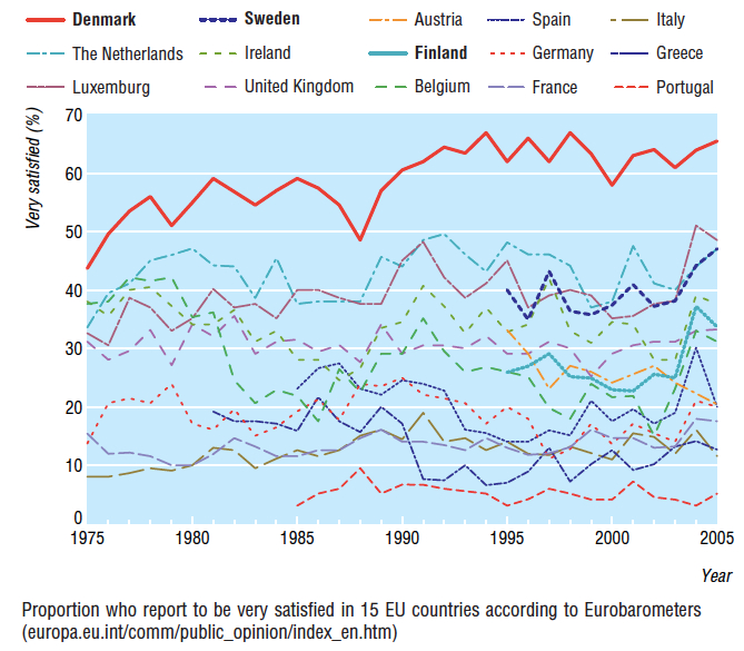
The Atlantic has just published a fabulous article entitled “The Danish Don’t Have the Secret to Happiness“.  It is a response to a myriad of charts that look like this (taken from a tongue in cheek article in the British Medical Journal that The Atlantic references):

Life Satisfaction jpeg

Michael Booth, the author of the Atlantic article, is a Danish happiness cynic, questioning the happy state of Denmark on three fronts. He posits that

1. Danish happiness is a false construct arising from low expectations,

2. the boring nature of Danes allows them to remain happy, and

3. their smugness will ultimately lead to the nation’s final demise.

The low expectations argument is a restatement of what the happiness economist Caroline Graham calls the ‘happy peasants and miserable millionaires’ paradox (see, for example, here). According to her, our happiness set point can be a function of our surroundings.

While the research confirms the stable patterns in the determinants of happiness worldwide, it also shows that there is a remarkable human capacity to adapt to both prosperity and adversity. Thus, people in Afghanistan are as happy as Latin Americans – above the world average – and Kenyans are as satisfied with their healthcare as Americans. Crime makes people unhappy, but it matters less to happiness when there is more of it; the same goes for both corruption and obesity. Freedom and democracy make people happy, but they matter less when these goods are less common. The bottom line is that people can adapt to tremendous adversity and retain their natural cheerfulness, while they can also have virtually everything – including good health – and be miserable.

Indeed, an individual’s happiness set point can not only be a function of relative health, wealth, beauty and so on relative to one’s peers but also the same yardsticks measured against one’s past life. So how about the Greeks? Are they adapting to their new straightened circumstances? According to OECD data, the answer must be “no” or at least “not yet”. From the “How’s Life in Greece, May 2014” survey, life satisfaction comes in at around 4.7 out of 10, which puts Greece at the bottom of the OECD (here).

Further, while life satisfaction can be dubbed a function of the remembering self (when I sit down in a chair and think of my life, am I satisfied), people’s happiness as also related to their experiencing self (using the Nobel prize winner Daniel Kahneman’s terminology– see my post here). In short, am I cold, hungry, stressed, anxious , sad and/or in pain; or am I warm, replete, joyful, relaxed, rested and/or content? The OECD reports that only 52% of Greeks report having more positive than negative experiences in an average day (the lowest in the OECD) compared with an average of 76%.

For Greece to live with long-term austerity, Angela Merkel and the Troika must believe that Greek happiness indicators must, in the course of time, reset upwards. Unfortunately, they haven’t been reading the happiness literature in sufficient depth. While life satisfaction can adapt, adaption is generally a reaction to a set of circumstances that you have grown up with. Such forms of satisfaction lack what Graham calls “agency” or “the capacity to pursue a fulfilling and purposeful life”.  And once you have tasted “agency” you don’t want to lose it.

The appeal of Syriza, and its slogan of “hope”, is its potential to restore a degree of agency to the Greek people. Whether they can deliver this agency is a different question. In reality, income and wealth bestow a high degree of agency since they give us the financial wherewithal to make choices. However, agency can still arise from non-financial means, such as having the ability to adopt a non-conventional lifestyle, move from one area to another, change career, better one’s education and gain access to art and culture.  To stop disillusionment setting in, Syriza will have to put much effort into the fostering of such sources of low cost agency.

Happiness can be viewed from other vantage points too. Many scholars of happiness have identified eudaimonia as a source of happiness. This is sometimes described as human flourishing, but I prefer to view it as the sense of participating in and contributing to something greater than one’s own life. Past political movements have tapped into eudaimonia to give their followers a sense of shared propose and even destiny–sometimes, of course, to disastrous effect. However, at its best, it can be a fuel for transformational social movements that enthuse and enrich those advancing the cause as much as the final beneficiaries. Alexis Tsipras has certainly given Greeks a vision of change that could stimulate eudaimonia, but whether this can morph into a philosophy or ideal that has some staying power beyond the post-election honeymoon is a different question.

Meanwhile, for Danes seeking eudaimonia, a temporary move to Greece would not be a bad idea. But remember that the Danes always have the option of returning to Denmark and restocking on more mundane sources of happiness. The Greeks don’t.
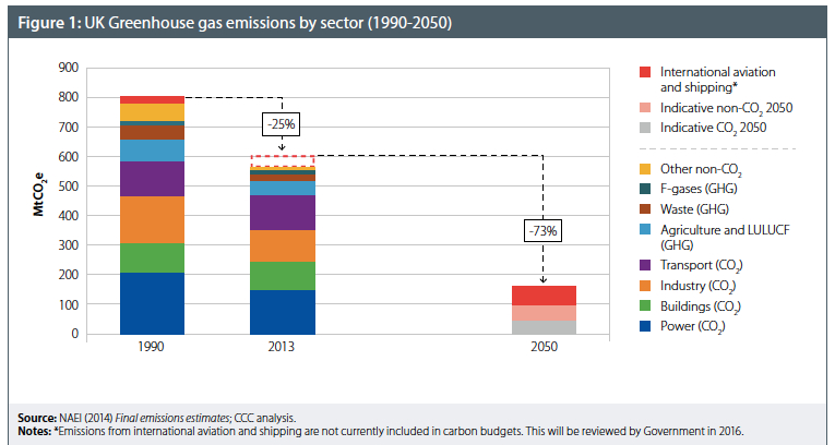
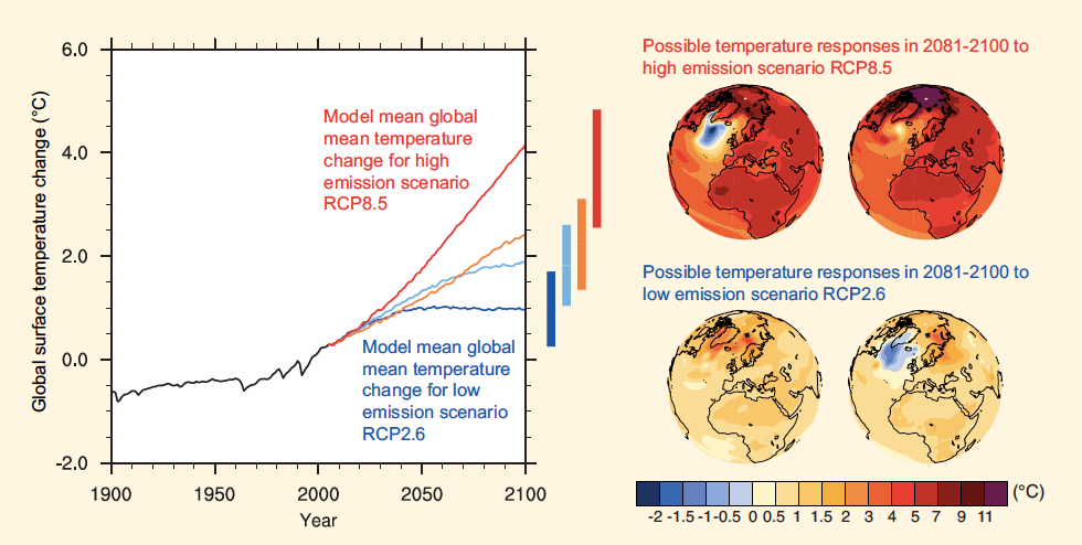
Chart of the Day, 30 Jan 2015: Pick a Pathway (to Climate Nirvana or Climate Hell)

After yesterday’s post on China’s emissions, I will try to keep in a ‘cup half full’ frame of mind today.

The Intergovernmental Panel on Climate Change (IPCC) is an organisation for which I have great respect. But while their research may be applauded for its rigour,  communication with the wider world frequently lacks clarity (to put it mildly). Take, for example, the emissions scenarios, which in the Fifth Assessment Report (AR5) are called Representative Concentration Pathways (RCPs). Here are the RCPs and the change in temperature that accompanies them (Source: IPCC AR5, WG1).

Global Mean Temperature Change jpeg

I have spent many an hour grinding through IPCC reports trying to find clear explanations of what sits behind these pathways, but it is a painful process. Eventually, Skeptical Science saved the day by publishing “The Beginner’s Guide to Representative Concentration Pathways“.

There are four Representative Concentration Pathways: RCP 8.5, RPC 6, RCP 4.5 and RCP 2.6. The numbers refer to what is termed the ‘radiative forcing’, the change in net energy flow as measured in watts per square metre. Moreover, RCP 8.5 is expected to keep on increasing past 2100, RCP 6 and 4.5 will peak in 2100 and RCP 2.6 will have peaked prior to 21oo. Simplistically, a larger forcing means the globe will reach a higher mean temperature, as you can see in the chart above.

Surprisingly, AR5 is not particularly concerned with the socioeconomic assumptions that lie behind the RCPs. In this respect, the climate scientists behind the RCP concept are thinking the way economists often do: they are saying “imagine if we had condition X, what would be the output Y”. In this way, you can explore the model, and, hopefully, you obtain some insight which you can then take back to the real world.

I’m still a little uncomfortable with this. I think the IPCC should have chosen RCPs with highly transparent assumptions and realistic story lines. Instead, two of the four RCPs look utterly unrealistic to me. For example, to get to RCP 2.6 would require a transition away from fossil fuels that now looks impossible. And the good news? Well, RCP 8.5 looks barking mad to me too. Here are the emissions trajectories (from the Skeptical Science RCP report; click for larger image):

RCP Emission Trajectories jpeg

And if you concentrate on the blue line in the CO2 chart, you can see that around 24 giga tonnes of carbon are expected to be emitted in 2060. In yesterday’s blog post I was on working in units of tonnes of CO2. In the above chart, while the subject is CO2, the y-axis is in carbon. For those who have forgotten high school chemistry, you have to remember this:

CO2 jpeg

So when we move from calculations working in tonnes of carbon to tonnes of CO2 we have to multiple by 3.67 (44 ÷12) and vice versa. Joe Romm had a great piece in Climate Progress a while ago highlighting the number of people who get caught out through mixing up CO2 and carbon units. Accordingly, the 24 giga tonnes of carbon in 2060 is equivalent to about 88 giga tonnes of CO2. To put this in perspective, what are the big emitters putting out today:

Regional Emissions to 2019 jpeg

European emissions are already in decline and US emissions are flatlining. China’s emission growth will decelerate because its fixed-investment driven GDP growth model will come to the end of its natural life. China is also just about to enter its own demographic transition, and we have all see what such a transition did to Japanese economic growth (and by extension its emissions).

Obviously, India and other developing nations will increase their emissions, but they are unlikely to be able to replicate China’s export-led growth model. Further, with every passing year, the grid parity of renewables falls. Prime Minister Modi announced a push toward renewables when meeting President Obama. This was not just as a diplomatic gesture ahead of the Paris climate talks, but also as a pragmatic measure to buttress India’s energy independence and reduce the country’s exposure to volatile fossil fuel price movements.

So the cup half full is that RCP 8.5 looks unlikely–but the cup half empty is that RCP 6.5 is pretty awful climate-wise all the same.

Chart of the Day, 29 Jan 2015: China Slowdown a CO2 Emissions Silver Lining

If you follow the climate change debate over time, it is difficult not to get depressed: it’s the feeling of helplessness as the slow-motion cash crash takes place before your eyes.

So when a little bit of light shines through, it comes as a relief. And sometimes, hope comes from the most unlikely of sources–in this case China. It is almost a truism that as go China’s CO2 emissions, so go the world’s. See the chart below (Source: Trends in Global C02 Emissions Report; click for larger image):

Global CO2 Emissions jpeg

Very roughly, global CO2 emissions have gone from around 24 billion tonnes per annum in the early 1990s to around 36 billion tonnes today: an increase of 12 billion, or 50%.

Taking the top six emitters, we see can China’s prime role in this growth more clearly (click for larger image):

Top 6 Emitters jpeg

So we have seen China move from emitting around three billion tonnes of CO2 in the 1990s to around 10 billion tonnes today. Thus of the extra 12 billion tonnes of CO2 emitted per annum globally after 20 years, 7 billion has come from China.

The Global Carbon Project sees emissions continuing to grow to 43 billion tonnes in 2019 (note giga is equivalent to billion).

CO2 Emissions to 2019 jpeg

And again it is China leading the trend:

Regional Emissions to 2019 jpeg

And keep in mind that we have a CO2 budget of around 1,200 billion tonnes of CO2 before we commit the earth to 2 degrees Celsius of warming with a 66% probability. On current trends, that budget will be used up by about 2041, or in around 27 years.

Carbon Budget 2014 jpeg

Over that period, China is likely to emit approximately 15 billion tonnes of CO2 per year on average on present trends. That would mean that by 2041, China would have emitted about 400 billion tonnes of CO2, or a third of the total budget available. Next question: is there any way China can free up more of the budget?

A paper by Luukkanen et al provides us with a detailed decomposition of China’s future emissions using a Kaya identify with a sectoral overlay. To refresh your memory, the Kaya identity allows us to estimate future emissions based on population growth, GDP growth per person, energy intensity per unit of GDP, and carbon intensity per unit of energy (see my post “The Unbearable Logic of the Kaya Identity” for a little more detail).

The paper sets out three fuel-related emission scenarios: reference (business as usual), policy (following the government’s developmental plans) and industry (a  focus on heavy industry and investment-led growth).

China CO2 Scenarios jpeg

Note that the above charts are only looking at fuel combustion emissions. Accordingly, these numbers don’t tally with the Global Carbon Budget numbers that also add in agriculture and industry-related emissions. Nonetheless, where fuel emissions go, so will total emissions.

Here is where the silver lining comes: the most-muted emissions scenario above, termed ‘policy’, still looks far too high growth-oriented to me. Here are the assumptions that underpin this scenario `click for larger image):

China Sectoral Annual Growth Rates jpeg

In the policy scenario, a GDP growth rate of 7.4% is still forecast between 2016 and 2020, and then 5.2% growth  between 2021 and 2030. If you believe in a much quicker slow-down scenario, which I do, then these numbers look hopelessly optimistic (from a growth rather than climate perspective). See my post referring to Michael Pettis’ work.

If you then combine a much swifter descent to growth rates of 3-5%, plus a continued pivot from investment-led growth to consumption-led growth, and then add on an aggressive renewables roll out (which we are seeing), then China could free up an additional 100 billion tonnes of the carbon budget.

Frankly, that still doesn’t get us anywhere near capping climate change to 2 degrees of warming, but it gives us a little bit of extra time. And given where we are, every little bit helps.

Chart of the Day, 28 Jan 2015: Oil, Cornucopians, Peakists and Jeremy Grantham

The stunning collapse in oil and metal prices since last summer (see yesterday’s post) has brought the cornucopians and abundantites crawling out of the wood work. From an (otherwise very good) article in The Economist of 17th January titled “Let there be light”.

An increase in supply, a surprising resilience in production in troubled places such as Iraq and Libya, and the determination of Saudi Arabia and its Gulf allies not to sacrifice market share in the face of falling demand have led to a spectacular plunge in the oil price, which has fallen by half from its 2014 high. This has dealt a final blow to the notion of “peak oil”. There is no shortage of hydrocarbons in the Earth’s crust, and no sign that mankind is about to reach “peak technology” for extracting them.

Frankly, this is just sloppy thinking from The Economist: the second sentence, which talks of a “final blow” to the notion of peak oil, doesn’t follow on from the first.

In short, the paragraph muddles the short term and the long term. Why is a fall in oil prices barely six months’ old a “final blow” to the notion of peak oil? And while fracking shows we are far from “peak technology”, it says nothing about price. Can tight oil keep coming to market for years to come at current prices? I think not. For a longer treatment of oil supply versus oil demand, see my more detailed post titled “Has Shale Killed Peak Oil“.

One of the most vocal advocates of the ‘peakist’ or ‘depletist’ hypothesis is Jeremy Grantham, who has used The Quarterly Letter of GMO as a platform for his views. The chart below is taken from The Third Quarter 2014 letter (click for larger image):

U.S. Average Hourly Manufacturing Earnings:Oil Price per Barrel jpeg

Grantham points out that in 1940 one hour’s work for an American engaged in manufacturing could buy 20% 0f a barrel of oil. At the twin peaks of oil abundance–1972 and 1999–the same wage could buy over a barrel of oil. But those days, he argues, are long gone. According to Grantham, this has implications for not only oil markets but also for the energy underpinnings of global economic and productivity growth.

Yesterday, I also argued that the rapid slowing to the Chinese economy was the likely culprit behind the havoc in commodity markets rather than a breakthrough in one particular extraction technology. As evidence, I noted how iron ore and copper prices had collapsed along with the oil price, despite the fact that you can’t frack for copper and iron ore.

The critical question now is what will happen to supply in the face of sluggish demand. Tight oil production is dramatically different from traditional oil production due to the accelerated nature of the depreciation schedule. Fracked fields deplete quickly, so to maintain production you must continually invest. If you don’t, aggregate production falls fast–that is, within a year or two. So we won’t witness a decade long excess capacity work-out as you would have seen in previous oil price busts: supply should adjust to demand at breakneck speed this time around.

Consequently, while we are not at “peak technology” for oil extraction, we possibly are at “peak cheap technology”. If so, forget all talk of “final blows” to peak oil.