Category Archives: Climate Change

The Republican Party’s Climate Change Cul-de-Sac

Back in 2009, I was having a long lunch with a banking analyst in Tokyo. Somehow, the topic of climate change was raised. My luncheon companion, an American, suddenly came out with the following comment:

Of course, I don’t believe in global warming; I’m a Republican.

I almost fell off my chair. To me, climate change is a subject like Newtonian physics or plate tectonics—in other words, not appropriate for political categorisation. It was then that I realised that climate change was becoming a so called wedge issue in the U.S.: a key determiner of one’s political allegiance.

The transformation has been swift. The Republican Party’s platform of 2008 included a whole section on “Addressing Climate Change Responsibly” within a chapter entitled “Environmental Protection”. It contained these words:

The same human economic activity that has brought freedom and opportunity to billions has also increased the amount of carbon in the atmosphere. While the scope and longterm consequences of this are the subject of ongoing scientific research, common sense dictates that the United States should take measured and reasonable steps today to reduce any impact on the environment. Those steps, if consistent with our global competitiveness will also be good for our national security, our energy independence, and our economy.

A Washington Post article contrasts and compares this approach with the 2012 platform: Continue reading

Trends, Fluctuations and Having Skin in the Game

Anyone who has seriously invested in financial markets starts by learning to separate fluctuations from the trend. If you don’t, your life in the markets will be nasty, brutish and short. The same applies to any analysis of global temperature. You have a trend, principally driven by greenhouse gas concentrations in the atmosphere; and you have fluctuations, principally driven by the El Nino Southern Oscillation (ENSO) cycle.

When we are in the  El Niño phase, Pacific ocean temperatures are higher then average; in a La Niña phase, lower. The impact is significant enough to influence overall global mean temperature. Accordingly, if you wish to make a statement about the recent trend in global warming, start by adjusting for the ENSO fluctuation. Of course, many don’t. Indeed, the claim that global warming has ceased over the last decade is frequently aired in many a newspaper column (like this from the Wall Street Journal), not just the wackier end of the blogosphere.

Let us for a minute look at the distribution of El Niño and La Niña events over the last couple of decades. The excellent blog Skeptical Science does just that (here) and presents the following chart (click for larger image):

Temperature and ENSO jpg

The piece concludes with the following: Continue reading

NASA Announces 2012 Temperature Data

On January 15, NASA’s Goddard Institute of Space Studies (GISS) announced temperature data for 2012 (slightly later than usual as GISS has been experiencing some web site problems—guess nobody is immune from these).

The year 2012 has been officially pegged as the ninth hottest since 1880, with a temperature anomaly (difference) of 0.56 degrees Celsius over the 1951-1980 base period. Below I have ranked the top 20 hottest years in the 1880 to 2012 period (click for larger image). As you can see, recent years dominate the ranking and the oldest year to make the cut is 1988.

GISSTempAnomalies jpg

Continue reading

The Supreme Folly of Buying Oceanfront Property

If one wants to have an opinion on climate change, you need to at the very least have read the Summary for Policy Makers from the Fourth Assessment Report (AR4, 2007) of the Intergovernmental Panel on Climate Change (IPCC). Is this too much to ask? It is only 18 pages long!

Within the text, you find this chart on temperature and sea level rise (click for larger image):

IPCC Sea Level jpg

The range of seal level rise estimates across the scenarios goes from 18 cm to 59 cm. Nothing to be alarmed about? Let’s read the column text within the chart:

Model-based range excluding future rapid dynamical changes in ice flow

That basically means any ice sheet melt factors that are difficult to measure. In other words, we estimate sea level rise risk but without including the risky bits. The years flow by, and the science moves on. Here are the sea level rise scenarios from  the United States National Climate Assessment dated December 2012 (click for larger image):

Sea Level Scenarios jpg

The range is now 20cm to 200cm including all the risky bits. An oceanfront property that is economically feasible to defend with, say, 20cm of sea level rise may not be defendable at one metre plus. And note that the market is not stupid enough to wait until inundation before marking down the price. Once the market predicts the deluge decades ahead with a reasonable degree of certainty, prices are correspondingly marked down.

That absolutely prime piece of oceanfront property suddenly moves from a freehold to a leasehold valuation metric. Caveat emptor.

Links for Week Ending 12th January

  • Desdemona Despair looks back at the year through 50 images.
  • While Prof Stephan Lewandowsky at Shaping Tomorrow’s World lists the 19 top climate events of 2012.
  • A lovely piece of journalism by Edward Platt in the New Statesman  covering Britain’s flood capital Tewkesbury.
  • Stuart Staniford’s Early Warning blog is consistently interesting. This week Stuart has some insights into CO2 emission paths (here).
  • Brace yourselves for food price rise in 2013 according to Liam Halligan in The Telegraph.
  • Joe Romm at Climate Progress flags the release of a draft of the U.S. Climate Assessment. I intend to post on this over the coming week.
  • One of my favourite authors, Jared Diamond, has a new book out called “The World until Yesterday”. A previous book of his, “Collapse”, is a must read for anyone who wants to understand the implications of a changing climate. A summary of the collapse theme plus a link to an excellent presentation on Youtube made by Diamond can be found at TH!NK (here).

Global Trends 2030: Futurology Fit for a President? (Part 1 Climate Change)

Every four years,  just before inauguration, each incoming president gets a 100-page National Intelligence Council (NIC) briefing called “Global Trends” that looks at potential risks to the United States 20 years ahead. As futurology goes, the report’s aims are quite cautious:

The report is intended to stimulate thinking about the rapid and vast geopolitical changes characterizing the world today and possible global trajectories during the next 15-20 years. As with the NIC’s previous Global trends reports, we do not seek to predict the future—which would be an impossible feat—but instead provide a framework for thinking about possible futures and their implications.

The NIC is the long-term strategic think tank of the U.S. Intelligence Community, which in turn is a cooperative federation of 16 U.S. government agencies (including the CIA) that work on intelligence issues. Continue reading

Australian Climate: The Unlucky Country

In 1964, a book was published that caught the Australian public’s attention. It was called “The Lucky Country”. Ironically, while the book was a social critique of 1960s Australian society, the term The Lucky Country took a life of its own and came to represent the good life that Australia offered: a life founded on clement weather, bountiful natural resources and a peaceful civil society.

For the British, The Lucky Country allure was overpowering and tens of thousands made the long journey to a new life every year; indeed, today over 1 million Australian residents give their place of birth as the British Isles. Decades on, much of The Lucky Country elixir still seems in place: a high standard of living, relatively low unemployment and an economy still benefiting from a natural resources boom. So, for a family with young children stuck in austerity Britain, surely emigration to Australia if an appealing option, especially if the parent’s principal concern is to open up fresh opportunities for their children.

Unfortunately, my advice over whether to emigrate to Australia would have to be “no” for one single reason: climate. In sum, as the children of today grow into the adult workforce of tomorrow, the Australian climate could be a much more malevolent thing than it is now. Indeed, it could be so different as to transform Australian society if no concerted global effort is made to restrict carbon emissions.

Austalian Max Temperature copy

The current heatwave in Australia gives us all a sneak preview of things to come (click chart above for larger image, source here) both in its severity, extent and duration. Continue reading

Dec 2012 CO2 Data Release: Implications

Atmospheric CO2 concentration is the world’s leading risk indicator.

As reported in my previous post, details of the December 2012 data release for atmospheric CO2 concentration in parts per million at the Mauna Loa Observatory in Hawaii are as follows:

  • December 2012 = 394.39 ppm, +2.60 ppm year-on-year
  • Twelve Month Average = 393.84 ppm, +2.19 ppm year-on-year
  • Twelve month average over pre–industrial level = +40.7%

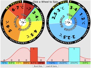
Temperature Rise Probabilities jpg

The current trajectory in atmospheric CO2 concentration rise coupled with the fact that no global agreement has been reached to reduce CO2 emissions mean that the world’s average temperature is likely to rise within the range described by the left-hand ‘no policy’ roulette-style wheel (click for larger image) as developed by the Massachusetts Institute of Technology (MIT) Joint Program on the Science and Policy of Global Change

Continue reading

Atmospheric CO2 Data Watch: Dec 2012 Release

Atmospheric CO2 concentration is the world’s leading risk indicator.

Every month, the National Oceanic and Atmospheric Administration (NOAA), a U.S. government federal agency releases, releases data on the concentration of atmospheric CO2 as measured by the Mauna Loa Observatory in Hawaii. This is the longest continuous monthly measurement of CO2 and dates back to March 1958, when 315.70 parts per million (ppm) of CO2 was recorded.

The Intergovernmental Panel on Climate Change (IPCC) uses the year 1750 as the pre-industrialisation reference point, at which date the atmospheric concentration of CO2 was approximately 280 ppm according to ice core measurements.Key numbers relating to release:

  • December 2012 = 394.39 ppm, +2.60 ppm year-on-year
  • Twelve Month Average = 393.84 ppm, +2.19 ppm year-on-year
  • Twelve month average over pre–industrial level = +40.7%

Decadal CO2 Change jpg

Continue reading

Natural Catastrophe Watch

The Financial Times has an interesting chart based on data from the reinsurance company Munch Re (click for larger image):

Natural Catastrophes Worldwide jpg

Note: roughly speaking you could substitute ‘drought’ for the world ‘climatological’; ‘storms’ for the word ‘meteorological’; and ‘floods’ for ‘hydrological’. ‘Geophysical’ are mostly ‘earthquakes’.

In financial terms, Munich Re sees catastrophe losses coming to $160 billion in aggregate, led by Hurricane Sandy at $25 billion (here). Overall, the US accounted for 67% of overall losses, or $107 billion. To put this in context, US GDP was around $15.8 trillion in 2012, so such losses were 0.67% of GDP. We have to be a little careful here, however, since GDP is a flow concept (like earnings) and catastrophe losses are a stock concept (like wealth).

United States net wealth didn’t growth by $15.8 trillion since you need to take into account depreciation of household, corporate and public-sector assets. The best approach would be to find a figure for the annual change in net wealth and then compare this with projected catastrophe losses going forward (which will almost certainly follow an exponential curve upward). I will return to this theme in future posts.